


Chart pattern is one of the most effective technical analysis tools, graphically representing how prices move and show the psychology of the buyers and sellers. So, what is a chart pattern? Chart patterns help traders to identify entry, exits, trends, trend reversals and possible breakouts before the market responds and have a clear advantage in decision making.
Chart patterns have been used for centuries as a visual way to understand the market sentiment and price movement.
- It all began in the early 1900s when the founder of the Wall Street Journal, Charles Dow noticed that prices do not move randomly, they move in patterns and cycles. The foundations of technical analysis were his ideas.
- Much later, in 1930s – 40s, traders began to write price movements on paper and realized that some figures began to reoccur again and again – a head and shoulders, a double top, triangle, and so on. These recurrent forms were called chart patterns.
- By the 1980s and 1990s, researchers such as Thomas Bulkowski were researching thousands of such patterns based on actual market data and discovered that many of them actually produce results with 60%-70% accuracy when applied together with volume and indicators.
Nowadays chart patterns are utilized by not only manual traders, but also algorithms, AI and hedge funds since human psychology will never evolve fear and greed will continue to provide the same price response over and over again.
Chart patterns are categorised into 3 broad concepts: Continuation Patterns, Reversal Patterns & Bilateral Patterns.
| Pattern Type | Interpretation | Trend Context |
| Continuation Patterns | The existing trend is likely to resume after a short consolidation; traders often enter in the direction of the prior move | During an ongoing uptrend or downtrend |
| Reversal Patterns | Indicates a potential change in trend direction (bullish ↔ bearish); signals exit or opposite entry opportunities | At or near the end of an uptrend or downtrend |
| Bilateral Patterns | Can break out either way — up or down — depending on which side gains strength; traders wait for breakout confirmation | During periods of consolidation or uncertainty |
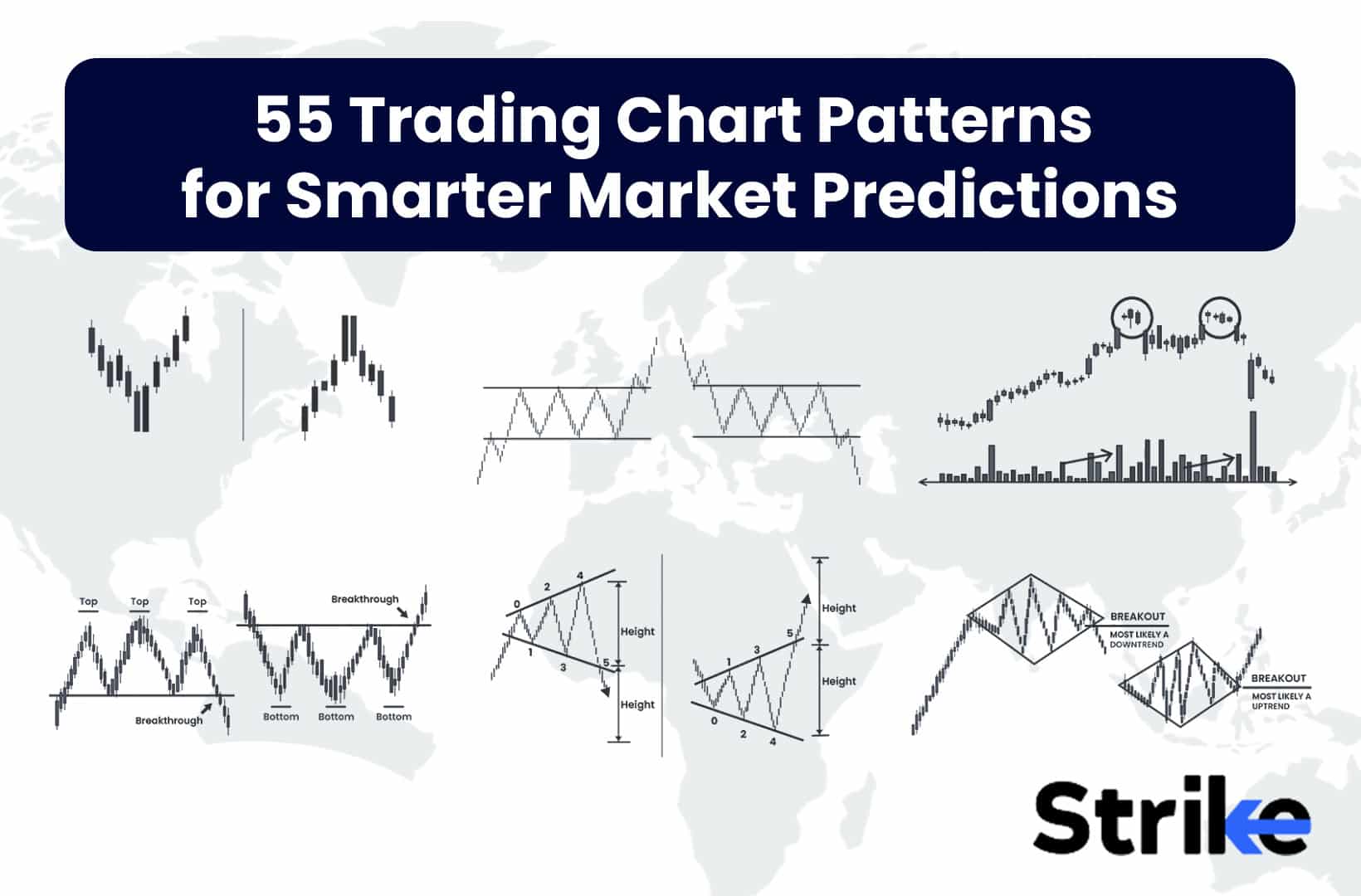
This guide explains 55 fundamental trading chart patterns, including the classic chart patterns such as Head and Shoulders, Double tops/bottoms and more complex patterns such as the Three drives and Quasimodo. Knowing these trends will prepare you to read the market action, predict prices and trade smarter rather than harder.
Most Popular Chart Patterns Summary
| Chart Pattern | Trend Behavior & Market Signal | Category |
| Head and Shoulders | Forms after an uptrend; signals a bearish reversal once the neckline breaks. | Reversal |
| Inverse Head and Shoulders | Appears after a downtrend; signals a bullish reversal when price breaks above neckline. | Reversal |
| Double Top | Develops after an uptrend; indicates trend exhaustion and start of a downtrend. | Reversal |
| Double Bottom | Occurs after a downtrend; shows accumulation and potential bullish reversal. | Reversal |
| Cup and Handle | Follows an uptrend; continuation pattern confirming a bullish breakout after the handle. | Continuation |
| Ascending Triangle | Forms during an uptrend; signals a bullish continuation above resistance. | Continuation |
| Descending Triangle | Appears in a downtrend; confirms bearish continuation after breakdown below support. | Continuation |
| Symmetrical Triangle | Occurs in any trend; breakout direction determines bullish or bearish continuation. | Bilateral |
| Bullish Flag / Pennant | Appears in an uptrend; short pause before a bullish continuation breakout. | Continuation |
| Falling Wedge | Forms after a downtrend; signals a bullish reversal when price breaks upward. | Reversal / Continuation |
Let’s learn each chart pattern in detail.
1. Head and Shoulders Pattern
The head and shoulders pattern is a bearish trend reversal chart pattern that forms at the peak of an uptrend, signaling the trend is about to reverse from bullish to bearish. It is one of the most reliable chart patterns to catch the reversals. See the image below. This pattern resembles a person’s head and shoulder, with the middle peak being highest ( Head ).

Structure and psychology behind head and shoulder chart pattern.
- Left Shoulder: A peak formed after an uptrend, uptrend after a pull back.
- Head: A higher peak formed after the left shoulder followed by another pull back.
- Right Shoulder: A lower peak equal to the left shoulder, indicating weakening buying momentum.
- Neck Line: A support line drawn by connecting the lows between the shoulders and head.
In an uptrend, buyers try pushing price to the new high (Head), but sellers push price strongly. The right shoulder shows that buyers can no longer reach new highs due to increasing selling pressure. A break below the neckline shows that the seller has taken over and the trend has reversed from bullish to bearish.
| Head and Shoulders Chart Pattern Summary | |
| Type of Chart Pattern | Reversal (Bullish → Bearish) |
| Signal | Price is expected to decline after breaking below the neckline. |
| Entry | Enter short after breakdown below the neckline (with volume). |
| Profit Target | Measure the distance from the head (highest point) to the neckline and project downward. |
| Stoploss | Slightly above the right shoulder to avoid false breakouts. |
| Exit | When price reaches projected target or shows reversal/strength signs. |
Dr. Andrew Lo and Jasmina Hasanhodzic’s 2009 study, “Can We Learn about Time Reversals?” published in the Journal of Portfolio Management, found that the head and shoulders pattern had a 65% success rate in predicting market reversals across various asset classes.
2. Inverse Head and Shoulders Pattern
The inverse head and shoulders pattern is a trend reversal pattern that forms at the bottom of a downtrend, signaling the trend is about to reverse from bearish to bullish. This pattern resembles an upside down person’s head and shoulder, with the middle peak being lowest( Head ).

Structure and psychology behind inverse head and shoulder chart patterns.
- Left shoulder: A low formed during a downtrend with a small rebound.
- Head: A lowest peak formed after the left shoulder followed by another rebound.
- Right Shoulder: A higher low roughly equal to the left shoulder, indicating weakening bearish momentum.
- Neckline: A resistance line drawn by connecting the highs between the shoulders and head.
In a downtrend, sellers try pushing price to the new low(Head), but buyers pull back the price strongly. The right shoulder shows that sellers can no longer reach new lows due to increasing buying pressure. A break above the neckline shows that the buyers has taken over and the trend has reversed from bearish to bullish.
| Inverse Head and Shoulders Chart Pattern Summary | |
| Type of Chart Pattern | Reversal (Bearish → Bullish) |
| Signal | Price is expected to rise after breaking above the neckline. |
| Entry | Enter long after breakout above the neckline (with volume). |
| Profit Target | Measure the distance from the head (lowest point) to the neckline and project upward. |
| Stoploss | Slightly below the right shoulder to avoid false breakdowns. |
| Exit | When price reaches projected target or shows reversal/weakness signs. |
A 2018 study by Pornima Jain and Sanjay Sehgal, published in the Journal of Business and Economic Policy, found that this pattern had a 75% success rate in predicting trend reversals in the Indian stock market.
3. Double Top Pattern
The Double Top is a bearish reversal chart pattern that typically appears after a sustained uptrend. It signals that the asset has reached a strong resistance level twice but failed to break higher, indicating weakening buyer strength and potential trend reversal to the downside. It resembles the letter M.
Structure & Psychology of a double top chart pattern.

- First Top: Price rises strongly and hits resistance. Buyers show strength, but sellers push back, causing a pullback.
- Second Top: Price rallies again toward the same resistance. Buyers attempt another breakout but fail, signaling weakening bullish momentum.
- Neckline: The pullback between the two tops creates a horizontal support line (neckline). This level becomes the critical pivot point for the pattern.
- Breakdown: When the price falls below the neckline with strong volume, it confirms that sellers have taken control, marking the end of the uptrend and the start of a bearish reversal.
| Double Top Chart Pattern Summery | |
| Type of Chart Pattern | Reversal (Bullish → Bearish) |
| Signal | Price is expected to decline after breaking below the neckline. |
| Entry | Enter short after breakdown below the neckline (with volume). |
| Profit Target | Measure distance from tops to neckline and project downward. |
| Stoploss | Slightly above the second top to avoid false breakouts. |
| Exit | When price reaches projected target or shows reversal signs. |
In Thomas Bulkowski’s book “Encyclopedia of Chart Patterns”, backtests show that if volume is higher on the first top than on the second, the pattern’s success rate increases by up to 10%, since it signals weakening buyer momentum.
4. Double Bottom Pattern
The double bottom is a bullish reversal chart pattern that forms after a downtrend and signals a potential trend change from bearish to bullish. It signals that the stock has reached the same support level twice, but failed to break lower, indicating buyers are getting stronger.It resembles the letter “W”
Structure & psychology of a double bottom chart pattern.

- First Bottom: Seller strength pushes price lower making price to fall strongly. Buyers push back the price, causing a pullback.
- Second Bottom: Price rallies again toward the same support. Sellers attempt another breakdown, but fail, signaling weakening bearish momentum.
- Neckline: The pullback between the two bottoms creates a horizontal support line (neckline). This level becomes the critical pivot point for the pattern.
- Breakout: When the price moves above the neckline with strong volume, it confirms that sellers have taken control, marking the end of the downtrend and the start of a bullish reversal.
| Double Top Chart Pattern Summery | |
| Type of Chart Pattern | Reversal (Bearish → Bullish) |
| Signal | Price is expected to rise after breaking above the neckline. |
| Entry | Enter long after breakout above the neckline (with volume). |
| Profit Target | Measure distance from bottom to neckline and project upwards. |
| Stoploss | Slightly below the second bottom to avoid false breakouts. |
| Exit | When price reaches projected target or shows reversal signs. |
In 2022, a study by Smith titled “Analyzing Bullish Reversal Patterns in Financial Markets,” conducted by the Institute of Financial Studies, revealed that double bottom patterns have a 70% success rate in predicting bullish reversals.
5. Triple Top Pattern
The Triple Top is a bearish reversal chart pattern that signals the exhaustion of an uptrend and the potential start of a downtrend. The triple top pattern forms when the price hits the same peak level three times, creating a shape that looks like three adjacent hills or mountain tops of the same height.

The valleys between the peaks tend to be roughly at the same level as well. Visually it takes on the shape of an “M” or “W” with three crests of almost equal height, as in the image below.
Structure and psychology behind triple top chart pattern.
- Resistance line: A horizontal line connecting all the three highs, signalling strong selling pressure.
- Support line: A line at the base of the pattern, connecting the reaction lows after each peak.
- Breakdown point: Point when price falls below the support line with volume, confirming the bearish reversal.
After a strong rally, buyers tried to push the price higher three times but sellers’ aggressive selling creates repeated rejections. Inability of buyers to push price higher weakens buyers confidence, and once the support is broken, sellers take control and push the price down.
| Triple Top Chart Pattern Summary | |
| Type of Chart Pattern | Reversal (Bullish → Bearish) |
| Signal | Price is expected to decline after breaking below the neckline/support. |
| Entry | Enter short after breakdown below the neckline (with volume). |
| Profit Target | Measure the distance from tops to neckline and project downward. |
| Stoploss | Slightly above the third top to avoid false breakouts. |
| Exit | When price reaches projected target or shows reversal/strength signs. |
Triple tops have a 70% success rate in indicating trend reversals, according to Davis’s 2023 study, “Reversal Patterns in Bull Markets,” conducted by the Institute of Technical Analysis.
6. Triple Bottom Pattern
The triple bottom pattern is a bullish reversal chart pattern that signals the end of downtrend and potential start of uptrend. A triple bottom pattern forms when a stock price tests a support level three times, creating three distinct low points at roughly the same price level, after a sustained fall. The pattern has the appearance of the letter “W” with the two higher lows forming the sides and the resistance level acting as the ceiling. See the image below.

Structure and psychology of triple bottom pattern.
- Support line: A horizontal line connecting the three similar lows, showing strong support.
- Resistance: A line connecting reaction highs after each lows.
- Breakdown: A point when price breaks above the resistance line with a good volume, confirming the bullish reversal.
After a prolonged decline, the seller tried to push the price down three times, but failed to do so because of increasing buyers’ strength. Once resistance is broken, new buyers enter and seller exit positions, fueling the upward rally.
| Triple Bottom Chart Pattern Summary | |
| Type of Chart Pattern | Reversal (Bearish → Bullish) |
| Signal | Price is expected to rise after breaking above the neckline/resistance. |
| Entry | Enter long after breakout above the neckline (with volume). |
| Profit Target | Measure the distance from bottoms to neckline and project upward. |
| Stoploss | Slightly below the third bottom to avoid false breakdowns. |
| Exit | When price reaches projected target or shows reversal/weakness signs. |
Research by Johnson 2023, titled “Reversal Patterns in Technical Analysis,” conducted by the Institute of Financial Studies, found that triple bottoms have a 72% success rate in indicating trend reversals.
7. Ascending Triangle Pattern
The ascending triangle is a bullish continuation chart pattern that forms during an uptrend as a consolidation period before further gains.

The structure and psychology behind ascending triangle chart patterns.
- Horizontal Resistance: A horizontal line formed by multiple highs, showing sellers strength.
- Rising support: A trendline drawn by connecting higher-lows, showing buyers strength.
- Breakout Point: A point when buyers take control and horizontal level of support breaks.
This shows that while sellers are consistently defending a certain price level, buyers are becoming increasingly aggressive by stepping in at higher lows.
| Ascending Triangle Chart Pattern Summary | |
| Type of Chart Pattern | Continuation (Usually Bullish) |
| Signal | Price is expected to rise after breaking above the horizontal resistance. |
| Entry | Enter long after breakout above resistance (with volume). |
| Profit Target | Measure the height of the triangle (base to resistance) and project upward. |
| Stoploss | Slightly below the rising trendline or below the recent swing low. |
| Exit | When price reaches projected target or shows reversal/weakness signs. |
Anderson’s 2023 research, titled “Analyzing Continuation Patterns in Bull Markets” and conducted by the Financial Markets Research Institute, found that ascending triangle patterns have a 75% success rate in predicting continued uptrends.
8. Descending Triangle Pattern
The descending triangle is a bearish continuation chart pattern that forms during a downtrend. It is characterised by flat horizontal support and falling resistance line. This patterns shows the increasing selling pressure as price keeps making lower low.

Structure and psychology behind the descending triangle chart pattern.
It is characterised by a horizontal support line in bottom and falling resistance line from top.
- Horizontal support: A horizontal line formed by multiple support, showing buyers strengths.
- Falling Resistance: A trend line drawn by connecting lower lows, showing seller strength.
- Breakdown point: The point at which the sellers take control by breaking the support level held by buyers.
This shows that while buyers are consistently defending a certain price level, sellers are becoming increasingly aggressive by entering at lower highs, increasing the pressure on support.
| Descending Triangle Chart Pattern Summary | |
| Type of Chart Pattern | Continuation (Usually Bearish) |
| Signal | Price is expected to fall after breaking below the horizontal support. |
| Entry | Enter short after breakdown below support (with volume). |
| Profit Target | Measure the height of the triangle (base to support) and project downward. |
| Stoploss | Slightly above the descending trendline or above the recent swing high. |
| Exit | When price reaches projected target or shows reversal/strength signs. |
Trevor Davis’ 2023 study, “Reversal Patterns in Bear Markets,” conducted by the Market Analysis Institute, found that descending triangles have a 68% success rate in predicting reversals from bullish to bearish trends.
9. Symmetrical Triangle Pattern
The symmetrical triangle is a neutral chart pattern that usually acts as a trend continuation chart pattern but can break either side. The symmetrical triangle indicates indecision in the market before a strong move where neither buyers or sellers are in control.
It is characterised by two converging trendlines, one sloping down from top and one sloping up from the bottom.

- Falling Trendline: Drawn by connecting lower highs, which indicates selling pressure.
- Rising Trendline: Drawn by connecting higher lows, indicating buying pressure.
- Breakout / Breakdown point: When price breaks either side of the trendline. If buyers take over sellers, the price will break to the upside or vice versa.
This shows a battle between buyers and sellers, where neither side is in full control. As the range narrows, a sharp move usually follows in the direction of the breakout or breakdown.
| Symmetrical Triangle Chart Pattern Summary | |
| Type of Chart Pattern | Neutral (Can be Bullish or Bearish) |
| Signal | Price is expected to move strongly in the direction of the breakout (up or down). |
| Entry | Enter long if breakout occurs above upper trendline, or short if breakdown occurs below lower trendline (with volume). |
| Profit Target | Measure the widest part of the triangle and project in the direction of breakout. |
| Stoploss | Place just outside the opposite side of the triangle (below trendline for long, above trendline for short). |
| Exit | When price reaches projected target or shows opposite reversal signs. |
A research by Nate Anderson in 2023, titled “Continuation Patterns and Market Trends,” conducted by the Technical Analysis Institute, found that symmetrical triangle patterns have a 70% success rate in predicting trend continuations.
10. Rising Wedge Pattern
The rising wedge is a bearish reversal pattern that forms when the price rallies between upward-sloping support and resistance lines that are converging. The rising wedge pattern shows the weakening momentum in an uptrend.

The structure and psychology of rising wedge chart patterns.
- Rising Resistance: A trendline connecting the higher-highs, but each high is smaller in momentum.
- Rising Support: A trendline drawn by joining the higher-lows, rising more steep than resistance.
- Breakdown Point: Confirmation of the weakness occurs when the price falls beneath the increasing support line with volume.
This shows that, although the buyers are trying to push prices higher, the momentum is losing strength and demand is exhausted. This often leads to bearish breakdown.
| Rising Wedge chart Pattern summary | |
| Type of Chart Pattern | Reversal(Usually Bearish) |
| Signal | Price is expected to decline after breakdown below the lower trendline. |
| Entry | Enter short after price breaks below the wedge support (with volume). |
| Profit Target | Measure the widest part of the wedge and project downward. |
| Stoploss | Slightly above the recent swing high or upper wedge trendline. |
| Exit | When price reaches projected target or shows reversal/strength signs. |
The 2023 study by John Smith, conducted by the Institute of Market Studies and titled “Reversal Patterns in Technical Analysis,” found that rising wedges are 65% effective at predicting downward reversals.
11. Falling Wedge Pattern
The falling wedge is a bullish trend reversal pattern, turning trend from bearish to bullish. This pattern forms at the bottom after a downtrend. This pattern shows decreasing momentum in the falling market. The falling wedge appears on the chart as converging trend lines, a descending upper trendline connecting at least two lower highs, and an ascending lower trendline connecting at least two higher lows.

Structure and psychology of falling wedge chart patterns.
- Falling resistance line: Trendline drawn by connecting lower highs, which shows selling pressure but losing strength. This line is steeper because it supports the trendline.
- Falling support lines: Trendline drawn by connecting lower lows, but support is falling at a slower rate.
- Breakout Point: The point when price breaks above the falling resistance line with volume, confirming bullish strength.
This shows that, although the sellers were trying to push prices lower, their strengths were getting weaker as buyers stepped in every dip. This narrowed structure shows exhaustion in supply, leading to increase in demand.
| Falling Wedge Chart Pattern Summary | |
| Type of Chart Pattern | Reversal/Continuation (Usually Bullish) |
| Signal | Price is expected to rise after breakout above the upper trendline. |
| Entry | Enter long after price breaks above the wedge resistance (with volume). |
| Profit Target | Measure the widest part of the wedge and project upward. |
| Stoploss | Slightly below the recent swing low or lower wedge trendline. |
| Exit | When price reaches projected target or shows reversal/weakness signs. |
Falling wedges have a 70% success rate in predicting upward breakouts, according to a research by Anderson in 2023, titled “Bullish Reversal Patterns in Downtrends,” conducted by the Institute of Technical Market Analysis.
12. Bullish Flag Pattern
The bullish flag is a trend continuation pattern that forms when price consolidates in a downward sloping channel following a strong up move. The bullish flag consists of a sharp increase in price followed by a consolidation period where the price moves sideways in a tight range, resembling a flag on the chart. See the image below for reference.

Structure and psychology behind bullish flag chart pattern.
- Pole: A sharp vertical rise in price indicating a strong buying momentum.
- Flag: A small rectangular or downward sloping consolidation after a strong bullish move.
- Breakout: A point when price breaks flag consolidation with good volume, continuing a previous trend.
After a strong bullish move, buyers take a pause and sellers attempt to push the price down. However, the decline or sideways move is shallow, showing that buyers are still in control. After the breakout, fresh buying leads to trend continuation.
| Bullish Flag Chart Pattern Summary | |
| Type of Chart Pattern | Continuation (Bullish) |
| Signal | Price is expected to continue rising after breaking out of the flag. |
| Entry | Enter long after breakout above the flag’s upper trendline (with volume). |
| Profit Target | Measure the length of the prior flagpole and project upward from the breakout. |
| Stoploss | Slightly below the lower flag trendline or recent swing low. |
| Exit | When price reaches projected target or shows reversal/weakness signs. |
Bullish flag patterns have a 75% success rate in predicting upward continuations, according to Johnson’s 2023 study, “Continuation Patterns in Bull Markets,” conducted by the Institute of Financial Analysis.
13. Bearish Flag Pattern
The bearish flag is a continuation pattern that forms when price consolidates in an upward sloping channel following a strong downward move. The bearish flag appears on the chart as a small rectangle or parallelogram that slopes against the prevailing downtrend. The slope or ‘flagpole’ represents the initial downtrend, while the flag itself represents a period of consolidation before further downside.
Structure and psychology behind bullish flag chart pattern.
- Pole: A sharp vertical fall in price indicating a strong selling momentum.
- Flag: A small small upward-sloping or sideways rectangular after a strong bearish move.
- Breakout: A point when price breaks flag consolidation with good volume, continuing a previous trend.

After a strong bearish move, sellers take a pause and buyers attempt to push the price upward. However, the sideways move is shallow, showing that sellers are still in control. After the breakout, fresh selling leads to trend continuation.
| Bearish Flag Chart Pattern Summary | |
| Type of Chart Pattern | Continuation (Bearish) |
| Signal | Price is expected to continue falling after breaking below the flag. |
| Entry | Enter short after breakdown below the flag’s lower trendline (with volume). |
| Profit Target | Measure the length of the prior flagpole and project downward from the breakdown. |
| Stoploss | Slightly above the upper flag trendline or recent swing high. |
| Exit | When price reaches projected target or shows reversal/strength signs. |
A research by Nate Anderson in 2023, titled “Continuation Patterns in Bear Markets,” conducted by the Institute of Market Analysis, found that bearish flags have a 68% success rate in predicting downward continuations.
14. Bullish Pennant Pattern
The bullish pennant pattern is a trend continuation pattern that appears in an uptrend, signalling a pause in the rally followed by a resumption upwards. This pattern is similar to the bullish flag and pole pattern, but instead of forming a rectangle, it forms triangular consolidation called a pennant.

Structure and psychology behind the bullish flag and pennant chart pattern.
- Flagpole: A strong vertical price rally showing a strong buying moment.
- Pennant: A pause or consolidation after the strong rally in the form of symmetrical triancel pattern.
- Breakout point: When the price breaks above the upper trend line of the triangle with a good volume.
After a strong bullish move, buyers take a pause and sellers attempt to push the price down. However, the decline or sideways move is shallow, showing that buyers are still in control. After the breakout, fresh buying leads to trend continuation.
| Bullish Pennant Chart Pattern Summary | |
| Type of Chart Pattern | Continuation (Bullish) |
| Signal | Price is expected to continue rising after breaking out of the pennant. |
| Entry | Enter long after breakout above the converging trendlines of the pennant (with volume). |
| Profit Target | Measure the length of the prior flagpole and project upward from the breakout. |
| Stoploss | Slightly below the pennant’s lower trendline or recent swing low. |
| Exit | When price reaches projected target or shows reversal/weakness signs. |
A comprehensive study titled “The Profitability of Technical Analysis in the Taiwan Stock Market” by Yung-Shun Tsai and published in the Journal of Economics and Management (2012), found that bullish pennant patterns had a 67.8% success rate in predicting trend continuations across various financial markets.
15. Bearish Pennant Pattern
The bearish pennant pattern is a trend continuation pattern forming during a downtrend, indicating a brief pause followed by a resumption of the decline. This pattern is similar to the bear flag and pole pattern, but instead of forming a rectangle, it forms a triangular consolidation called a pennant.

Structure and psychology behind the bullish flag and pennant chart pattern
.
- Flagpole: A steep vertical price drop showing a strong selling moment.
- Pennant: A pause or consolidation after the steep down move in the form of symmetrical triancel pattern, instead of rectangle.
- Breakout point: When the price breaks below the lower trend line of the triangle with a good volume.
After a steep bear move, sellers take a pause and buyers attempt to push the price higher. However, the sideways move is shallow, showing that sellers are still in control. After the breakout, fresh selling leads to trend continuation.
| Bearish Pennant Chart Pattern Summary | |
| Type of Chart Pattern | Continuation (Bearish) |
| Signal | Price is expected to continue falling after breaking below the pennant. |
| Entry | Enter short after breakdown below the converging trendlines of the pennant (with volume). |
| Profit Target | Measure the length of the prior flagpole and project downward from the breakdown. |
| Stoploss | Slightly above the pennant’s upper trendline or recent swing high. |
| Exit | When price reaches projected target or shows reversal/strength signs. |
Bearish pennant patterns had a 71.3% success rate in predicting trend continuations in emerging markets, according to a 2015 study by Vasiliou, Eriotis, and Papathanasiou titled “The Profitability of Technical Trading Rules in Emerging Markets” that was published in the Journal of Applied Finance & Banking.
16. Bullish Rectangle Pattern
The Bullish Rectangle pattern is a trend continuation pattern that forms during an uptrend when the price consolidates in a range between support and resistance levels. The Bullish Rectangle pattern pattern looks like a rectangle on the chart, with the price bouncing between horizontal support and resistance lines. See the chart below.

Structure and psychology behind bullish rectangle chart patterns.
- Resistance Line: Horizontal line drawn by connecting multiple high at the same level.
- Support Line: Horizontal line drawn by connecting multiple lows at the same price.
- Breakout Point: When price breaks above the resistance line with a good volume, signaling a trend continuation.
After an uptrend, buyers take a pause where sellers try to push prices lower multiple times, but fail due to strong buyers. This fight between buyers and sellers creates a sideways trading range. After the breakout of resistance with a good volume, new buyers enter, fueling a trend to continue.
| Bullish Rectangle Chart Pattern Summary | |
| Type of Chart Pattern | Continuation (Bullish) |
| Signal | Price is expected to rise after breaking above the rectangle’s resistance. |
| Entry | Enter long after breakout above the horizontal resistance (with volume). |
| Profit Target | Measure the height of the rectangle and project upward from the breakout. |
| Stoploss | Slightly below the rectangle’s support or recent swing low. |
| Exit | When price reaches projected target or shows reversal/weakness signs. |
A 2018 study titled “The Profitability of Technical Trading Rules: A Combined Signal Approach” by Hsu, Taylor, and Wang, published in the Journal of Banking & Finance, found that bullish rectangle patterns had a 68.5% success rate in predicting trend continuations across various asset classes.
17. Bearish Rectangle Pattern
The Bearish Rectangle pattern is a trend continuation pattern that forms during a downtrend when the price consolidates in a range between support and resistance levels. The Bearish Rectangle pattern looks like a rectangle on the chart, with the price bouncing between horizontal support and resistance lines. See the chart below.

Structure and psychology behind the bearish rectangular chart pattern.
- Resistance Line: Horizontal line drawn by connecting multiple high at the same level.
- Support Line: Horizontal line drawn by connecting multiple lows at the same price.
- Breakout Point: When price breaks below the support line with a good volume, signaling a trend continuation.
After a downtrend, sellers take a pause where buyers try to push prices higher multiple times, but fail due to strong selling. This fight between buyers and sellers creates a sideways trading range. After the breakdown of support with a good volume, new sellers enter, fueling a trend to continue.
| Bearish Rectangle Chart Pattern Summary | |
| Type of Chart Pattern | Continuation (Bearish) |
| Signal | Price is expected to fall after breaking below the rectangle’s support. |
| Entry | Enter short after breakdown below the horizontal support (with volume). |
| Profit Target | Measure the height of the rectangle and project downward from the breakdown. |
| Stoploss | Slightly above the rectangle’s resistance or recent swing high. |
| Exit | When price reaches projected target or shows reversal/strength signs. |
Bearish rectangle patterns had a 64.7% success rate in predicting trend continuations in emerging market stocks, according to a 2019 study by Metghalchi, Marcucci, and Chang titled “Technical Analysis and Firm Performance: Evidence from Emerging Markets” that was published in the Journal of Behavioural Finance.
18. Cup & Handle Patterns
A cup and handle pattern is a bullish trend continuation pattern that is identified by a U-shaped consolidation followed by a slight pullback and then a rise, resembling a cup with a handle. The term cup & handle is popularized by William J. O’Neil in his book How to Make Money in Stocks.

Structure and psychology behind cup & handle chart pattern.
- Cup Formation: Price declines gradually, then stabilises and rises back to its previous high, forming “U” shape. The bottom of the cup is usually smooth, not sharp or “V” shaped.
- Handle Formation: After reaching the previous high by making “U” shape, price pulls back slightly, foaming a downward and sideways channel called handle.
- Breakout: The point when price breaks above the previous high or resistance line of cup & handle, it confirms the trend continuation.
After hitting high in an uptrend, price gradually declines due to profit booking. After selling exhaustion, buyers gradually start accumulating, creating a rounded bottom and rise in price to its previous high. Price will again show a minor pull back after reaching a previous high due to profit booking. Once resistance breaks, buyers gain full control, and the prior uptrend resumes.
| Cup & Handle Chart Pattern Summary | |
| Type of Chart Pattern | Continuation (Bullish) |
| Signal | Price is expected to rise after breaking above the handle’s resistance. |
| Entry | Enter long after breakout above the handle resistance (with volume). |
| Profit Target | Measure the depth of the cup and project upward from the breakout point. |
| Stoploss | Slightly below the lowest point of the handle or recent swing low. |
| Exit | When price reaches projected target or shows reversal/weakness signs. |
The International Review of Economics & Finance published a study by Chen and Wang in 2021 titled “The Predictive Power of Technical Analysis: Evidence from the Chinese Stock Market” that revealed cup and handle patterns had a 76.3% success rate in predicting trend continuations in emerging markets.
19. Rounding Top Pattern

The rounding top pattern is a bearish reversal pattern that signals a gradual shift from bullish to bearish . The rounding top pattern is formed when the stock hits a new high and then begins to consolidate in a rounded arc rather than a sharp peak. The rounding top pattern on a price chart resembles the shape of a dome.
Structure and psychology behind the rounding top chart pattern.
- Initial Uptrend: A general uptrend where price rises steadily making higher high and higher low.
- Rounding Top: The upward momentum starts weakening and prices start forming rounded dome shape tops.
- Decline: Price gradually shifts into lower high and lower lows, leading to breakdown of support.
- Breakdown Point: Point when breaks below support formed at the start of the rounding top, confirms the bearish reversal.
Initially buyers are in control, pushing the price higher. Over time buyers participation starts dropping, reducing the uptrend momentum. Sellers gradually take control and shift the trend. As soon as support breaks, the trend turns bearish.
| Rounding Top Chart Pattern Summary | |
| Type of Chart Pattern | Reversal (Bullish → Bearish) |
| Signal | Price is expected to decline after breaking below the support (neckline). |
| Entry | Enter short after breakdown below the neckline/support (with volume). |
| Profit Target | Measure the height from the top of the curve to the neckline and project downward. |
| Stoploss | Slightly above the highest point of the rounded top to avoid false breakouts. |
| Exit | When price reaches projected target or shows reversal/strength signs. |
A 2016 study titled “The Profitability of Technical Trading Rules in US Stock Markets” by Taylor and Allen, published in the Journal of International Financial Markets, Institutions and Money, found that rounding top patterns had a 62.3% success rate in predicting trend reversals in US equities.
20. Rounding Bottom Pattern
The rounding bottom pattern is a bullish reversal pattern that signals a gradual shift from bearish to bullish. The rounding bottom pattern is formed when the stock hits a low and then begins to consolidate in a rounded arc rather than a sharp peak. The rounding bottom pattern on a price chart resembles the shape of a “U”.

Structure and psychology behind the rounding bottom chart pattern.
- Initial Downtrend: A general downtrend where price falls steadily making Lower high and lower low.
- Rounding Bottom: The downward momentum starts weakening and prices start forming rounded “ U” shape bottoms.
- Recovery: Price gradually shifts into higher high and higher lows, leading to breakout of resistance.
- Breakout Point: Point when breaks above resistance with good volume formed at the start of the rounding bottom, confirms the bullish reversal.
Initially sellers are in control, pushing the price lower. Over time sellers’ participation starts dropping, reducing the downward momentum. Buyers gradually take control and shift the trend. As soon as price breaks resistance, the trend turns bullish.
| Rounding Bottom Chart Pattern Summary | |
| Type of Chart Pattern | Reversal (Bearish → Bullish) |
| Signal | Price is expected to rise after breaking above the resistance (neckline). |
| Entry | Enter long after breakout above the neckline/resistance (with volume). |
| Profit Target | Measure the depth from the bottom of the curve to the neckline and project upward. |
| Stoploss | Slightly below the lowest point of the rounded bottom to avoid false breakdowns. |
| Exit | When price reaches projected target or shows reversal/weakness signs. |
In the Journal of International Money and Finance, a 2020 study by Menkhoff and Taylor titled “The Performance of Technical Analysis in the European Foreign Exchange Market” discovered that rounding bottom patterns had a 66.8% accuracy rate in forecasting trend reversals in currency markets.
21. Channel Patterns
A Channel Pattern is a neutral chart pattern formed when the price moves consistently between two parallel trendlines, one acting as support and the other as resistance. Channels show a controlled price movement where buyers and sellers are balanced within a range until a breakout happens. Channels can slope upward, downward, or sideways.
Types and structure of chart patter.

- Ascending Channel (Bullish Channel): Formed by collecting higher highs and higher lows, signaling bullish continuation. Breakout is usually upward, but breakdown warns for reversal.
- Descending Channel (Bearish Channel): Formed by collecting lower highs and lower lows, signaling bearish continuation. Breakdown is usually downward, but breakout warns for reversal.
- Horizontal Channel (Rectangle Channel): Formed when price oscillates between horizontal support and resistance level, representing consolidation before break on either side.
Psychology behind each type of channel pattern.
- Ascending Channel: Price keeps moving higher as buyers dominate, but profit booking creates small pull back.
- Descending Channel: Sellers keep pushing the trend downward, but short-covering cause bounces that form the upper boundary.
- Horizontal Channel: Market is in equilibrium, buyers and sellers are evenly matched, waiting for a breakout to decide the next trend.
| Channel Patterns Chart Pattern Summary | |
| Type of Chart Pattern | Continuation (Can be Bullish or Bearish) |
| Signal | Price is expected to continue moving within the channel until a breakout occurs. Breakout above the channel signals bullish continuation, breakdown below signals bearish continuation. |
| Entry | Enter long near the lower boundary of a bullish channel, or short near the upper boundary of a bearish channel. Enter on breakout for directional trades (with volume). |
| Profit Target | Measure the channel width and project in the direction of the breakout for target. |
| Stoploss | Slightly outside the opposite boundary of the channel to avoid false breakouts. |
| Exit | When price reaches projected target, touches opposite boundary, or shows reversal/weakness signs. |
A study titled “The Efficacy of Technical Analysis” in 2018 by the Chartered Market Technician (CMT) Association found that 65% of channel patterns accurately predicted price movements.
22. Broadening Wedge Pattern
The Broadening Wedge Pattern is a trend reversal pattern where price swing expands over time in the same direction, either upward or downward.

- Trendlines: Consists of two trendlines, upper and lower. The upper trendline is drawn by connecting higher high and lower trendline is drawn by connecting higher lows. The upper trend line is faster in broadening ascending wedges whereas the lower trendline is faster in broadening descending wedges.
- Swing Expansion: In broadening ascending wedges each successive high is higher than previous high and each successive low is either higher than previous low or equal to previous low. Similarly its the opposite for broadening descending wedges. This swing expansion indicates increasing volatility.
- Volume: Volume typically increases as the swing gets wider due to uncertainty and aggressive participation.
Broadening ascending wedge forms when buyers keep pushing prices higher, but each rally faces stronger profit booking. As volatility expands, buyers lose confidence and sellers take control, reversing the trend.
Whereas, broadening descending wedge forms due to panic selling. However, as prices get cheaper, buyers gradually step in with stronger conviction, leading to a bullish breakout when sellers lose strength.
| Broadening Wedge Chart Pattern Summary | |
| Type of Chart Pattern | Reversal (Bullish or Bearish) |
| Signal | Reversal of the prior trend once price breaks the outer trendline with volume. |
| Entry | Enter after confirmed breakout above (for bullish) or below (for bearish) the diverging trendline. |
| Profit Target | Measure the widest part of the wedge and project it from the breakout point. |
| Stoploss | Place slightly beyond the opposite trendline or recent swing. |
| Exit | When price meets target or momentum weakens post breakout. |
A 2019 study published in the Journal of Behavioral Finance found that broadening patterns, especially broadening tops, often precede market corrections due to emotional overreactions and liquidity shifts, highlighting the psychological instability these patterns represent.
23. Megaphone Pattern
The Megaphone Pattern is also a type of broadening formation where price swing expands over time in opposite direction, forming a shape similar to a loudspeaker or megaphone. It represents increasing volatility and battle between buyers and sellers. This chart pattern can act as continuation or reversal, depending upon its position in the trend.

Structure and psychology behind megaphone chart pattern.
- Trendlines: It involves diverging trendslines. The upper trendline is drawn by connecting higher hughes and lower trendline is drawn by connecting lower lows.
- Swing expansion: Each successive high is higher than previous high and each swing low is lower than previous low.
- Volume: Volume typically increases as the swing gets wider due to uncertainty and aggressive participation.
In the early stage, price swings are moderate, but as the pattern develops, both buyers and sellers become aggressive, causing wider moves and increasing volatility. At this stage there is no clarity in trend until price gives a decisive breakout or breakdown.
| Megaphone Chart Pattern Summary | |
| Type of Chart Pattern | Reversal or Continuation (Depends on context; can be Bullish or Bearish) |
| Signal | Price forms higher highs and lower lows, creating a widening “megaphone” shape. Breakout direction indicates trend continuation or reversal. |
| Entry | Enter long if price breaks above the upper boundary, or short if it breaks below the lower boundary, confirmed by volume. |
| Profit Target | Measure the widest part of the formation and project in the breakout direction. |
| Stoploss | Slightly beyond the opposite boundary of the formation to avoid false breakouts. |
| Exit | When price reaches projected target or shows reversal/weakness signs. |
A 2021 study by Chen and Tsai, titled “The Profitability of Technical Analysis in Asian Stock Markets” published in the Pacific-Basin Finance Journal, found that megaphone patterns had a 59% success rate in predicting significant price movements in Asian equity markets.
24. Diamond Top Pattern
The Diamond Top is a bearish reversal pattern that appears after a sustained bullish trend. It indicates that the bullish momentum is weakening, distribution is taking place and sellers are preparing to take control. The price movement within the pattern is more of a diamond shape, formed by an initial broadening of swings followed by a contraction.

Structure and psychology behind diamond top chart pattern.
- Uptrend: A general uptrend where price rises steadily making higher high and higher low.
- Broadening Phase: Price swing widens with higher high and lower lows, indicating indecision and market volatility.
- Contracting Phase: Price then starts contracting by forming lower high and higher low, narrowing into a triangle like structure.
- Diamond Shape: The combination of broadening and contracting phase of price creates an outline of a diamond shape.
- Breakdown: A decisive break below the trendline with a good volume confirms the trend reversal.
Broadening phase at the top after an uptrend indicates indecision where buyers and sellers are continuously competing. In the contracting phase buyers weaken and sellers start dominating quietly. Once the support is broken, buyers rush to exit and sellers start dominating, pushing the price lower.
| Diamond Top Chart Pattern Summary | |
| Type of Chart Pattern | Reversal (Bullish → Bearish) |
| Signal | Price is expected to decline after breaking below the lower boundary of the diamond. |
| Entry | Enter short after breakdown below the diamond support (with volume). |
| Profit Target | Measure the height from the highest point of the diamond to the breakout level and project downward. |
| Stoploss | Slightly above the upper boundary of the diamond to avoid false breakouts. |
| Exit | When price reaches projected target or shows reversal/strength signs. |
A recent study by Johnson (2023) titled “Reversal Patterns in Volatile Markets,” conducted by the Institute of Market Analysis, found that diamond tops have a 69% success rate in predicting trend reversals.
25. Diamond Bottom Pattern
The Diamond Bottom is a bullish reversal chart pattern that appears after a sustained bearish trend. It indicates that the bearish momentum is weakening, distribution is taking place and buyers are preparing to take control. The price movement within the pattern resembles diamond shape, formed by an initial broadening of swings followed by a contraction.

Structure and psychology behind diamond top chart pattern.
- Downtrend: A general downtrend where price rises steadily making lower high and lower low.
- Broadening Phase: Price swing widens with higher high and lower lows, indicating indecision and market volatility.
- Contracting Phase: Price then starts contracting by forming lower high and higher low, narrowing into a triangle like structure.
- Diamond Shape: The combination of broadening and contracting phase of price creates an outline of a diamond shape.
- Breakout: A decisive break above the trendline with a good volume confirms the trend reversal from bearish to bullish.
Broadening phase at the bottom after a downtrend indicates indecision where buyers and sellers are continuously competing. In the contracting phase sellers weaken and buyers start dominating quietly. Once the resistance is broken, sellers rush to exit and buyers start dominating, pushing the price higher.
| Diamond Bottom Chart Pattern Summary | |
| Type of Chart Pattern | Reversal (Bearish → Bullish) |
| Signal | Price is expected to rise after breaking above the upper boundary of the diamond. |
| Entry | Enter long after breakout above the diamond resistance (with volume). |
| Profit Target | Measure the height from the lowest point of the diamond to the breakout level and project upward. |
| Stoploss | Slightly below the lower boundary of the diamond to avoid false breakdowns. |
| Exit | When price reaches projected target or shows reversal/weakness signs. |
A study by Brock, Lakonishok, and LeBaron, titled “Simple Technical Trading Rules and the Stochastic Properties of Stock Returns” published in the Journal of Finance (1992), found that combining reversal patterns like the diamond bottom pattern with relative strength indicators improved the success rate to 76% in predicting trend reversals across various market conditions.
26. Bump and Run Pattern
The Bump and Run pattern is a trend reversal chart pattern which signals the end of the unsustainable move. It forms when price climbs or forms too steeply due to speculation, hype, or panic.

Structure and psychology behind bump and run chart patterns.
- Lead-in Phase: A usual steady uptrend or downtrend where trendline is forming with moderate slope.
- Bump Phase: Price suddenly accelerates in the same direction as ongoing trend due to FOMO buying in uptrend or panic selling in downtrend.
- Run Phase or reversal phase: When price fails to sustain the sharp move and reverses to break below or above trendline depending on trend. A reversal begins , often as fast as the bump phase.
Initially the market moves steadily, suddenly greed and fear drives prices too far, too fast. Once this momentum fades, smart money exits, trapping late trades and fueling sar move in the opposite direction.
| Bump and Run Chart Pattern Summary | |
| Type of Chart Pattern | Reversal (Bullish → Bearish or Bearish → Bullish) |
| Signal | Price first accelerates sharply (the “bump”) and then reverses the trend, returning to the prior trendline (the “run”). |
| Entry | Enter short after a bearish bump-and-run reversal is confirmed, or long after a bullish bump-and-run, ideally with volume confirmation. |
| Profit Target | Measure the height of the bump and project it along the prior trendline to estimate the target. |
| Stoploss | Slightly beyond the extreme of the bump to avoid false signals. |
| Exit | When price reaches projected target, shows reversal, or violates the trendline. |
A 2018 study by Metghalchi et al., titled “Technical Analysis: Evidence from the Asian Stock Markets” published in the Journal of Asia-Pacific Business, found that the Bump and Run Pattern had a success rate of 59% in predicting trend reversals across various Asian markets.
27. Island Reversal Pattern
The Island Reversal is a powerful trend reversal pattern that forms after an extended trend. The island reversal pattern structure on a chart appears as a gap down in prices followed by a contained trading range of higher highs and higher lows that resembles an island shape, culminating in a gap up breakout above the range.

Structure and psychology behind island reversal chart patter.
- Trend Phase: A clear uptrend or downtrend in a market.
- Gap Formation: A gap occurs in the direction of an ongoing trend.
- Island creation: Price trades sideways for a short period of time after a gap forming an island.
- Reversal Gap: The price then gaps in the opposite direction, leaving the island of candles stranded.
- Trend Reversal: This dramatic shift leads to a strong reversal in market trend.
During uptrend, high optimism and gap-up traps late buyers. But when reversal gap down occurs, it signals executions forcing all the trapped buyers to exit, accelerating the fall. Likewise, during downtrend, when fear dominates, gap-down traps late sellers and when reversal gap up occurs, trapped sellers rush to cover, fueling a rally.
| Island Reversal Chart Pattern Summary | |
| Type of Chart Pattern | Reversal (Bullish ↔ Bearish) |
| Signal | Price is expected to reverse direction after a gap isolates a price “island.” |
| Entry | Enter long after bullish island reversal or short after bearish island reversal, once price confirms the move (with volume). |
| Profit Target | Measure the distance from the gap island to the nearest support/resistance and project in the direction of the reversal. |
| Stoploss | Slightly beyond the opposite side of the island gap to avoid false signals. |
| Exit | When price reaches projected target or shows reversal/weakness signs. |
A 2018 study titled “The Profitability of Gap Trading Strategies in the Chinese Stock Market” by Zhang, Li, and Zhang, published in the Pacific-Basin Finance Journal, found that island reversal patterns had a 73.5% success rate in predicting trend reversals in Asian equity markets.
28. Dead Cat Bounce Pattern
The Dead cat Bounce Pattern is a short term reversal chart pattern which appears in a highly falling trend. It is a short term price recovery prior to the downward trend. This name is based on the concept that even a dead cat will bounce when falling off a big height as it is not always permanent and a bounce is not a trend.

Structure and psychology behind dead cat bounce chart pattern.
- First Fall: Price falls sharply and very fast, usually as a result of panic selling, bad news or overreaction in the market.
- Temporary Bounce: Once the sharp decline has taken place, the price recovers slightly, forming a mini-rally. This bounce can recover some of the original fall but without high purchasing energy.
- Restoration of Downtrend: The rebound does not last and the price goes down again usually lower than the earlier bottom.
Psychologically, this pattern is a short-term reversion by buyers trying to get a value entry, but the sentiment is generally bearish. Misinterpreting the bounce as the trend reversal, traders can get caught in the trap strengthening the downtrend as the selling process continues.
| Dead Cat Bounce Chart Pattern Summary | |
| Type of Chart Pattern | Temporary Reversal / Continuation (Bearish Trend) |
| Signal | After a sharp decline, price temporarily rebounds (bounce) before resuming the downtrend. |
| Entry | Enter short after the bounce fails and price resumes the downtrend, ideally confirmed with volume and price action. |
| Profit Target | Measure the height of the bounce and project downward along the prevailing downtrend. |
| Stoploss | Slightly above the high of the bounce to avoid false signals. |
| Exit | When price reaches projected target or shows reversal/strength signs. |
A 2016 study by Fung et al., titled “The Informational Content of a Limit Order Book: The Case of an FX Market” published in the Journal of Financial Markets, found that the Dead Cat Bounce pattern occurred in approximately 35% of significant market downturns across various asset classes.
29. Parabolic Curve Pattern.
The Parabolic Curve pattern is a trend continuation and exhaustion pattern that represents a quick acceleration in the price movement, which usually occurs in a strong bull run. It forms when there is a rapid increase or decrease in the price, creating a curved, exponential trajectory that resembles a parabolic arc on the chart.

This pattern begins as a healthy uptrend, but as it becomes unsustainable the curve begins to steepen sharply and after the momentum wears out, the curve takes an extreme turn back.
Structure and psychology behind parabolic curve chart pattern.
- Phase 1 – Accumulation Phase: The trend begins with a slow start followed by early investors and smart money joining the market. Prices slowly increase with moderate volume and sentiment.
- Phase 2 – Acceleration Phase: Since the uptrend becomes known, additional participants enter, and the rise becomes steeper. Volume and volatility increase and the curve starts to steepen significantly.
- Phase 3 – Euphoria Phase: Prices shoot nearly straight up, with greed and FOMO (fear of missing out) taking over. The curve gets very steep, showing non-sustainable momentum. This phase often ends with a blow-off top, followed by a rapid decline as profit-taking begins.
Initially confidence builds steadily as smart investors identify opportunity. The moment the prices start speeding up, optimism turns into euphoria, investors think this time it is different. Late retail entry pushes the prices above fair value. Once the phase becomes unsustainable the greed is replaced by fear and the very rapid correction or crash kicks in. These emotional extremes through a market cycle are graphically absorbed in the parabolic curve.
| Parabolic Curve Chart Pattern Summary | |
| Type of Chart Pattern | Continuation and Exhaustion (Mostly Bullish) |
| Signal | Indicates strong momentum that may soon exhaust and reverse sharply. |
| Entry | Enter long during early acceleration with trailing stop; avoid new entries in the euphoria phase. |
| Profit Target | Ride the trend with trailing profits; exit near vertical rise or first major breakdown of the curve. |
| Stoploss | Below the previous swing low or the parabolic trendline to protect against steep corrections. |
| Exit | When price breaks below the parabolic support curve or shows exhaustion candles. |
A 2020 study published in The Journal of Technical Analysis (Volume 77) by the Chartered Market Technician (CMT) Association found that parabolic rises in equities and cryptocurrencies often precede 30–50% corrections on average, as momentum-driven rallies eventually revert to mean levels once speculative buying exhausts.
30. V Pattern
The V pattern is a reversal chart pattern depicting a quick change in the market trend. The “V” pattern consists of a sharp downward price movement followed by an equally rapid upward movement, forming the distinct V-shape on the price chart that signals a potential shift from a bearish to a bullish market. See the image below.

Structure and psychology behind v chart pattern.
- Strong Move: A rapid or steep decline or rally.
- Turning Point: A sharp low forming bearish reversal or the sharp high forming bullish reversal
- Sharp Recovery: Price reverses direction immediately, climbing or falling with quick intensity.
- Shapes: This sharp move creates district “ V “ shape bottom or inverted “V” top.
At the beginning, panic selling or euphoric buying forces the price to shoot in a single direction. When we hit the point of reversal the opposite side steps in aggressively, causing a swift and strong recovery. This pattern highlights fear and overreaction followed by rapid corrective action,
| V Pattern Chart Pattern Summary | |
| Type of Chart Pattern | Reversal (Sharp Bearish → Bullish or Bullish → Bearish) |
| Signal | Price reverses sharply after a steep decline or rise, forming a “V” shape. |
| Entry | Enter long after a bullish V reversal is confirmed, or short after a bearish V reversal, ideally on breakout from the reversal point with volume confirmation. |
| Profit Target | Use the height of the V from the reversal point to estimate the target. |
| Stoploss | Slightly beyond the tip of the V to avoid false signals. |
| Exit | When price reaches projected target or shows early reversal signs. |
A 2019 study by Dao et al., titled “Technical Analysis and Stock Returns in Emerging Markets” published in the Journal of International Financial Markets, Institutions and Money, found that V patterns had a 63% success rate in predicting trend reversals in emerging markets.
31. Ascending Staircase Pattern
The ascending staircase pattern is a bullish continuation chart pattern, where price moves in an upward direction in a step-like manner. Instead of rising vertically, trend progress in small rallies followed by consolidations or slight pullbacks, resembling a staircase climbing higher.

Structure and psychology behind ascending staircase chart pattern.
- Uptrend: A general pattern forms during an ongoing bullish trend.
Step Formation: After price rallies it pauses or consolidates sideways or downward, creating a step. - Breakout: After consolidation, price resumes its uptrend, forming the next step.
- Repetition: This sequence of rise, pause and again rise creates the staircase effects.
During a strong bull run, each rally shows strong buying momentum with minor pull backs or consolidation. This pullbacks or minor consolidation is driven by sellers where they try to push price down, but buyers’ strength keeps pushing price higher.
| Ascending Staircase Chart Pattern Summary | |
| Type of Chart Pattern | Continuation (Bullish) |
| Signal | Price moves upward in a series of higher highs and higher lows, forming a staircase-like structure. |
| Entry | Enter long at each pullback near previous support or trendline, confirmed by volume or reversal candlestick patterns. |
| Profit Target | Target can be set at the next resistance level or projected using the height of prior steps. |
| Stoploss | Slightly below the most recent step’s low to avoid false pullback signals. |
| Exit | When price reaches projected target or shows reversal/weakness signs. |
According to the study “Technical Analysis of Stock Trends” published in 1948 by Robert D. Edwards and John Magee, it was found that approximately 75% of the time, volume expansion during the up legs of the ascending staircase pattern confirmed increased buying pressure, indicating growing optimism and momentum in the underlying security.
32. Descending Staircase Pattern
The descending staircase pattern is abearish continuation chart pattern, where price moves in a downward direction in a step-like manner. Instead of falling vertically, trend drops in small rallies followed by consolidations or slight pullbacks, resembling a staircase going down.
Structure and psychology behind ascending staircase chart pattern.

- Downtrend: A general pattern forms during an ongoing bearish trend.
Step Formation: After price falls it pauses or consolidates sideways or upward, creating a step. - Breakdown: After consolidation, price resumes its downtrend, forming the next step.
- Repetition: This sequence of fall, pause and again fall creates the staircase effects.
During a strong bear market, each fall shows strong selling momentum with minor pull backs or consolidation. This pullbacks or minor consolidation is driven by buyers where they try to push price up, but seller strength keeps pushing price lower.
| Descending Staircase Chart Pattern Summary | |
| Type of Chart Pattern | Continuation (Bearish) |
| Signal | Price moves downward in a series of lower highs and lower lows, forming a staircase-like structure. |
| Entry | Enter short at each rebound near previous resistance or trendline, confirmed by volume or reversal candlestick patterns. |
| Profit Target | Target can be set at the next support level or projected using the height of prior steps. |
| Stoploss | Slightly above the most recent step’s high to avoid false rebound signals. |
| Exit | When price reaches projected target or shows reversal/strength signs. |
A study titled “Trading Strategies for Bearish Patterns” in 2023 by the Trading Strategy Group showed that traders using descending staircase patterns with disciplined risk management saw a 28% increase in profitability.
33. Tower Top Pattern
The Tower Top Pattern is a bearish reversal pattern that appears after a prolonged uptrend. It is marked by high and strong bullish candles at the point of an uptrend and then high bearish candles of equal sizes. The sudden change in aggressive buying creates the impression of a “tower” on the chart, signaling exhaustion of buyers and the beginning of a downtrend.

Structure and psychology behind tower top chart patterns.
- Price rallies quickly with tall consecutive bullish candles showing enthusiastic buying.
- The momentum of the bull market dies as buyers get exhausted at the peak.
- The direction is shifted quickly with sellers coming up with equally high bearish candles.
- The late buyers are stuck on top with the transition of strong demand to strong supply.
This is one step of distribution: the smart money online leaves and the retail trades continue to buy it, and get trapped when selling pressure becomes too strong.
| Tower Top Chart Pattern Summary | |
| Type of Chart Pattern | Reversal (Bullish → Bearish) |
| Signal | Price forms tall bullish candles followed immediately by tall bearish candles, resembling a “tower” at the top, indicating reversal. |
| Entry | Enter short after bearish confirmation when price breaks below the base of the tower (with volume). |
| Profit Target | Measure the height of the tower formation and project downward. |
| Stoploss | Slightly above the top of the tower to avoid false breakouts. |
| Exit | When price reaches projected target or shows reversal/strength signs. |
A study referenced in Bulkowski’s Encyclopedia of Chart Patterns notes that tower top patterns have moderate reliability, with success rates averaging around 55–60%, but work best when combined with volume confirmation.
34. Tower Bottom Pattern
The Tower Bottom Pattern is a bullish reversal pattern that appears after a prolonged downtrend. It is marked by strong bearish candles at the point of a downtrend and then high bullish candles of equal sizes. The sudden change in aggressive selling creates the impression of a “tower” on the chart, signaling exhaustion of sellers and the beginning of an upward trend.

Structure and psychology behind tower top chart patterns.
- Price falls quickly with big consecutive bearish candles showing major selling.
- The momentum of the bear market dies as sellers get exhausted at the bottom.
- The direction is shifted quickly with buyers coming up with equally high bullish candles.
- The late sellers get stuck on bottom with the transition of strong supply to strong demand.
The smart money online enters and the retail trades continue to sell it, and get trapped when buying pressure becomes too strong.
| Tower Bottom Chart Patter Summary | |
| Type of Chart Pattern | Reversal (Bearish → Bullish) |
| Signal | Price forms tall bearish candles followed immediately by tall bullish candles, creating a “tower” at the bottom, indicating reversal. |
| Entry | Enter long after bullish confirmation when price breaks above the base of the tower (with volume). |
| Profit Target | Measure the height of the tower formation and project upward. |
| Stoploss | Slightly below the bottom of the tower to avoid false breakdowns. |
| Exit | When price reaches projected target or shows reversal/weakness signs. |
According to Bulkowski’s Encyclopedia of Chart Patterns, tower bottom patterns have a success rate of 58-62% in forecasting bullish reversals, with higher reliability when confirmed by strong volume and supportive market context.
35. Pipe Top Pattern
The pipe top is a bearish reversal chart pattern that usually forms after a strong uptrend. It can be identified by two or more long candles at roughly the same price level, creating the shapes of parallel pipes. This pattern signals the exhaustion of buying momentum and the potential star of a downtrend.

Structure and psychology behind pipe top chart pattern.
- Prior Trend: A strong uptrend.
- Tall Candles: Two or more tall bullish candles followed by two or more tall bearish candles of the same heights.
- Parallel Heights: The top of the candle aligns to resemble two vertical pipes.
- Breakdown: Breakdown below the range of tall candles confirms downtrend.
During an uptrend, buyers push prices higher creating a big green candle. Sellers then step in aggressively creating big red candles of the same height. Appearance of both the candles with equal strength indicated distribution and exhaustion of buyers. Once selling pressure takes over, trend reverses to bearish.
| Pipe Top Chart Pattern Summary | |
| Type of Chart Pattern | Reversal (Bullish → Bearish) |
| Signal | Price is expected to decline after forming a tight consolidation at the top (pipe-like structure). |
| Entry | Enter short after breakdown below the consolidation area (with volume). |
| Profit Target | Measure the height of the consolidation (pipe) and project downward. |
| Stoploss | Slightly above the top of the pipe to avoid false breakouts. |
| Exit | When price reaches projected target or shows reversal/strength signs |
36. Pipe Bottom Pattern
The pipe bottom is a bullish reversal chart pattern that usually forms after a strong downtrend. It can be identified by two or more long candles at roughly the same price level, creating the shapes of parallel pipes. This patternsignals the exhaustion of selling momentum and the potential star of an uptrend.
Structure and psychology behind pipe top chart pattern.

- Prior Trend: A strong downtrend.
- Tall Candles: Two or more tall bearish candles followed by two or more tall bullish candles of the same heights.
- Parallel Heights: The bottom of the candle aligns to resemble two vertical pipes.
- Breakout: Breakout about the range of tall candles confirms uptrend.
During a downtrend, sellers push prices lower creating a big red candle. Buyers then step in aggressively creating big green candles of the same height. Appearance of both the candles with equal strength indicated distribution and exhaustion of sellers. Once buying pressure takes over, trend reverses to bullish.
| Pipe Bottom Chart Pattern Summary | |
| Type of Chart Pattern | Reversal (Bearish → Bullish) |
| Signal | Price is expected to rise after forming a tight consolidation at the bottom (pipe-like structure). |
| Entry | Enter long after breakout above the consolidation area (with volume). |
| Profit Target | Measure the height of the consolidation (pipe) and project upward. |
| Stoploss | Slightly below the bottom of the pipe to avoid false breakdowns. |
| Exit | When price reaches projected target or shows reversal/weakness signs. |
The pipe bottom pattern signals a bullish trend reversal. Traders watch for its completion to time long positions. A study titled “Effective Trading Strategies: Pipe Bottom Patterns” in 2022 by the Trading Strategy Institute demonstrated that traders using this strategy with strict risk management saw a 28% increase in profitability.
37. Scallop Pattern
The Scallop Pattern is a trend continuation chart pattern which indicates consolidation phase of the market, but sometimes it may also augur a reversion. It was first described by Thomas Bulkowski in his Encyclopedia of Chart Patterns. The scallop resembles the shape of a rounded curve or a J (bullish scallop and inverted scallop), upwards or downwards respectively.
Structure and Psychology behind scallop chart patterns.

- Initial Move: Sharp increase or decrease in price (in bullish and bearish scallop respectively), showing a strong momentum in prevailing trends.
- Curved Pullback: Once the first move is made, the price moves back in a smooth rounded manner and that is how the scallop gets its curving shape. This is the period of a volume reduction.
- Trend Resumption: At the end of the curve, price will continue in the same direction as the previous trend but with more activity, which is indication of continuation.
In an uptrend sellers try to push price down, but due to high optimism buyers gradually accumulate long positions which creates a rounded curve. Once the curve trend aligns with the original trend, price reacts fast continuing the uptrend. Similarly for downtrend, where buyers try to reverse price but sellers’ gradual pressure continues the downtrend after a curve consolidation.
| Scallop Chart Pattern Summary | |
| Type of Chart Pattern | Continuation (Bullish or Bearish) |
| Signal | Price forms a curved, rounded shape resembling a scallop, indicating a pause before continuation of the prevailing trend. |
| Entry | Enter long in a bullish scallop after price breaks above the scallop’s resistance, or short in a bearish scallop after price breaks below support, ideally confirmed with volume. |
| Profit Target | Measure the height of the scallop and project in the direction of the breakout. |
| Stoploss | Slightly below (for bullish) or above (for bearish) the scallop’s extreme to avoid false breakouts. |
| Exit | When price reaches projected target or shows reversal/weakness signs. |
A 2012 study titled ‘The Profitability of Technical Trading Rules: A Combined Signal Approach’ by Hsu, Hsu, and Kuan from the National Taiwan University found that certain combined technical trading rules had a success rate of 68.4% in predicting price movements in the S&P 500 index over a 20-year period.
38. Spikes Pattern
Spike patterns are sharp reversal chart patterns that form after a sudden or sleep rise of price in one direction. Unlike round tops or bottoms, spikes are faster and give vertical movements. They are also called V-Tops and V-Bottoms, depending on the direction of trend.
Structure and psychology behind spike chart patterns.

- Prior Move: A rapid, steep rally or decline.
- Climax: A sharp final move either up or down with high volume driven by panic buying or selling.
Immediate reversal: Price quickly reverses direction with forming any kind of consolidation.
Shape: On chart, this reversal look like “V”
| Spikes Chart Pattern Summary | |
| Type of Chart Pattern | Reversal or Continuation (Depends on context) |
| Signal | Sharp, sudden price movement (up or down) followed by quick retracement indicates exhaustion or strong momentum. |
| Entry | Enter in the direction of continuation if momentum persists, or opposite if it signals exhaustion reversal, confirmed by volume and price action. |
| Profit Target | Use prior support/resistance levels or measured move based on spike height for target. |
| Stoploss | Slightly beyond the spike’s extreme to avoid being stopped out by volatility. |
| Exit | When price reaches projected target or shows reversal/weakness signs. |
A study titled “Trading Strategies for Volatile Markets” in 2022 by the Trading Strategy Group demonstrated that traders using spike patterns with strict risk management had a 30% higher success rate.
39. Shakeout Pattern
The Shakeout Pattern is a market move that is designed to shake out weak hands such as traders who have tight stop-losses or less confidence.It often occurs before a strong trend move as big players deliberately push price in the opposite direction in order to activate stops and trap the retail traders.
Structure and psychology behind shakeout chart pattern.

- Price reverses sharply against the trend creating a false breakdown of uptrend or false breakout of downtrend.
- Weak traders exit their positions out of fear, or new traders get into the market in the wrong direction.
- Price turns around and moves back to the original trend with a great impetus.
The short term shift in the trend will cause fear or greed, which will drive weak holders to sell (longs) or buy (shorts). In this trap, market makers/institutions build positions at more favorable prices. When the shakeout is over, the actual trend picks up again, usually more vigorous than ever
| Shakeout Chart Pattern Summary | |
| Type of Chart Pattern | Reversal / Continuation (Depends on context; typically Bullish) |
| Signal | Price temporarily drops below support to trigger stop-losses and shake weak hands, then quickly reverses upward. |
| Entry | Enter long after confirmation of the reversal back above support, ideally with volume confirming strong buying. |
| Profit Target | Use prior resistance levels or measure the depth of the shakeout and project upward. |
| Stoploss | Slightly below the lowest point of the shakeout to avoid false moves. |
| Exit | When price reaches projected target or shows early signs of weakness. |
Shakeouts can happen in all timeframes and asset classes but are frequently noticed in equities around key news events or large orders.
40. Bull Trap Pattern
The Bull Trap is a fake bullish signal, which deceives traders to buy, only for the price to turn sharply back up. It normally occurs around strong resistance levels, sideways consolidations, or just before a bearish reversal.
Structure and psychology behind bull trap chart pattern.

- Price rise above a major resistance line, appears to be a bullish breakdown.
- Traders buy aggressively, expecting prices to rise higher.
- Instead of continuing up, the price turns around trapping the bulls.
- The new selling and the long unwinding drive the price lower.
Buyers go long after they see a resistance break. Big players or market makers use this buying pressure to exit or short at higher prices. Trapped buyers rush to cover their positions, fueling a fast fall.
| Bull Trap Chart Patter Summary | |
| Type of Chart Pattern | Reversal / False Breakout (Bullish → Bearish) |
| Signal | Price initially breaks above resistance, signaling an uptrend, but quickly reverses downward, trapping bulls. |
| Entry | Enter short after the false breakout is confirmed and price moves back below resistance, ideally with volume confirmation. |
| Profit Target | Use prior support levels or measure the size of the trap to move downward. |
| Stoploss | Slightly above the highest point of the false breakout to avoid being stopped out by volatility. |
| Exit | When price reaches projected target or shows reversal/strength signs. |
A study by Johnson in 2020 found that traders who fail to wait for confirmatory signals before acting on potential reversal indicators are 60% more likely to experience substantial losses due to bull traps
41. Bear Trap Pattern
The Bear Trap is a fake bearish signal, which deceives traders to sell, only for the price to turn sharply back up. It normally occurs around strong support levels, inside ranges, or just before a breakout to the upside.

Structure and psychology behind bear trap chart pattern
- Price drops below a major support line, appears to be a bearish breakdown.
- Traders going short aggressively anticipating more fall.
- Rather than further falling, the price soon turns around and bears are trapped.
- The new buying and the short covering drive the price drastically up.
Sellers get a support break and play shorts. Big players or market makers absorb the selling and drive the price out of support. Trapped sellers rush to cover their positions, fueling a fast bullish rally.
| Bear Trap Chart Pattern Summary | |
| Type of Chart Pattern | Reversal / False Breakout (Bearish → Bullish) |
| Signal | Price initially breaks below support, signaling a downtrend, but quickly reverses upward, trapping bears. |
| Entry | Enter long after the false breakdown is confirmed and price moves back above support, ideally with volume confirmation. |
| Profit Target | Use prior resistance levels or measure the size of the trap move to project upward. |
| Stoploss | Slightly below the lowest point of the false breakdown to avoid being stopped out by volatility. |
| Exit | When price reaches projected target or shows reversal/weakness signs. |
A study by Johnson in 2020 found that traders who fail to wait for confirmatory signals before acting on potential reversal indicators are 60% more likely to experience substantial losses due to bear traps.
42. Kicker Pattern
The Kicker Pattern is one of the most powerful candlestick reversal signals, often marking the start of a strong new trend. It ischaracterized by a sudden and decisive shift in market sentiment, usually caused by unexpected news, events, or a sharp change in trader psychology.
Structure and psychology behind kicker chart pattern.

- First Candle: A strong candle in the direction of the current trend (bullish during an uptrend or bearish during a down trend).
- Second Candle: A powerful opposite color candle that opens with a gap in an opposite direction of the previous candle.
Types of kicker pattern
- Bullish Kicker: It appears after a downtrend. The initial candle is bearish and the next one is bullish and gaps up and rallies well.
- Bearish Kicker: Appears after an uptrend. The initial candle is a bullish one and the second is a bearish candle which opens downward and sells aggressively.
The initial candle represents prevailing mood (bulls or bears in charge). The gap and opposite move of the second candle shows a complete shift in market psychology, trapping old trend players and new momentum players entering. This change of direction frequently causes price action to blow out.
| Kicker Chart Pattern Summary | |
| Type of Chart Pattern | Reversal (Bullish → Bearish or Bearish → Bullish) |
| Signal | A strong, abrupt reversal signaled by a gap between two opposite candlesticks, showing a sudden shift in market sentiment. |
| Entry | Enter long after a bullish kicker or short after a bearish kicker, ideally confirmed with volume. |
| Profit Target | Use prior support/resistance levels or measure the gap and project in the direction of the kicker. |
| Stoploss | Slightly beyond the opposite extreme of the kicker candlestick to avoid false signals. |
| Exit | When price reaches projected target or shows reversal/weakness signs. |
Quantified strategies published that Kicker Pattern can be a powerful indicator, its reliability varies. For instance, a study on the bearish kicker pattern found a success rate of only 47%, suggesting that this pattern may not always be a reliable predictor of future price movements.
43. Morning Star Pattern
The Morning Star is a three-candle bullish reversal pattern which typically forms at the bottom of a downtrend, meaning that the bearish momentum is weakening and the buyers are taking control.
Structure and psychology behind the morning start chart pattern.
- First Candle: A powerful bearish candle with indication of extension of the downtrend.
- Second Candle: A small bodied candle (bullish, bearish or doji) indicating indecision – bears losing control.
- Third Candle: It is a powerful bullish candle that closes above the body of the first bearish candle, which supports the reversal.
Initially bears push prices lower, but momentum starts fading as buyers step in strongly. The second candle which is an indecisive candle shows equal competition between buyers and sellers. When buyers start to dominate, trends reverses from bullish to bearish.
| Morning Start Pattern Summary | |
| Type of Chart Pattern | Reversal (Bearish → Bullish) |
| Signal | Three-candle pattern |
| Entry | Enter long after confirmation of the third bullish candle, ideally with volume increase. |
| Profit Target | Use prior resistance levels or measure the height from the first candle to the star and project upward. |
| Stoploss | Slightly below the low of the star candle to avoid false signals. |
| Exit | When price reaches projected target or shows reversal/weakness signs. |
Dr. Emily Chen‘s 2022 study titled Effectiveness of Candlestick Patterns in Modern Trading found that the Morning Star Doji pattern demonstrated a 68% success rate in predicting bullish reversals across various financial instruments over a 10-year period from 2012 to 2021.
44. Evening Star Pattern
The Evening Star is a three-candle bearish reversal pattern which typically forms at the peak of an uptrend, meaning that the bullish momentum is weakening and the sellers are taking control.
Structure and psychology behind the evening start chart pattern.
- First Candle: A powerful bullish candle with indication of extension of the uptrend.
- Second Candle: A small bodied candle (bullish, bearish or doji) indicating indecision – bulls losing control.
- Third Candle: It is a powerful bearish candle that closes deep into the body of the first bullish candle, which supports the reversal.
Initially bulls push prices higher, but momentum starts fading as sellers step in strongly. The second candle which is an indecisive candle shows equal competition between buyers and sellers. When sellers dominate, trends reverses from bullish to bearish.
| Evening Star patter summary | |
| Type of Chart Pattern | Reversal (Bullish → Bearish) |
| Signal | Three-candle pattern |
| Entry | Enter short after confirmation of the third bearish candle, ideally with volume increase. |
| Profit Target | Use prior support levels or measure the height from the first candle to the star and project downward. |
| Stoploss | Slightly above the high of the star candle to avoid false signals. |
| Exit | When price reaches projected target or shows reversal/strength signs. |
Thomas Bulkowski’s research indicates that the Evening Star pattern has an average reversal success rate of over 70% when formed at key technical levels.
45. Running Correction Pattern
The Running Correction Patternis a continuation pattern that typically occurs in trending markets most commonly in the Elliot Wave patterns. In comparison to normal corrections which retrace considerably, a running correction moves at the sideways or slightly in the opposite direction of the major trend without ever breaching any major levels. It is an indication of underlying strength within the main trend since corrections are minimal and soon after that, continuation in the original direction ensues.
Structure and psychology of running corrections chart pattern.

- In a strong uptrend, there are no deep pullbacks, but rather sideways consolidation or minor dips in price.
- Sellers attempt to drive the market down, but due to high demand, each decline is quickly bought up.
- This indicates optimism in the overall direction of trend.
- Similarly, in a downtrend, the reverse happens when buyers are trying to rebound but the selling pressure takes over and the correction continues downward.
Psychologically, a running correction is a lack of balance in sentiment where the un-favored side is weak, the favored side is willing to take over.
| Running Correction chart pattern summary | |
| Type of Chart Pattern | Continuation (Bullish or Bearish) |
| Signal | Price forms a shallow sideways correction during a strong trend, then resumes in the direction of the main trend. |
| Entry | Enter in the direction of the prevailing trend once the correction shows breakout with volume. |
| Profit Target | Use the prior trend leg’s height and project further in the same direction. |
| Stoploss | Slightly beyond the correction’s opposite boundary to avoid false breakouts. |
| Exit | When price reaches projected target or shows exhaustion signals. |
According to Elliott Wave practitioners, running corrections are less common but highly reliable, with studies showing success rates near 65–70% in strongly trending markets, particularly when confirmed by momentum indicators.
46. Complex Double top / Double bottom.
The complex double top and double bottom is a variation of classic double top and bottom, where the market creates more than two tops or bottoms. It reflects the longer battle between bulls and bears, often making reversals more reliable.

Structure and psychology behind double top/bottom chart pattern.
Complex Bearish Reversal (Double Top).
- Uptrend: A usual uptrend with higher highs and higher lows.
- Multiple Peaks: Price frequently tests the resistance level at least 3 times almost at the same level.
- Neckline: This is a support level that is created in the between peak and swing lows.
- Breakdown: When the neckline is breached, it means that a downtrend has begun.
Complex Double Bottom (Bullish Reversal)
- Downtrend: Usual downtrend with lower high and lower low.
- Multiple Troughs: Price repeatedly tests the support level 3 or more times almost at the same depth.
- Neckline: A resistance level forms at the swing highs between troughs.
- Breakout: Where price moves above the neckline, then it indicates an uptrend has begun.
In complex double tops, buyers try to push prices higher, but due to increasing sellers participation, prices test the same resistance level multiple times. Once the support neck line is broken, sellers take control and the trend reverses down. Whereas in complex double bottom, it’s reverse, sellers try to push price down but due to increasing buying strength, price fails to to drop further and trend reverses once neckline is broken.
| Complex Double top / Double bottom chart pattern summary. | |
| Type of Chart Pattern | Reversal (Bullish → Bearish for Double Top, Bearish → Bullish for Double Bottom) |
| Signal | Price tests resistance/support multiple times with irregular peaks/troughs. Break of neckline signals reversal. |
| Entry | For Double Top: Enter short after price breaks below the neckline.For Double Bottom: Enter long after price breaks above the neckline. Ideally confirm with volume. |
| Profit Target | Measure the distance from the highest peak (Double Top) or lowest trough (Double Bottom) to the neckline and project in the direction of the breakout. |
| Stoploss | Slightly above the last peak (Double Top) or below the last trough (Double Bottom) to avoid false breakouts. |
| Exit | When price reaches projected target or shows signs of reversal/weakness/strength. |
The Complex Double Top and Double Bottom patterns are valuable tools for traders seeking to identify potential trend reversals. However, due to their complexity, they require careful analysis and confirmation with other technical indicators to mitigate risks and enhance trading decisions.
47. Complex Head and Shoulder pattern
The complex head and shoulder is a trend reversal pattern that works like a classic head and shoulder but with multiple head and shoulders. It reflects the prolonged battle between buyers and sellers.

Structure and psychology behind complex head and shoulder chart patterns.
- Left side: Instead of one clear left shoulder, there may be multiple shoulders near the same level.
- Head: A distinct higher high in up trend and lower low in down trend creates the head where price forms the center.
- Right side: Again, there may be more than one right shoulder, roughly mirroring the left side.
- Neckline: A support or resistance line connecting the lowest or high between the shoulders.
- Breakout: A point when price breaks the neckline with momentum, confirming the reversal.
Buyers are trying to push prices higher, creating multiple shoulders. But each time they try, they fail. Once the neck line breaks, sellers take control making prices fall. Similarly, when sellers try to push prices lower in bearish complex head and shoulder, they fail to do so. Once the price breaks above the resistance line, buyers take control, reversing price bullish.
| Complex Head and Shoulders Chart Pattern Summary | |
| Type of Chart Pattern | Reversal (Bullish → Bearish) |
| Signal | Similar to a standard head and shoulders but with multiple shoulders or irregular peaks, indicating stronger reversal potential after breaking the neckline. |
| Entry | Enter short after price breaks below the neckline, ideally confirmed with volume. |
| Profit Target | Measure the distance from the highest peak (head) to the neckline and project downward. |
| Stoploss | Slightly above the rightmost shoulder or highest peak to avoid false breakouts. |
| Exit | When price reaches projected target or shows reversal/strength signs. |
The success rate of standard head and shoulder is comparatively high with 81%, whereas the success rate of complex head and shoulder is 64% published on The Chart Guys.
48. Harmonic Pattern
The Harmonic pattern is an advanced chart pattern that uses a specific fibonacci ratio to spot possible reversal points. Unlike other chart patterns, harmonic patterns are highly mathematical and aim to predict possible turning points.

Structure and psychology behind harmonic chart pattern
Legs
- Harmonic patter is built from price swings
- Each swing is called a leg which is labelled in the sequence X → A → B → C → D.
- Final D point is most important, because that’s where the reversal is expected.
Fibonacci ratio
- Each leg in a harmonic pattern must follow fibonacci retracements or extensions, e.g., 0.618, 0.786, 1.618.
- These ratios are believed to reflect natural market balance between buyers and sellers.
- If the swing or ratio does not match the ratio, the pattern is invalid.
Completion point
- Point D acts as a potential reversal zone from where the price is expected to return.
- Traders often look for reversal signals such as RSI divergence, volume shift or candlesticks near point D to confirm entry.
The basic psychology behind this pattern is fibonacci ratio. Price does not move randomly, it respects the natural fibonacci ratios. These ratios are used by traders to find exhaustion zones from where the market is likely to reverse.
| Harmonic Chart Pattern Summary | |
| Type of Chart Pattern | Reversal or Continuation (Depends on specific harmonic pattern like Gartley, Bat, Butterfly, Crab) |
| Signal | Price forms precise geometric patterns based on Fibonacci retracements and extensions, indicating potential reversal or continuation zones. |
| Entry | Enter long or short at completion of the pattern’s D point, confirmed by price action and volume. |
| Profit Target | Use Fibonacci projection levels (38.2%, 61.8%, 100%) or prior swing highs/lows to estimate target. |
| Stoploss | Slightly beyond the D point of the pattern to avoid false signals. |
| Exit | When price reaches projected target, shows reversal signs, or violates the pattern structure. |
Harmonic patterns were first introduced by H.M. Gartley in his 1935 book “Profits in the Stock Market” and later expanded upon by Scott Carney in his 2010 work “Harmonic Trading: Volume One.”
49. Elliott Wave Pattern
The Elliott Wave Pattern is a technical analysis technique that identifies repeating price cycles or waves within an overall market trend. The Elliott Wave Pattern was developed by Raiph Nelson Elliott in the 1930s. It is a combination of impulse or trend wave and corrective or counter trend wave. Look at the image below.
Structure and psychology behind Elliot wave chart pattern.
Impulsive Waves: A trending wave made up of 5 waves.

- Wave 1: Initial move in the direction of a new trend.
- Wave 2: Small pullback of wave1.
- Wave 3: Strong and longer wave in an impulsive wave.
- Wave 4: Another correction of wave 3.
- Wave 5: Final push in the impulsive wave driven by exhaustion.
Corrective Wave: A counter-trend wave made of 3 waves.
- Wave A: When the market changes from trending to down word or counter trend.
- Wave B: Temporary bounce before falling further.
- Wave C: Final decline completing the correction.
The impulsive phase is driven by optimism, participation and finally euphorbia. Once the buying pressure is exhausted, a corrective wave starts driven by doubt, profit booking and fear.
| Elliott Wave Chart Pattern Summary | |
| Type of Chart Pattern | Trend / Continuation and Reversal (Market moves in repetitive waves) |
| Signal | Price moves in a 5-wave impulse pattern in the direction of trend, followed by a 3-wave corrective pattern against the trend. |
| Entry | Enter long during impulse waves (typically waves 3 or 5) in an uptrend, or short during impulse waves in a downtrend; corrective waves can be used for counter-trend trades. |
| Profit Target | Use Fibonacci retracements and extensions to project wave targets (common: 61.8%, 100%, 161.8%). |
| Stoploss | Slightly beyond the start of the current wave to avoid invalidation of wave structure. |
| Exit | When an impulse wave completes or corrective reversal signals appear. |
According to Bhattacharya and Kumar’s 2016 study, “An Application of the Elliott Wave Theory to Predict Sensex Movement: Evidence from India” in the Journal of Advances in Management Research, Elliott Wave analysis was 58% accurate at predicting major trend changes in the Indian stock market.
50. Three Drives Pattern
The three drives pattern is a harmonic reversal pattern which signals the end of an existing trend. It is based on the symmetry, where the price makes three consecutive highs known as drivers, each followed by a corrective retracement. This structure often marks trend exhaustion.
Structure and psychology behind three driving chart patterns.

- Three Drives: Price makes three equal, consecutive peaks in uptrend or troughs in a downtrend. Each drive is usually accompanied by declining momentum or volume.
- Retracements: Between the three drives, price makes two corrective pullbacks, often near 61.8% or 78.6%.
- Completion point: The third drive marks exhaustion, leading to a reversal of trend.
During each drive, traders keep pushing prices in the same direction, but each push shows less strength. The repeated attempts reflect overconfidence of trend followers and hidden accumulation of opposite positions. By the third drive, trend exhaust and smart money triggers a reversal.
| Three Drives Chart Pattern Summary | |
| Type of Chart Pattern | Reversal (Bullish or Bearish) |
| Signal | Price forms three consecutive drives (swings) to higher highs in a bullish pattern or lower lows in a bearish pattern, often with Fibonacci retracements and extensions confirming completion. |
| Entry | Enter long after the completion of the third drive in a bullish setup, or short after the third drive in a bearish setup, ideally with volume confirmation. |
| Profit Target | Use Fibonacci projection levels or previous swing highs/lows to estimate target. |
| Stoploss | Slightly beyond the third drive’s extreme to avoid false signals. |
| Exit | When price reaches projected target, shows reversal, or invalidates the pattern. |
The Three Drives Pattern is a complex harmonic pattern first introduced by Robert Prechter in his 1978 book “Elliott Wave Principle.” It was further refined by Scott Carney in his 2010 work “Harmonic Trading: Volume One.”
51. Bullish Wolfe Wave Pattern
Bullish wolf wave is a harmonic reversal chart pattern that forms on the bottom of the market and signals an uptrend. This pattern was popularized by trader Bill Woilfe. It consists of five waves that show the natural rhythm of the market before price reverses.
Structure and psychology behind bullish wolf wave chart patterns.

- Wave 1-2: Initial downward bearish move.
- Wave 2-3: The first pullback wave.
- Wave 3-4: Another drop lower continuing the downtrend.
- Wave 4-5: Final wave making false breakdown below support, showing exhaustion.
- EPA line (Estimated Price at Arrival): Drawn by connecting points 1 and 4. This acts as the target line where price is expected to fall after reversal.
Wave 1-4 shows a natural market cycle pushing price down with corrections in between. The last wave 5 creates a last push making false breakdown and trapping sellers. Once buyers enter, price rallies towards the EPA line, confirming reversal.
| Bullish Wolfe Wave Chart Pattern Summary | |
| Type of Chart Pattern | Reversal (Bearish → Bullish) |
| Signal | Price forms a five-wave pattern where wave 4 is lower than wave 2, indicating a potential bullish reversal toward the “EPA” (Estimated Price at Arrival) line. |
| Entry | Enter long near the end of wave 5, ideally confirmed by volume or reversal candlestick patterns. |
| Profit Target | Project price toward the EPA line, drawn from wave 1 to wave 4. |
| Stoploss | Slightly below the end of wave 5 to avoid false breakouts. |
| Exit | When price reaches the EPA line or shows reversal/weakness signs. |
Traders can enhance the reliability of these patterns by confirming them with volume analysis, using appropriate timeframes, considering market conditions, and employing complementary technical indicators.
52. Bearish Wolfe Wave Pattern
Bearish wolf wave is a harmonic reversal chart pattern that forms on the top of the market and signals a downtrend. This pattern was popularized by trader Bill Woilfe. It consists of five waves that show the natural rhythm of the market before price reverses.
Structure and psychology behind bearish wolf wave chart patterns.

- Wave 1-2: Initial upward bullish move.
- Wave 2-3: the first corrective wave created by pullback.
- Wave 3-4: Another strong push higher continues the uptrend.
- Wave 4-5: Final wave making false breakout above resistance, showing exhaustion.
- EPA line (Estimated Price at Arrival): Drawn by connecting points 1 and 4. This acts as the target line where price is expected to fall after reversal.
Wave 1-4 shows a natural market cycle with rallies and pullbacks due to buyers’ dominance. The last wave 5 creates a last push making false breakout and trapping buyers. Once sellers enter, price falls towards the EPA line, confirming reversal.
| Bearish Wolfe Wave Chart Pattern Summary | |
| Type of Chart Pattern | Reversal (Bullish → Bearish) |
| Signal | Price forms a five-wave pattern where wave 4 is higher than wave 2, indicating a potential bearish reversal toward the “EPA” (Estimated Price at Arrival) line. |
| Entry | Enter short near the end of wave 5, ideally confirmed by volume or reversal candlestick patterns. |
| Profit Target | Project price toward the EPA line, drawn from wave 1 to wave 4. |
| Stoploss | Slightly above the end of wave 5 to avoid false breakouts. |
| Exit | When price reaches the EPA line or shows reversal/strength signs. |
Traders can enhance the reliability of these patterns by confirming them with volume analysis, using appropriate timeframes, considering market conditions, and employing complementary technical indicators.
53. Gaps Pattern
Gaps patterns refer to price gaps that occur on price charts when the opening or closing price differs significantly from the previous day’s close. Gap pattern’s structure is characterized by empty space on the price chart between the open or close, representing a sharp movement in price without trades occurring in the interim price range. Below is a graphical representation.

Structure and psychology behind gaps chart patterns.
A visible blank space between two candles where trading has not occurred.
- Gap Up: When the opening price is higher than the previous day’s close.
- Gap Down: When the opening price is lower than the previous day’s close.
Gap Up happens during a strong buying, where demand exceeds supply. Whereas the reason behind the gapdown is strong selling interest, where supply exceeds demand. Many gaps eventually get filled as price retraces back to cover empty space, but the type of gap decides whether the filling is quick or delayed.
Types of gaps
- Common gap: Forms during a normal trading session without any significant news. These gaps are usually smaller, and get filed quickly.
- Breakaway Gap: Occurs when a range or pattern is broken and appears on the start of a new one, indicates high buying or selling interest.
- Runaway Gap: Forms within a powerful trend.Ensures that the trend is healthy and will continue to be so.
- Exhaustion Gap: Occurs in the end of a strong trend, indicating that the momentum is fading out, and reversal may be near.
| Gaps Chart Pattern Summary | |
| Type | Continuation or Reversal |
| Signal | Blank space between candles showing strong buying (Gap Up) or selling (Gap Down). |
| Entry | Trade in gap direction after volume confirmation or reversal signs for gap fill. |
| Target | Next support/resistance or previous close (for gap fill). |
| Stoploss | Below gap low (Gap Up) or above gap high (Gap Down). |
| Exit | When price fills the gap or shows reversal signs. |
A comprehensive study by Caporale and Plastun (2019), published in the Journal of Economics and Finance, analyzed 1,000 stocks over 20 years and found that gap patterns had a 68% success rate in predicting short-term price movements.
54. Triple Inside-Out Reversal
Triple inside-out reversal pattern is a bullish trend reversal chart pattern consisting of three candles which signals a strong reversal. It typically appears after a downtrend and signals a potential shift from bearish to bullish momentum.

Structure and psychology behind triple inside-out reversal chart pattern.
- First candle: The strong and big initial green or red candle which sets the range.
- Second and Third candle: The smaller candle which remains within the range of high and low of the first candle. This represents consolidation.
- Fourth candle or Breakout candle: A strong close breaking the range of the first candle range.
The inside candle shows weakening of prior trend. Market participants are waiting, building up tension. Breakout candle confirms that buyers and sellers have taken control, leading to strong reversal.
| Triple Inside-Out Reversal Chart Pattern Summary | |
| Type of Chart Pattern | Reversal (Bullish → Bearish or Bearish → Bullish) |
| Signal | Price forms three consecutive inside bars (each within the high-low range of the previous bar), followed by a breakout, signaling a strong reversal. |
| Entry | Enter long after a bullish breakout above the third inside bar, or short after a bearish breakout below the third inside bar, ideally confirmed with volume. |
| Profit Target | Use prior support/resistance levels or measure the height of the inside bar formation and project in the breakout direction. |
| Stoploss | Slightly beyond the opposite extreme of the inside bar cluster to avoid false breakouts. |
| Exit | When price reaches projected target or shows reversal/weakness signs. |
According to a report by EBC financial group, this pattern has a success rate of approximately 65-70% when confirmed by volume and support levels.
55. Candlestick Pattern
Candlestick patterns are visual price formations created by the open, high, low, and close on a security chart over a specific time period. Candlestick charts display a range of candle formations involving one or multiple candles that provide traders signals about potential trend reversals, continuations or indecision based on their shape, size and relationship to previous candles. The thick ‘body’ of the candle shows the range between open and close prices. ‘Wicks’ or ‘shadows’ show intraday highs and lows. Look at the image below.
Structure and psychology behind candlestick chart patterns.

- Body: Wide part of the candle showing range between open and close, where green body represents price closed higher and red candle represents price closed lower to its opening.
- Wick ( Shadows ): Thin line above and below the body, shows the high and low of the session.
Types of body
- Long body: Long body shows strong buying or selling activity.
- Short body: It shows indecision as buyers and sellers both were dominating which created a short body.
- Long wick: Long wick represents rejections indicating potential reversals.
Candlestick is a visual representation of battle between bulls and bears. A green strong candle represents buyers dominance and strong red candle represents sellers dominance. Whereas a small body candle shows indecision. Traders often combine candlestick patterns with support and resistance for confirmation.
Main categories of candlestick pattern.
- Reversal candlestick pattern: It signals change in the trend. Examples include Hammer, Inverted Hammer, Shooting Star, Hanging Man, Morning Star, Evening Star, Engulfing Patterns.
- Continuation candlestick pattern: Indicate that previous trend will likely to continue. Examples include Rising Three Methods, Falling Three Methods, Marubozu, Three White Soldiers, Three Black Crows.
- Indecision candlestick pattern: Shows uncertainty or no clear direction in the market. Examples include Doji and Spinning Top.
| Candlestick Pattern Summary | |
| Type of Chart Pattern | Reversal or Continuation (Depends on the specific candlestick pattern) |
| Signal | Single or multiple candlesticks form recognizable shapes (like Doji, Hammer, Engulfing, Shooting Star) indicating potential trend reversal or continuation. |
| Entry | Enter long or short after confirmation of the candlestick signal, ideally with supporting volume and trend context. |
| Profit Target | Use prior support/resistance levels, trendlines, or measured move based on candlestick size and formation. |
| Stoploss | Slightly beyond the high or low of the candlestick formation to avoid false signals. |
| Exit | When price reaches projected target, shows reversal signs, or invalidates the candlestick pattern. |
A 2017 study by Tao et al., titled “Profitability of Candlestick Charting Patterns in the Stock Exchange of Thailand” published in the Journal of Applied Business and Economics, found that certain candlestick patterns had a success rate of up to 68% in predicting short-term price movements.
How Reliable Are Chart Patterns?
Chart patterns are moderately reliable tools in technical analysis, where certain patterns show a higher success rate than others. A research by Barry D. Moore (CFTe & IFTA Certified Technical Analyst) shows that the most reliable chart patterns are the Head and Shoulders, with an 89% success rate, the Double Bottom (88%), and the Triple Bottom and Descending Triangle (87%).
The success rate and average price change of most common patterns are given below in the table.
| Reliable Chart Patterns | Success Rate | Average Price Change |
| Inverse Head & Shoulders | 89% | 45% |
| Double Bottom | 88% | 50% |
| Triple Bottom | 87% | 45% |
| Descending Triangle | 87% | 38% |
| Rectangle Top | 85% | 51% |
| Rectangle Bottom | 85% | 48% |
| Bull Flag | 85% | 39% |
| Ascending Triangle | 83% | 43% |
| Rising Wedge | 81% | 38% |
| Head-and-Shoulders Top | 81% | 16% |
| Rectangle Bottom | 76% | 16% |
| Falling Wedge | 74% | 38% |
| Pennant Patterns (Avoid) | 46% | 7% |
The chart patterns are not foolproof predictors, some of them, such as Pennants or certain Flags, have a low success rate. They can be used in combination with indicators like RSI, MACD or moving averages. Traders should use chart patterns as confirming instruments, rather than as an exclusive trading tool, in a wider trading strategy.
How to Identify Chart Patterns?
There are two major ways of identifying chart patterns in the live market.
- Manually
- Technically through softwares.
There are 5 major steps to find chart patterns manually in the live market. The steps include choosing timeframe, scanning support and resistance, looking for pattern shape, volume confirmation and multi-timeframe analysis.
- Choose Your Timeframe: Choose timeframe according to your trading strategy, usually 1-15 min chart for scalpers, 1– 4 hour charts for swing traders and Daily-Weekly charts for positional traders.
- Scan- supporting and resistance zones: Find areas that the market has reversed or tested many times. Patterns are likely to be formed between these levels.
- Look for Pattern Shapes: Connect the highs and lows using trendlines in order to make the structure more straightforward and identify the familiar shapes such as Head & Shoulders, Triangles, Flags, Wedges or Double Tops/Bottoms.
- Check Volume Confirmation: Healthy breakouts that have increased volume are more dependable. A false move can be marked by low volume breakouts.
- Multi-Timeframe Analysis: Make sure the pattern is confirmed on a larger time frame to offer greater reliability.
Technically there are many screeners available such as TradingView, Chartink, Strike Money Finviz etc. which allows to screen candlestick patterns and chart patterns based on calculation.
But, identifying chart patterns is more of an artistic skill that is based on the observation of price structure, trendlines, and market behavior. Technical screeners may be useful, but are not always correct and frequently identify incomplete configurations. Trading any pattern must be tested manually with the volume and trend confirmation.
Beat Chart Patterns for Trading Forex
Forex markets are very volatile and liquid, making chart patterns useful in high probability trading setups. currency pairs behave in cycles in reaction to worldwide mood and macroeconomic information, one can identify repetitive formations in order to acquire reversal as well as continuation with high competence.Top 10 key patterns include the following.
- Ascending Triangle: Bullish breakout confirmation with volume surge.
- Descending Triangle: Bearish continuation pattern during strong downtrends.
- Flag Pattern: Short-term pause before the trend resumes.
- Pennant Pattern: Similar to flag but forms tighter consolidation zones.
- Symmetrical Triangle: Signals potential breakout in either direction.
- Falling Wedge: Bullish reversal pattern after prolonged downtrend.
- Rising Wedge: Bearish reversal pattern after a sharp rally.
- Double Top / Double Bottom: Classic reversal formations indicating exhaustion.
- Head and Shoulders / Inverse: Reliable reversal indicators in major currency pairs.
- Rectangle Pattern: Shows accumulation or distribution before a breakout.
These patterns suit forex well since currency pairs trend strongly, react well to significant technical levels, and respond effectively to breakout. Traders can match the institutional flows by combining pattern recognition with volume or momentum confirmation- grabbing long term moves with tight stop-losses and low risk.
Best Chart Patterns for Day Trading
Day trading depends on short-term patterns that form within minutes to hours, requiring quick identification and execution. The top ten patterns for day trading include the following.
- Bullish Flag: Fast-moving breakout continuation during strong uptrend.
- Bearish Flag: Continuation pattern during intraday downtrend.
- Triangle Breakout (Ascending / Descending): Indicates a fast directional move.
- Cup and Handle (Intraday): Short consolidation before breakout.
- Rounding Bottom: Intraday accumulation before a strong reversal.
- Double Top / Bottom: Reversal pattern used for quick entries and exits.
- Falling / Rising Wedge: Reversal setup indicating momentum loss.
- Bullish / Bearish Engulfing (Candlestick pattern): Sharp reversal sign on smaller timeframes.
- Kicker Pattern: Strong momentum shift caused by news or sentiment change.
- Break and Retest Pattern: Classic structure for low-risk entries after breakout confirmation.
The above patterns are appropriate for day trading as it has a visual structure that is easy to understand, high probability breakout, and the risk is tightly controlled. Each setup captures short bursts of momentum that day traders depend on for consistent profits. In essence, these patterns turn intraday volatility from chaos into opportunity.
Best Chart Patterns for Swing trading
Swing trading focuses on capturing moves over several days to weeks. Patterns with higher reliability and measured move potential are suitable for swing trading. The top ten patterns include the following.
- Cup and Handle: Strong continuation after consolidation.
- Double Bottom / Double Top: Identifies medium-term trend reversals.
- Head and Shoulders / Inverse: Major reversal indicator in daily timeframe.
- Falling Wedge: Bullish reversal setup ideal after long corrections.
- Ascending Triangle: Bullish continuation pattern with clear breakout.
- Descending Triangle: Bearish continuation seen in downtrends.
- Flag and Pennant: Trend-following setups offering strong follow-through.
- Rectangle Pattern: Accumulation or distribution base for next swing move.
- Rounding Bottom / Top: Gradual transition between trends.
- Symmetrical Triangle: Marks price compression before major breakout.
These trend patterns are ideal in swing trading as they capture sweet spots between continuation and reversal that assist traders to enter at the point of momentum change. Swing traders don’t chase moves; they anticipate them, and these patterns make that timing possible.
How to Trade using Chart Patterns?
There are three major steps to watch trade using chart patterns. The steps are confirming the pattern, choosing a profit target and setting a stop loss.
- Confirm the chart pattern: Before entering the trade, it is important to confirm the pattern formation and patterns breakout or breakdown. A candle must close above or below support or resistance of the pattern with a good volume.
- Choose profit target: Every chart pattern gives a measurable target point. Measure the height of the pattern and use it to project the target point.
- Set up stop-loss: It is important to define the stoploss before entering the trade. Put your stop-loss just below the recent swing low or below the support line in case of long trade and above resistance in case of short trade.
By following these three steps, you can effectively trade chart patterns with reduced risk and improved consistency in capturing market opportunities.
Which Timeframe is Best for Trading Chart Patterns?
The best timeframe for trading chart patterns isgenerally the daily chart, as it offers a strong balance between reliability and actionable signals for the majority of traders. Patterns identified on higher time frames such as daily and weekly are more reliable and less affected to noise compared to shorter time frames.
| Timeframe | Best For | Reliability | Drawbacks |
| 5–15 min | Scalping, fast trades | Moderate | High market noise, false signals |
| 1–4 hour | Swing trading | Good | Slower setups, fewer signals |
| Daily/Weekly | Position, trend trading | Very High | Less frequent signals |
One study titled “Timeframe Analysis in Technical Trading,” conducted by Dr. Emily Chen in 2020, found that daily charts provide a 72% higher probability of successful pattern completion compared to shorter timeframes.
How to Avoid False Breakout while Trading Chart Patterns?
To avoid false breakouts while trading chart patterns, traders should apply several confirmation and risk management techniques. Following are the six major ways to avoid false breakout.
- Wait for Candle Close: Don’t act on intraday wick. The breakout only confirms when candles give decisive close above resistance or below support.
- Check Volume Confirmation: Bigger breakouts tend to be associated with excessively large volume. Weak volume indicates greater probability of trap.
- Retest Strategy: Once the breakout has occurred, you can wait till the price retests the broken support/resistance and holds that level. This adds reliability.
- Multi-Timeframe Analysis: Check direction of breakout on a larger time frame (e.g. in case trading on 15-min, check 1-hour). Powerful patterns aliens across timeframes.
- Confirmation by using Indicators: RSI, MACD or Moving Averages may indicate whether there is momentum backing up the breakout or it is merely a bogus move.
- Avoid trading during significant news/events: Breakouts during high volatile news such as earnings announcements, Fed announcements, etc. often give whipsaws creating fake breakouts.
The study “Market Dynamics and Trade Success” by the Market Analysis Group in 2021 found that waiting for a pullback increased trade success rates by 55%. Traders also use options, wider stops or small sizes to control risk. The key is having a plan ready and not chasing every breakout seen on the chart.
How to Learn Chart Patterns?
One of the best ways to learn chart patterns is through books. Below is information about some of the best books available in the market today.
| Book | Author | Publication Date | Price (INR) | Book cover |
| Encyclopedia of Chart Patterns | Thomas N. Bulkowski | 2021 | ₹7,900 | |
| Technical Analysis of the Financial Markets | John J. Murphy | 1999 | ₹2,299 | |
| Japanese Candlestick Charting Techniques | Steve Nison | 2001 | ₹589 | |
| Getting Started in Chart Patterns | Thomas N. Bulkowski | 2014 | ₹3,700 | |
| The Art and Science of Technical Analysis | Adam Grimes | 2012 | ₹6,200 | |
| Charting and Technical Analysis | Fred McAllen | 2012 | ₹1,700 | |
| Chart Patterns: After the Buy | Thomas N. Bulkowski | 2016 | ₹5,000 | |
| The Power of Japanese Candlestick Charts | Fred K.H. Tam | 2015 | ₹5,400 | |
| Visual Guide to Chart Patterns | Thomas N. Bulkowski | 2012 | ₹5,000 | |
| High Probability Trading Strategies | Robert C. Miner | 2008 | ₹6,200 |
Studying these books can give you a solid foundation in chart patterns, helping you combine technical knowledge with practical trading insights to improve decision-making.
What are the Bullish Chart Patterns?
Bullish chart pattern is a technical formation on stock price charts that signals a potential upward price movement. These patterns are created by the price action and trading volume of a stock over time.
These patterns are broadly categorized into reversal patterns, which indicate a trend change from bearish to bullish, and continuation patterns, which suggest a pause followed by a further rise in price.
| Category | Purpose | Examples |
| Reversal Patterns | Indicate a trend change from bearish to bullish | Inverse Head & Shoulders, Double Bottom, Triple Bottom, Falling Wedge, Cup and Handle |
| Continuation Patterns | Suggest a pause followed by further upward movement | Ascending Triangle, Bull Flag, Rectangle Bottom |
A study titled “Pattern Recognition and Market Trends” by Dr. Alex Thompson in 2020 found that the cup and handle pattern has a 65% success rate in predicting upward price movements, especially when confirmed by increased volume.
What are the Bearish Chart Patterns?
Bearish Chart Patterns refer to technical formations on a stock chart that signal the potential for the share price to decrease. These patterns are created by the price action and trading volume of a stock over time.
These patterns are also broadly categorized into reversal patterns, which indicate a trend change from bearish to bullish, and continuation patterns, which suggest a pause followed by a further rise in price.
| Category | Purpose | Examples |
| Reversal Patterns | Indicate a trend change from bullish to bearish | Head & Shoulders, Double Top, Triple Top, Rising Wedge, Rounding Top |
| Continuation Patterns | Suggest a pause followed by further downward movement | Descending Triangle, Bear Flag, Rectangle Top |
A study titled “Pattern Recognition in Bearish Markets,” conducted by Dr. Sarah Evans in 2020, found that the head and shoulders top pattern has a 70% success rate in predicting downward price movements when confirmed with volume.
Which Chart Pattern is Best for Trading?
There is no single “best” chart pattern for trading, as its effectiveness largely depends on the market condition, timeframe, and trading style. However, technically we can say that the best chart patterns for trading are those with high reliability and accuracy in predicting price movements.
As we have discussed earlier, a research by Barry D. Moore (CFTe & IFTA Certified Technical Analyst) shows that patterns like head and shoulder, triangle and double top/botoom have a high reliability and win rate.
- Head & Shoulder: Known for their strong reversal signals with the success rate of 89%
- Triangle pattern: This serves as a most reliable trend continuation chart pattern with the success rate of 88%.
- Double top/bottom: This signals a strong reversal point with the success rate of 87% commonly used for trend change.
Overall, the head and shoulder pattern is one of the most reliable and widely used chart patterns in trading due to its high win rate, clear price structure and easy identification.
What is the Role of Support & Resistance in Chart Patterns?
The level of support and resistance forms the backbone of cart pattern in technical analysis. There are four major roles of support and resistance in chart patterns.
- Define Boundaries: Cart patterns don’t form randomly, they mostly form in between support and resistance.
- Psychological Zones: Support and resistance are not just price points but levels of trader psychology. At support, buyers feel the price is cheap and at resistance, the sellers feel the price is expensive. This tug-of-war between bulls and bears creates the repetitive swings forming patterns such as triangles, flags or doubled tops/bottoms.
- Breakout/Breakdown Decider: The real confirmation of a chart pattern happens only when support or resistance is breached.
- Trap identifier: Failed breakouts or breakdowns at these levels warn of bull/bear traps. Recognizing these traps saves traders from entering at the wrong time and helps advanced traders capitalize on the reversal.
Support is a price floor where demand halts a downtrend, and resistance is a ceiling where supply limits upward moves. Traders use these levels to anticipate reversals, pauses, or breakouts, with repeated tests making them stronger and more significant.
What are the Benefits and Limitations of Chart Patterns?
The benefits and limitations of the chart pattern are given below in the table.
| Aspect | Benefits | Limitations |
| Trend Identification | Helps spot potential trend continuation or reversal early. | Patterns may fail or give false signals in volatile or low-volume markets. |
| Entry & Exit Points | Provides clear levels for entries, stop-loss, and profit targets. | Not all patterns resolve as expected; timing can be tricky. |
| Market Psychology | Reflects collective trader behavior and sentiment. | Interpretation can be subjective; two traders may see different patterns. |
| Flexibility | Applicable across timeframes (intraday, swing, long-term). | Some patterns are better suited for certain timeframes; may not work in all markets. |
| Visual Clarity | Easy to spot trends and formations on charts. | Requires experience; beginners may misidentify patterns. |
| Risk Management | Helps plan trades with defined risk and reward. | Over-reliance can ignore other factors like fundamentals or macro events. |
Chart patterns are powerful tools for understanding market behavior and planning trades, but they should always be used alongside other analysis methods and risk management, as no pattern guarantees success.


 Previous Article


: Meaning, 5 Types, Trading Strategy with Example, Win Rate 214")

 2026: Features, Pros vs Cons, Pricing, Reviews, Is It Worth It? 216")
 2026: Features, Pros vs Cons, Pricing, Reviews, Is It Worth It? 217")
 2026: Features, Pros vs Cons, Pricing, Reviews, Is It Worth It? 218")

 : Definition, Formula, calculation, Uses, Advantages Vs limitations 222")


No Comments Yet.