Other Features
- Scanners
- Bulletin Board
- Calendar
- IPO
- Heatmaps
- Futures & Options
- Stocks & Indices
- Sentiment Indicators
- Diffusion Indicators
- FII DII Data
- RRG
FAQs
What are Ratio Charts?
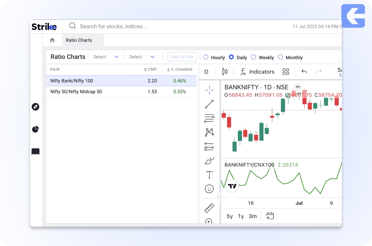
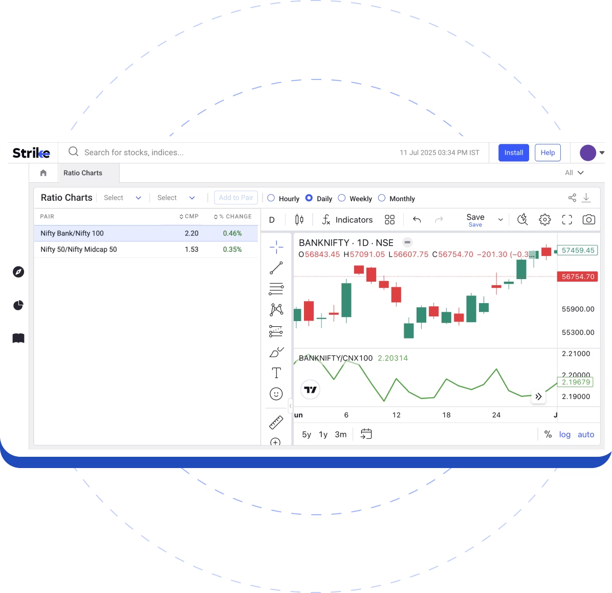
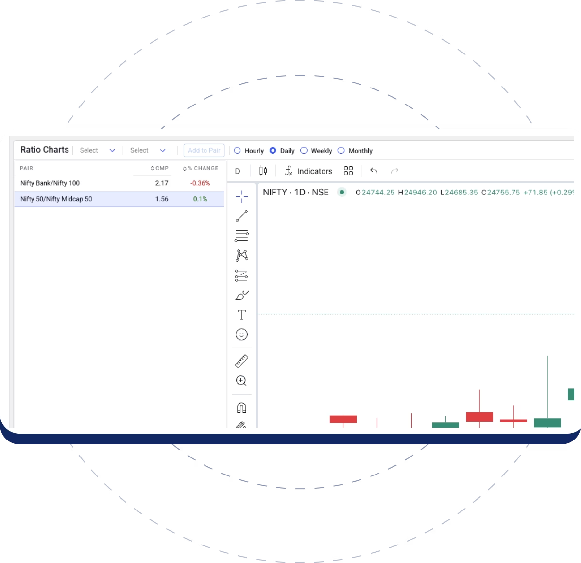
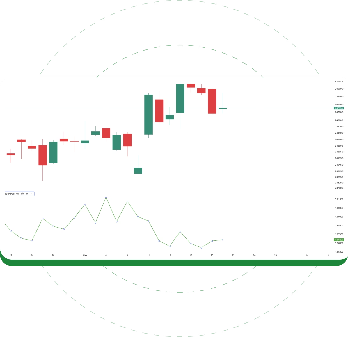
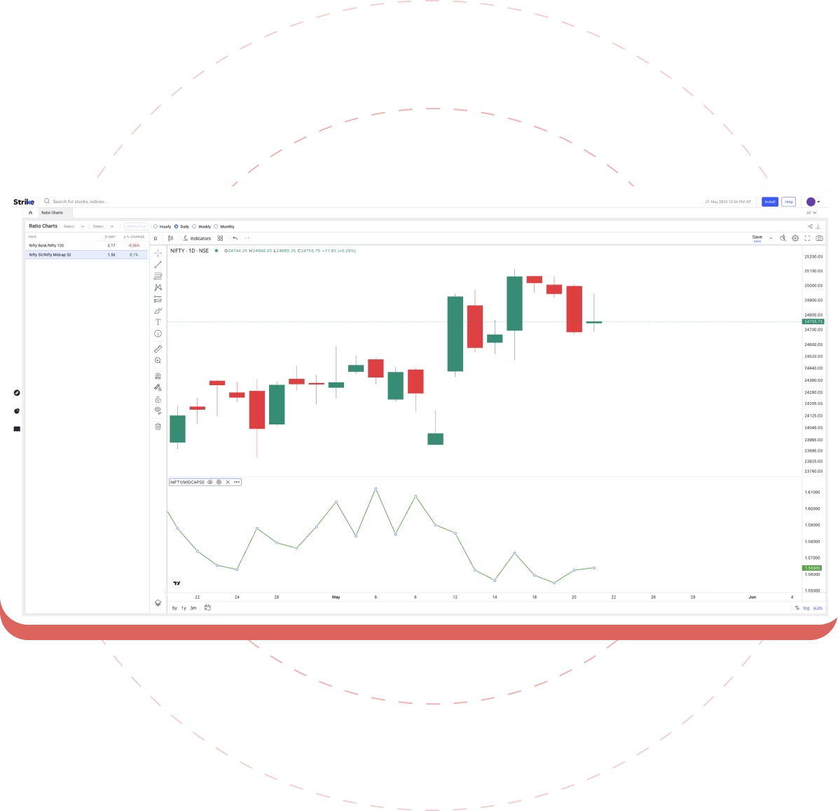
Ratio Charts are visual tools that help compare key financial ratios of stocks, sectors, or indices. They allow investors to analyze the relative performance of stocks or sectors based on metrics like price-to-earnings, price-to-book, and other financial ratios.
How can Ratio Charts help in stock analysis?
Ratio Charts help investors identify undervalued or overvalued stocks by comparing important financial ratios. They provide a clear, visual comparison of how a stock performs relative to others in the same sector or market, aiding in more informed decision-making.
Can I compare multiple stocks at once with Ratio Charts?
Yes! Ratio Charts allow you to compare multiple stocks side-by-side. This feature helps you analyze different stocks in a particular sector, enabling you to spot the best performers and make data-driven decisions.
Are Ratio Charts useful for long-term investors?
Absolutely! Ratio Charts are especially useful for long-term investors who want to track the historical performance of stocks over time. By analyzing long-term trends in financial ratios, you can identify strong growth potential or risks for sustained investments.
Do Ratio Charts update in real time?
Yes, Ratio Charts provide real-time data updates, allowing you to track the most up-to-date stock and sector performance and make timely decisions in a fast-moving market.
How do I interpret data from Ratio Charts?
Ratio Charts are designed to be intuitive and easy to interpret. By comparing the ratios visually, you can spot trends, identify outliers, and make comparisons between stocks quickly. Most charts come with tooltips or legends to explain what each ratio means.
