
Relative Rotation Graph
Visualize Stock and Sector Performance
Relative Rotation Graph (RRG) plots stocks/sectors against each other using relative strength and momentum. RRG shows clockwise rotation between leading, weakening, lagging and improving quadrants.
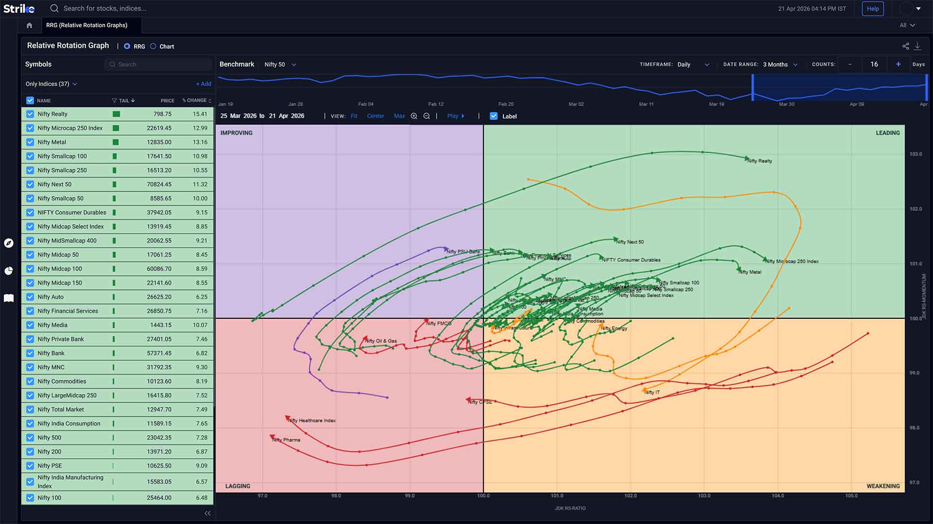


Powerful RRG Capabilities
Everything you need to track rotation, leadership, and relative positioning

Relative Strength Mapping
Compare stocks and sectors against a benchmark to see where outperformance or underperformance is building.

Momentum + RS Integration
Track how relative strength and momentum move together instead of analysing them separately.

Rotation-Based Insights
Understand how assets shift across quadrants and what that means for leadership and trend continuation.
Relative Performance Through RRG Views
Track quadrant rotation, relative strength, and momentum shifts against a benchmark
 Sector Rotation
Sector Rotation Analysis
Sector Rotation Analysis shows how different sectors move relative to each other over time. It helps identify which sectors are overweight or underweight.
-
 Sector rotation flow
-
Relative strength shifts
-
Benchmark comparison
 Relative Comparison
Stock and Sector Comparison
Stock and Sector Comparison lets you plot multiple stocks or sectors against a common benchmark. This makes it easier to see which ones are consistently outperforming or slipping.
-
Relative performance vs benchmark
-
Leader vs laggard view
-
Comparative positioning
 Quadrant View
Momentum Tracking
Momentum Tracking places stocks or sectors into four zones - Leading, Lagging, Improving, and Weakening based on how their relative strength and momentum are behaving.
-
Quadrant positioning
-
RS vs momentum
-
Rotation phases
 Momentum Direction
Directional Indicators
Directional Indicators use tail movement (arrows) to show how momentum is changing over time. The length of the arrow reflects the strength of momentum, while its direction shows whether the stock or sector is gaining or losing strength.
-
Tail direction
-
Momentum velocity
-
Rotation path
 Visual Mapping
Visual Clarity
Visual Clarity comes from plotting all assets in a single framework. RRG provides a clear visual representation of market rotations, so you can track relative movement, rotation, and positioning.
-
Single view comparison
-
Relative positioning
-
Rotation mapping
 Trend Shifts
Identification of Trend Shifts
Identification of Trend Shifts comes from how assets move between quadrants. Early transitions like Improving to Leading or Leading to Weakening often indicate changes in leadership
-
Quadrant transitions
-
Early shifts
-
Leadership changes

How Strike RRG Works
From relative data to rotation insight in three simple steps
Select Benchmark
Choose an index or benchmark to compare stocks or sectors against.
Track Movement
Watch how assets move across quadrants as relative strength and momentum change.
Read Rotation
Use direction, tail movement, and quadrant shifts to understand leadership and trend changes.
Explore All Features
Professional-grade tools built to analyze market movements and trading opportunities in real time

Advanced scanners
Filter stocks using price, volume, technical indicators, and patterns. Returns setups that match defined conditions without manual chart checks.
Explore Advanced scanners →

Futures & Options
Access open interest, volume, and long-short data across indices and stocks. Helps read position buildup and derivative activity.
Explore Futures & Options →

Sentiment Indicators
Analyse market positioning using breadth data, derivatives activity, and momentum signals across stocks and indices.
Explore Sentiment Indicators →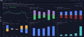

Stocks & Indices
View price trends, financial data, and technical indicators together. Compare performance across timeframes and track index movement.
Explore Stocks & Indices →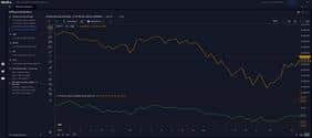

Diffusion Indicators
Measure percentage of stocks aligned with trend or momentum signals. Shows whether market moves have broad participation.
Explore Diffusion Indicators →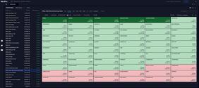

Interactive Heatmaps
Visualise sector and stock movement using percentage change and market cap weight. Highlights where gains or declines are concentrated.
Explore Interactive Heatmaps →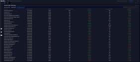

IPO Tracker
Track upcoming and active IPOs with issue dates, price bands, lot sizes, and subscription data across investor categories.
Explore IPO Tracker →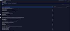

Bulletin Board
View news, announcements, corporate actions, and deal activity together. Helps link market events with price movement.
Explore Bulletin Board →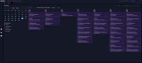

Market Calendar
Track earnings, IPOs, and economic events by date. Useful for planning trades around scheduled market triggers.
Explore Market Calendar →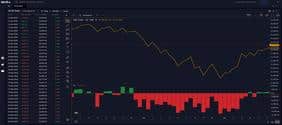

FII DII Data
Track institutional buying and selling across cash and derivatives segments. Shows changes in exposure by FIIs and DIIs.
Explore FII DII Data →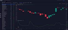

Ratio Charts
Compare stocks or sectors using price ratios. Helps identify relative strength and shifts in outperformance over time.
Explore Ratio Charts →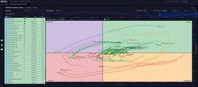

RRG
Plots relative strength and momentum against each other; shows clockwise rotation between leading, weakening, lagging, and improving quadrants.
Explore RRG →Frequently Asked Questions
RRG is a chart that plots stocks or sectors against a benchmark using two axes - relative strength and momentum. Instead of just looking at price, you’re seeing how something is performing compared to the broader market or index.
Each stock or sector gets plotted using two values - relative strength and relative momentum, both compared to a benchmark. As these values change, the point doesn’t stay still, it starts moving across the chart. Over a few sessions, you’ll see a path forming. That path is usually what people follow, not just the current position.
Leading is where both relative strength and momentum are positive - these are usually the outperformers. Lagging sits on the opposite side, where both are weak. Improving is where momentum has started picking up, but relative strength is still catching up. Weakening is a bit different - strength is still there, but momentum has already started to drop off.
It’s mainly used to track where leadership is shifting. For instance, when a sector moves from Improving into Leading and stays there for a few rotations, it tends to attract more interest. On the flip side, when something drifts from Leading into Weakening, you’ll often see it slow down even if price hasn’t fully reacted yet.
Yes, both are used. A lot of people start with sectors to understand broader rotation, then move into stocks within those sectors to see which ones are actually leading. It’s usually not done in isolation.
Depends on the timeframe you’re looking at. On shorter timeframes, the movement is quicker - rotations happen faster, sometimes a bit noisy as well. On higher timeframes, the shifts are slower but usually more stable, especially when leadership changes.
The tail shows how the asset has moved over the last few periods. If the tail is stretching out in a consistent direction, it usually means the shift in relative strength and momentum has been steady. Shorter or choppy tails tend to show less conviction or frequent reversals.
Sometimes it does, especially during quadrant transitions. When something starts moving out of Weakening and holds in Improving for a bit, it often shows momentum picking up before it becomes obvious on price. Same the other way - Leading to Weakening is usually where momentum starts fading first.
It’s not difficult, but it’s not something you read instantly either. Understanding what RS and momentum are doing together takes a bit of time. Most people get comfortable after watching how a few stocks move across quadrants over multiple sessions.
What Our Traders Say

Mr. Ayush
5.0
Working Professional

Vinit Baro
5.0
Working Professional

Nitin Prajapati
5.0
Working Professional


Manish Setia
5.0
Investor
Why Traders Love Our RRG

See Rotation, Not Just Price
Price alone doesn’t tell you where strength is shifting. Here, you can actually see which sectors or stocks are moving into leadership and which ones are fading.

Catch Leadership Changes Early
When something starts moving from Improving to Leading, it usually shows up here before it’s obvious on charts. Same with momentum fading.

Everything in One Framework
You’re not switching between charts to compare. Everything - relative strength, momentum, positioning is visible in one place.

Clearer Decision Context
Instead of guessing which stock is stronger, you can see it relative to others. That makes allocation and rotation decisions a bit more grounded.
Strike
PROFESSIONAL TRADING PLATFORM
Join thousands of traders worldwide
Get Market Insights Delivered Quickly
Join 100,000+ traders receiving our exclusive newsletter with market analysis, trading strategies, and actionable insights.

Expert insights on market trends and opportunities
Proven techniques from professional traders
Comprehensive beginner to advanced trading guide
Be the first to read our latest articles
"Strike's newsletter completely transformed my trading approach. The insights are invaluable!"
— Amit Sharma, Active Trader50K+
Active Traders
$2.5B+
Trading Volume
150+
Markets Covered
24/7
Support Available