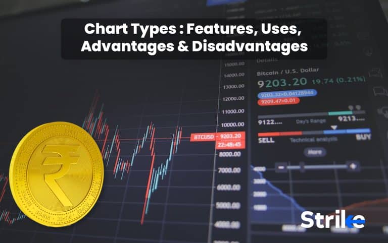
A chart is a visual representation of a stock’s price and volume movements over a certain period of time. X-axis in a chart represents the time period, and the Y-axis represents the price movement in the chart. The time period of a chart can vary from a single day to several months or more.
Stock charts are graphs that display the performance of a company’s publicly traded shares. Charts of a company’s stock display its performance over time, from a few days to several years.The charts are used to analyze how the company’s shares change during the course of the day when the market is open.
Investors are encouraged to perform an in-depth technical analysis of stock charts since it is used to predict future price movements of stocks by taking into account past price movements. This technical analysis supports decisions to buy, hold, and sell. It helps traders and investors to predict specific future actions, however, it does not always produce exact results.
Stock charts are mostly used by investment experts like investment bankers and stockbrokers to track the performance of the company and assist with investment decisions. The people who do not work in finance on a daily basis also utilize stock charts. Some people study stock charts because they have investments in the stock market or just because the performance of the stock market has a serious impact on the overall economy.
1. Line
Line charts are composed of a single line from left to right that connects the closing prices (or any specified price data point) at each specified time interval. A line chart connects a number of data points with a continuous line to graphically depict the previous market movements of an item. It is the easiest type of chart used in finance as it shows the closing prices of a security over time. Line charts can be used for any timeframe, but they most often use day-to-day price changes. A line chart displays information as a series of data points connected by straight line segments.
Line charts only plot the closing prices, reducing noise from less important moments in the trading day, such as the open, high, and low prices. A single continuous line is used in line charts to represent the market history of an item.
The line chart is the easiest chart to create. It is simply formed by connecting the prices of an asset. For example,the chart is created by connecting stocks that closes at $30, $29, $30, $32, $27, and $30.
This is unlike other charts that take more into consideration. Candlestick chart analysis, for instance, takes into account a chart’s open, close, high, and low points.

There are various advantages of using a line chart. 6 of them are listed below.
- Stock traders use this type of chart because it is the most straightforward, clean, and least complicated.
- Line charts are easy to engage and customizable.
- One of the features of the line chart is that it effectively removes all market noise.
- Line charts prove to be quite handy for quick updates and market trend developments.
- It is easier to understand and decode, even for new traders.
These advantages of line charts makes trading a little easier for new traders.
Line chart has its own set of disadvantages, 5 of them are listed below:-
- It does not provide enough information in comparison to other chart formats,
- It is inappropriate for a stock’s in-depth analysis as line charts consider the closing points only.
- It removes a significant amount of data in order to eliminate the market noise,
- It is difficult to spot a change in direction and buy or sell signals.
- Line chart only uses the closing stock price information.
Using a line chart can help traders interpret the frequently changing market trends without much difficulty, but line charts may be inadequate for an in-depth stock analysis.
2. Bar
A bar chart displays a stock’s price and volume (the number of shares traded) over a specified period of time, usually expressed in days, weeks, or months.A daily bar chart, for instance, will display the number of shares traded daily along with the opening, closing, and highest price for each day. A weekly bar chart displays the highest and lowest prices and the total volume for the full week.
Bar charts are also known as open-high-low-close (OHLC) charts. They are the Western version of Japanese candlesticks. Bar charts simply use vertical lines that extend to the highest and lowest prices for the specified period and a short horizontal line extending left at the opening price and short horizontal line extending right to indicate the closing price.
The color of the bar is based on the net gain (green) or loss (red) on the closing price.The color of a bar chart is black or green when the close is above the open and the color of a bar chart is red when the close is below the open.
Bar charts often come in 4 different patterns, including:-
Up day :- Up day is when the high and low of the current bar are higher than those of the preceding bar.
Down day :- Down day refers to a bar in which the high and low are lower than those of the previous bar.
Inside day :- The present bar is termed as an inside day when the high of the present bar is lower than the previous bar high and the low of the present bar is higher than the low of the previous bar.
Outside day :- Outside day refers to a bar in which the high of the present bar is higher than the previous bar while the low of the present bar is lower than the previous bar.

Bar chart analysis is more helpful when the bars are studied over a period of time allowing patterns to occur that help forecast future prices with varying degrees of success. The most straightforward comparison is between two consecutive bars. The closing price is considered the most important price, because traders have reacted to the news for the day. There are, however, times when the closing is lower than expected not because of bad news, but because many traders sell on close to avoid any price declines due to bad news overnight.
Higher closes imply a bullish market sentiment whereas lower closes indicate bearish market sentiment. A series of up days, with the highs often higher than the day before and the lows also higher, constitute an uptrend. The higher closes (up-day) and higher lows (up-day) both support the upward trend. The opposing pattern is a downtrend, in which subsequent down days often have lower highs, lows, and closes.
Technical analysts track price movement using bar charts or other chart types like candlestick or line charts to help them make trading decisions. Trades made by using bar charts assess trends, identify potential trend reversals, and track volatility and price changes.
Long vertical bars indicate a significant price difference between the high and low. This indicates that volatility increased throughout that time. Very small vertical bars on a bar indicate that volatility was low.
Bar charts have certain advantages which prove to be beneficial for the traders. Major 6 are listed below:-
- Bar charts provide more detailed information about stock as compared to line charts.
- It Gives data on the high, low, open, and close prices for a certain amount of time.
- Bar charts are Simple to use and to identify patterns.
- They work with most technical indicators, including moving averages.
- Bar Charts are Visually detailed and accurate, which allows easy analysis of the market and trends by investors.
- It Offers a wider range of information and economic data.
Bar charts, therefore as a technical analysis tool help the investors to understand the details and patterns about the market trends easily. Thereby helping them to make a more informed decision.
Everything that has advantages also has drawbacks. 3 most common drawbacks of bar charts are:-
- It is challenging for new traders to distinguish between rising and falling bars.
- Bar Charts are Not as easy to comprehend as candlestick charts.
- They are Visually harder to tell whether a stock’s value has increased or decreased over a certain time frame.
Bar charts provide a more detailed analysis of stock market trends over a period of time allowing the traders to make an informed decision, although it can be challenging for newbies to interpret the bar chart.
3. Candlestick
Traders study candlestick charts to predict potential price movement based on historical trends. Candlestick charts are helpful for traders because they provide four price points (open, close, high, and low) across the specified time period.
Candlestick charts are used in technical analysis of equity and currency price patterns. They are visually similar to box plots, though box plots show different information.
The real body is the region between the open and the close, and price deviations above and below the real body are called shadows (also called wicks). Wicks represent an asset’s highest and lowest traded prices throughout the time frame represented. The opening and closing deals are illustrated in the body.
The price range is the distance between the top of the upper shadow and the bottom of the lower shadow moved through during the time frame of the candlestick. The difference between the high price and the low price determines the range.
The body is hollow or unfilled if the asset closes higher than it did when it first opened, with the opening price at the bottom and the closing price at the top.The body is solid or filled, with the opening price at the top and the closing price at the bottom,if the asset closes lower than it opened.
Consequently, the “fill” (solid or hollow) of the candle shows the period’s overall price direction, while the colour of the candle represents price change relative to the close of the preceding period (solid for a higher open and lower close; hollow for a lower open and a higher close). A black (or red) candle represents a price action with a lower closing price than the prior candle’s close. A white (or green) candle implies that the price closed higher than it did on the previous candle. Rising or decreasing price candles can be given any colour,in reality.

Candlestick charts have their own pros and cons when it comes to trading. Let’s discuss the 8 of the most important pros first:-
- Candlestick charts are a chart type that investors frequently use.
- It is a knowledgeable chart type.
- Candlestick charts provide data on the high, low, open, and close prices for a specified amount of time.
- It represents the relevant data required to make decisions.
- The charts provide complete details for each time period.
- Candlestick charts incorporate the majority of technical indicators.
and provides a deeper understanding of stock action.
- They are designed to be used in combination with other technical analysis tools.
- It is an interactive and customizable type of chart.
Candlestick charts are the most widely used tool by traders because it provides relevant data to make an informed decision. It is also used in combination with other technical analysis tools, therefore traders find this chart more accessible.
Now that we know the pros let’s take a look at 5 major cons:-
- Does not display accurate stock movement data.
- There are fewer candlesticks on the screen compared to bar charts, which means there is less data available for analysis.
- Market gaps are common.
- Does not tell you whether the high or the low came first.
- Changes how it appears in each time frame.
We have, hence, come to the conclusion that Candlestick charts are helpful for traders because they provide data on four price points of the specified time period. It is, however, confusing because it changes frequently.
4. Point and figure chart
Point and figure charting, also known as P&F charting,has been used since the 1800s. Charles Dow was the first individual to record stock price movements and create a method of analysis called “Figuring”,according to resources. Figuring eventually came to be known as Point & Figure Charting.
Point and figure charts are used to see price changes and patterns in an asset regardless of how much time has passed. P&F charts utilize columns consisting of stacked X’s or O’s, each of which represents a set amount of price movement.
The X’s show increasing costs, whilst the O’s show decreasing prices.
P&F charts are regarded as “timeless” because, unlike traditional charts, time is not a factor. Traditional charts plot a security’s price over specified time periods even when the price is unchanged. P&F charts only plot fresh data on the chart when there is price action or a change in price. The chart remains unchanged if the price remains constant, even over an extended period of time. These charts are a useful tool for identifying resistance and support levels.
The share price is rising and is currently heading upward, if there are X’s in a column.The share price is declining and is currently heading downwards, as indicated by a column of O’s.

P&F charts offer a different insight on price movement that offers a number of benefits, 4 of them are:-
- Point and Figure charts filter insignificant price movements and noise.
- They eliminate time considerations from the analysis procedure.
- P&F charts make support and resistance levels much easier to identify.
- It focuses on significant price changes and provides automatic and subjective trend lines.
P&F Charts have a disadvantage. The drawback is that it is unable to provide an approximate timeframe to reach their predicted price objective.
5. Renko
Renko charts are a type of trading chart that eliminates small price changes to allow traders to concentrate on longer-term trends. The Japanese invented the Renko chart, a type of chart that is constructed using price movement rather than both price and specified time intervals as most charts are. The chart resembles a succession of bricks, hence its name, “renga,” which is a Japanese word for bricks. Each brick is placed at a 45-degree angle (up or down) to the brick before it when the price changes by a certain amount. A popular colour for an up brick is white or green, whereas a common colour for a down brick is black or red.
Renko charts are made to filter out insignificant price changes so that traders can concentrate on significant trends. This makes identifying trends more simple, however, there is one drawback. As a result of Renko charts’ basic brick design, some price information is lost.

A regular bar, line or candlestick chart has a uniform date axis with equally spaced days, weeks and months. This is due to the existence of a single data point each day or week. Renko charts disregard time and solely highlight changes in price. Drawing another brick requires a move of 10 points or more,when the brick value is set to 10, . Price changes of less than 10 points are taken into account, and the Renko chart remains unchanged.
6. Heikin-Ashi
Heikin-Ashi is a candlestick pattern technique that aims to minimize some of the market noise and generate a chart that more clearly illustrates trend direction than a regular candlestick chart.
Heikin-Ashi’s drawback is that some price data is lost while averaging, which may have an impact on risk.
Strong selling pressure is indicated by long down candles with a small upper shadow, while strong purchasing pressure is indicated by long up candles with a short or non-existent lower shadow.

Technical traders utilize the Heikin-Ashi method to easily recognize a trend. Strong uptrends are identified by hollow white (or green) candles without lower shadows, while strong downtrends are identified by filled black (or red) candles without an upper shadow.
Heikin-Ashi reversal candlesticks have small bodies and extended upper and lower shadows, similar to conventional candlestick reversal patterns. There are no gaps on a Heikin-Ashi chart since the current candle is calculated using information from the previous candle.
The Heikin-Ashi technique smooths price data over two periods, which makes it simpler to see trends, price patterns, and reversal points. Traditional candlestick charts usually have candles that move from up to down, which can make them challenging to read. Heikin-Ashi charts frequently feature more consecutive colored candles, which makes it easier for traders to recognize previous price movements.
The Heikin-Ashi approach helps traders avoid placing trades by reducing false trading signals, in weak and unstable markets. A trader using the Heikin-Ashi method is more likely to receive the true signal before the start of a trend rather than two false reversal candles.
What are Charts in the Stock Market?
Stock charts are used to create price charts specific to a given stock. A combination of price, volume, and time periods are used in charts to plot the historical data.
Charts display the activities of major investors. These charts help in detecting when a stock is being heavily bought or sold in order to decide when it is best to buy, sell, or hold your stock positions.
Stock charts are graphs that display the performance of a company’s publicly traded shares. These graphs can display the stock performance of a company across a range of time frames, from years to just a few days. You can even follow the movement of a company’s shares, while the market is open.
Why Trade Should Use Stock Market Charts?
The stock chart gives the possibility to study the movement of the stock price over time, ranging from intraday to weekly, monthly, yearly and multi-year data. Traders typically look for daily and intraday data to understand short-term price changes. Investors frequently consult such charts to determine if they should purchase a particular stock right away or wait a few days, because of the volatile nature of the stock market. They look at monthly or yearly data to find long-term trends.
Stock charts keep track of price and volume data to help identify whether the stock’s value is increasing or decreasing. Learning to read stock charts will enable you to make much more precise decisions. Subtle clues in the price and volume action can tell you many things including whether the stock is behaving normally or abnormally, falling in or out of favor with institutional investors, and beginning or ending a price advance.
Who Uses Charts in the Stock Market?
Technical traders evaluate market data using a range of stock charts to determine the best entry and exit points for their trades. One can quickly obtain the information required to make winning trading decisions by setting up effective charts and workspaces.
Investors are required to do a thorough technical analysis of stock charts since it enables future price movements of the specified equities to be forecasted while taking into account their past price movements.
This technical analysis supports decisions to buy, hold, and sell. It enables both traders and investors to anticipate particular future movements, even if the results might not always be precise.
How to Use the Charts for Technical Analysis?
Technical traders analyze price charts in an attempt to predict price movement. The two main variables for technical analysis are the time frame and the specific technical indicator that the trader chooses to use.
The time frames for technical analysis displayed on charts range from one minute to monthly or even annual time periods. Popular time frames that technical analysts most frequently examined include:-5-minute chart,15-minute chart,hourly chart,4-hour chart
The importance of technical analysis is evident in the fact that it can help draw attention 8 of the following factors:-
- Any volatility in the stock prices over time is more obvious.
- It is simpler to determine the stock’s intrinsic value than its market value.
- The stock’s general market performance viability.
- It is clear how certain occurrences affect the stock’s value both before and after they occur.
- Technical analysis helps to spot the price swings easily.
- The level of support and opposition is easier to recognise with technical analysis.
- The current market trends are simpler to adopt by analysing the charts.
- By using this analysis, investors determine when it is the optimal time to buy or sell a certain company, allowing for higher returns.
Technical analysis using the stock charts makes trading a lot more easier and accurate, since it provides in-depth analysis of current market trends allowing the traders to make an informed decision.
How Does the Chart Technical Analysis Work?
The top-down technique and the bottom-up approach are the two main approaches used in technical analysis. Long-term investors frequently adopt a bottom-up strategy, while short-term traders frequently adopt a top-down strategy.
Top-Down
The top-down method of macroeconomic analysis considers the entire economy before concentrating on specific securities. A trader would initially concentrate on economies, then sectors and last firms, in the case of equities. This strategy places less emphasis on long-term valuations and more on short-term rewards for traders.
Bottom-Up
The bottom-up method disregards the macroeconomic perspective in favour of individual stocks.
It includes analyzing a stock that is interesting on a fundamental level for possible entry and exit points. A trader, for instance may locate a stock that is cheap in a downtrend and utilize technical analysis to pinpoint an exact entry point when the stock may be bottoming out. They aim for value in their choices and expect to view their trades in the long term.
Certain traders favour using particular methods of technical analysis, in addition to these factors . Swing or position traders use chart patterns and technical indicators while day traders prefer straightforward trend lines and volume indicators.
Why are Charts Necessary?
Charts are crucial as a tool for dealing with irregular movement and maintaining discipline.
A chart provides you advice on what to do regardless of potential price action, even if it cannot predict the future.Using a stock chart has the advantage of assisting you in identifying entry points with a reduced risk. It is simpler to select the levels at which you can exit or buy more without suffering significant losses or forgoing rewards, the risk is fairly reduced. This discipline contributes to the achievement of superior outcomes. This kind of trading discipline is even more crucial in the age of computer algorithms.
Some market participants believe that the price action has become more erratic and unpredictable. Perhaps it is, but dealing with random movement makes it much more crucial to have a system in place that ensures your losses won’t grow out of control.
What Does Price Support Level Mean?
Price support level, sometimes referred to as support level, is the price that an asset does not drop below for an extended period of time. Buyers enter the market as the price of an asset decreases, establishing the asset’s support level. On a chart, the price support level is represented by a line connecting the lowest lows of the relevant time frame.
The support level, in terms of finance, is the price at which investors often buy or sell stocks.
What Does Price Resistance Level Mean?
Resistance is a price or price range that is above the current market and limits an asset’s upward movement. Resistance is the level at which supply is strong enough to stop the stock from moving higher.
Support and resistance levels are the points in time where the forces of supply and demand meet. Technical analysts believe that these levels of support and resistance are essential for assessing market psychology and supply and demand. When these levels of support or resistance are broken, it is assumed that the supply and demand variables that originated them have changed, in which case new levels of support and resistance are established.
Technical analysts utilize support and resistance levels to pinpoint price areas on a chart where there is a good chance that a current trend will pause or reverse.
Support appears where a downtrend is expected to pause because demand is concentrated.Resistance occurs where an uptrend is expected to pause temporarily, due to a concentration of supply.
Daily, weekly, and monthly charting time frames all contain support and resistance. Smaller time frames like one-minute and five-minute charts are frequently used by traders to identify support and resistance. Support or resistance becomes increasingly significant as time passes.
Targets for the trade are determined using support and resistance. Look for the immediate resistance level as the target,for a long trade. Look for the immediate support level as the target,for a short trade, .
What are the Common Types of Patterns Used in the Stock Market?
Chart patterns are used by traders to spot stock price trends and trading opportunities. Some patterns advise traders to buy, while others advise them to sell or maintain their positions.
There are various kinds of chart patterns. The major 8 patterns are explained below:-
- Ascending Triangle: An ascending triangle is a bullish chart pattern that indicates that a breakout is likely to occur where the triangle’s lines converge.

You must draw an ascending line (the uptrend line) along the support points and a horizontal line (the resistance line) on the resistance points,to create this pattern.
- Descending Triangle: Descending triangles signify a bearish downward market trend, unlike ascending triangles.

The resistance line is declining and the support line is horizontal, suggesting the potential for a downward breakout.
- Symmetrical triangle: A breakout in either direction can occur when two trend lines in a symmetrical triangle start to intersect. With an upward tendency for the support line and a downward trend for the resistance line, respectively.

It frequently follows the market’s overall trend,although the breakout can occur in either direction.
- Pennant: A pennant is made up of two lines that come together at a specific location.

These are commonly produced after big upward or negative swings where traders pause and the price consolidates, before the trend continues in the same direction.
- Flag: A flag is a continuation pattern created by joining two parallel trend lines that may slope upward, downward, or sideways (horizontal). A flag with an upward slope (bullish) appears as a pause in a down-trending market; a flag with a downward bias (bearish) shows a break during an uptrending market.

The flag’s formation is accompanied by declining volume, which recovers as price breaks out of the flag formation.
- Cup and handle: A bullish continuation pattern called a cup and handle indicates that an upward trend has paused but will resume if the pattern is proven. The “cup” section of the design should be a “U” shape that resembles the rounding of a bowl,instead of a “V” form with equal highs on both sides of the cup.

The “handle” appears as a brief pullback that resembles a flag or pennant chart pattern on the right side of the cup. The stock may break out to new highs and resume its upward trend once the handle is finished.
7. Bullish Engulfing pattern: Bullish engulfing pattern occurs when buyers supersede sellers.A long green real body engulfing a small red real body on the graph illustrates this. Bulls now have some degree of control, thus the price may rise.

8. Bearish Engulfing Patterns: A bearish engulfing pattern arises when the sellers overrule the buyers.It generally occurs in an uptrend.A long red real body covering a little green real body is an illustration of this action. The trend suggests that sellers are once again in charge and that the price may drop further.
What is a Bearish Pattern in a Bar?
Bearish bars are typically red. It means the opening price was higher than the closing price for the specified time interval. When the price opens above the high of the prior bar and closes below its low, a bearish key reversal bar is created.
What is the Bullish Pattern in a Bar?
Bullish bars are typically green. It means the opening price was lower than the closing price for the specified time interval.When the price opens below the previous bar’s low and closes above its high, this is known as a bullish key reversal bar.
Bar patterns can be used in any timeframe, say 5 minutes, 15 minutes, hourly, daily, weekly, monthly and so on.

What is the Bearish Pattern in Candlestick?
Bearish candles are typically red. It means the opening price was higher than the closing price for the specified time interval. Bearish candlestick patterns are formed at the end of an uptrend.The 5 powerful bearish candlestick patterns are:- Hanging man, Dark cloud cover, Three black crows, Bearish engulfing,and The evening star.
What is the Bullish Pattern in Candlestick?
Bullish candles are typically green. It means the opening price was lower than the closing price for the specified time interval.They are formed within a downtrend.

A bearish reversal candlestick pattern known as the “hanging man” has a large bottom shadow and a little true body.
This bearish candlestick pattern, which appears at the peak of an uptrend, indicates weakness in the current market movement and demonstrates that the bulls have pushed prices higher but are no longer able to do so. And bullish kicker is a trend-signalling candlestick pattern that appear after a bearish time period.
Its modest real body suggests that there is not much of a difference between the opening and closing prices. There should be no top shadow and a lower shadow that is twice as long as the body. The traders can square their purchase position and open a short position with the aid of this pattern.
What Chart is Used for Forex Trading?
A price chart for one or more currency pairs that displays historical price and volume information is called a forex chart. The historical movement of a currency over several time frames is thus graphically represented on a forex chart along with overlays, technical patterns, and indicators.
A forex chart is the graphical representation of the relative price performance of a currency pair or pairs.
Such charts are used by technical analysts and day traders to find patterns and indications that might help them make trading decisions.
Line, bar, and candlestick charts are the three most used types of forex charts.
Forex charts are crucial tools for traders who want to use technical analysis to choose where to put their money since they indicate if trends are there.
Forex charts utilize line, bar, and candlestick chart types. A typical forex chart shows the time period on the x-axis and the exchange rate on the y-axis.
What Chart is Used for Stock Market Trading?
Stock charts mainly include 4 kinds of charts including Bar charts, candlestick charts, point and figure charts, Heikin-Ashi charts.
Does Chart Indicate Stock Price?
Yes, stock charts show a company’s performance over a period of time, inform you of the stock’s current price and any recent price changes, and provide information on the total value of the business. Investment experts like investment bankers and stockbrokers frequently use stock charts to track company performance and assist with investment decisions.
Do Charts Have Limitations?
Yes, charts do have limitations. The majority of charting services are always changing. The investor decisions are hampered by the frequent changes in market trends. When the pattern changes two weeks after they provide a strong buy signal, they advise their clients to sell. As a result, these patterns periodically force their clients into and out of the market.
Are Charts the Only Way to Analyze the Stock Market?
No, charts are not the only way to analyse a stock market. There are two different ways to analyse a stock market- Fundamental analysis and technical analysis.
First method is fundamental analysis. The primary focus of fundamental research is on information from sources such as financial records, economic reports, corporate assets, and market share. Investors and analysts usually review the data on a business’s financial statements, including the balance sheets, income statement, cash flow statement, and footnotes, to do fundamental analysis on a publicly traded company or sector.
The second method of stock analysis is technical analysis. Technical analysis focuses on the study of past and present price action to predict the probability of future price movements. Technical analysts analyze the financial market as a whole and are primarily concerned with price and volume, as well as the demand and supply factors that move the market. Charts are a key tool for technical analysts as they show a graphical illustration of a stock’s trend within a stated time period.


 Previous Article


![15 Investing.com Alternatives [Free+Paid] You Should Use in 2026](https://www.strike.money/wp-content/uploads/2026/04/Investing.com-Alternatives.jpg "15 Investing.com Alternatives [Free+Paid] You Should Use in 2026 172")
![15 TradeStation Alternatives [Free+Paid] You Should Use in 2026](https://www.strike.money/wp-content/uploads/2026/04/TradeStation-Alternatives.jpg "15 TradeStation Alternatives [Free+Paid] You Should Use in 2026 173")
![15 Chartink Alternatives [Free+Paid] You Should Use in 2026](https://www.strike.money/wp-content/uploads/2026/04/Chartlink-Alternatives.jpg "15 Chartink Alternatives [Free+Paid] You Should Use in 2026 174")
: Overview, 10 Types of Indicators, Settings for Different Markets 175")


 : Definition, Formula, calculation, Uses, Advantages Vs limitations 178")


No Comments Yet.