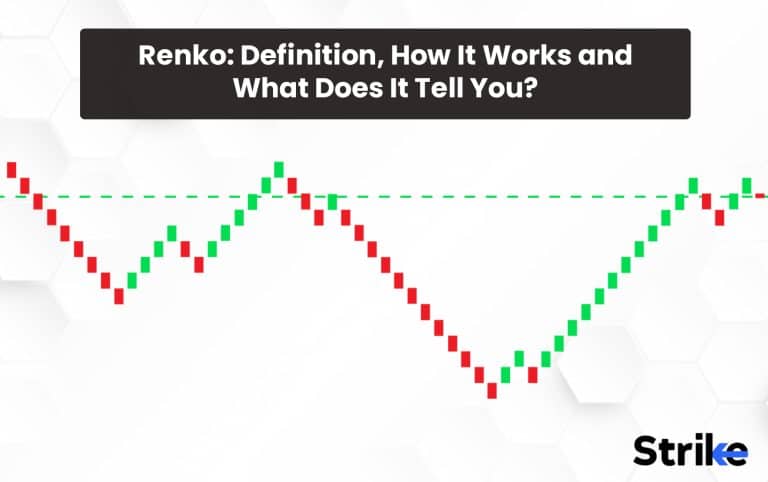
Renko is a price chart characterised by bricks that is used to analyse a stock’s price in a non-time-based model. The Renko chart is believed to have derived its name from the Japanese term “renga,” which means bricks. This is because the chart appears to be composed of a sequence of bricks. Renko has green and red bricks where the green brick shows a price higher than the previous brick and the red brick shows a price lower than the previous brick. The Renko charts are set to a predetermined amount and it will form a new brick when this amount is breached.
Renko charts tell you the price movement eliminating market noises. Renko charts are able to do this as they eliminate time as a constraint. This provides investors with a clearer picture of the price movement.
What is Renko?
Renko charts are a type of chart used in technical analysis that is built using price movements, rather than both price and standardized time intervals. Renko charts originated in Japan and are popular among traders and investors who seek to eliminate market noise and focus on significant price movements.
The Renko chart is created by plotting bricks or blocks that move up or down from the previous brick at a 45-degree angle. The bricks are created based on a pre-determined price movement, which is set to any value, such as one point, one rupee/dollar, or any other specified unit of measure. Take a look at the picture below.

Renko charts have less noise compared to traditional candlestick charts or bar charts. Since Renko charts are built based on price movements rather than time intervals, they filter out minor price movements and focus on significant ones. This makes it easier to identify trends and key support and resistance levels.
It is believed that the concept of Renko charts originated during the Edo period in Japan in the 1700s. Traders used Renko charts to track the price movements of rice back then.
Japanese journalist Goichi Hosoda developed a modern version of Renko charts known as “Kagi charts” in 1898. These charts were based on price movements and were designed to help traders identify trends.
Renko charts had gained popularity among traders and investors, particularly in the forex and futures markets by the 1990s,. The advent of computer technology made it easier to create Renko charts in real-time.
Renko charts continued to gain popularity, with traders and investors using them for technical analysis to identify trends, support and resistance levels, and potential trading opportunities in 2000s. Renko charts remain a popular tool for technical analysis today and is used by traders and investors around the world to gain insights into market trends and price action.
How do Renko Charts work?
Each brick determines a preset measurement (usually the price) in the Renko chart. A green brick denotes the price going higher than the previous block and red brick denotes the opposite. Renko chart does this to eliminate market noises and focus only on the price. Take a look at the below pictures.

The right is the Renko chart of a particular stock and the left is the line chart of the same time period. The Renko chart is much more stable as it ignores smaller price drops. This helps investors attain an eagle-eye view of the price.
Each brick of the Renko chart is formed by a predefined set price. Users set this price according to their needs.
For instance, let’s say we are looking at a Renko chart for a stock, and the brick size is set to Rs.1. The stock’s price is currently at Rs.50, and when it moves up to Rs.52, a green brick will be drawn on the chart to indicate the price increase. A red brick will be drawn on the chart to indicate the price decrease if the price then moves down to Rs.49, Look at the part marked in the graph below for reference.

Now let’s say that the price moves up to Rs.53. Another green brick will be drawn on the chart, above the previous green brick since the price has moved more than the brick size of Rs.1.No new brick will be drawn on the chart the price movement is less than the brick size if the price then moves down to Rs.51.
What Does Renko Charts Tell You?
Renko charts tell you price movement after eliminating noise in price movements and focusing on important trends. Renko chart is often referred to as a “blocking” chart because it blocks out minor price movements and only shows significant price changes.
The way Renko charts work is by plotting bricks or blocks that represent a fixed price movement, regardless of the time it takes to make that move. This makes it easier for traders to identify support and resistance levels and make trading decisions among other chart types.
Renko charts are useful in telling you the below things as well apart from price movements.
- Renko charts assist traders in identifying important support and resistance levels in the market. These levels are used to identify potential entry and exit points, as well as stop-loss levels.
- Renko charts also provide information regarding market volatility. The size of the blocks on the chart assists traders in determining the market’s volatility at any given time.
- Renko charts assist traders in identifying potential reversal points in the market. When the blocks on a chart begin to form in the opposite direction, it signals that the trend is about to reverse.
- Renko charts are a type of price action chart, which means that they provide a visual representation of market price movements. This aids traders in making informed decisions based on the current market conditions.
There are four types of Renko chart bars. They are listed below.
- Upward Trend Bar: This bar is displayed when the closing price is higher than the opening price in an upward trend.
- Downward Trend Bar: This bar is displayed when the closing price is lower than the opening price in a downward trend.
- Neutral Bar: This bar is displayed when the closing price is equal to the opening price, creating a neutral environment.
- Inside Bar: This bar is displayed when the closing price is within the range of the previous bar, creating a consolidation state
These four bars assist you in interpreting what the price chart shows.
What is the Renko Strategy?
A Renko trading strategy explains the trading strategies formed using Renko charts. Renko strategies are used in different trading scenarios including intraday, swing trading, etc.
Let us understand a simple Renko intraday trading strategy.
Let us assume the Renko bars used in this strategy is set to Rs.10. The Renko will form another brick only when the price go up or down by Rs.10.
It is a common conception regarding using any technical analysis tools that there should be another tool that backs up the finding of the primary. We can use an OBV indicator for this setup since Renko avoids volume as well.OBV (On Balance Volume) is an indicator used to measure a stock’s momentum. See the image to understand the set-up. The above chart shows Renko and below OBV. A simple moving average line is also applied over Renko chart for trend confirmation here.

OBV helps identify if the market volume is flowing in or out of the stock. A dip means low volume and a rise means high volume. The OBV often mimics the Renko chart setups. OBV movements often precede price changes as well.
The strategy tries to identify the key support and resistance levels using a combination Renko charts and OBV. A support level is a price level at which demand for a financial instrument is strong enough to prevent the price from falling further. A resistance level is a price level at which the supply for a financial instrument is strong enough to prevent the price from rising further.
Here is the set up.

We are looking for points where the new green Renko bar forms above the SMA. (denoted by the arrow).

This indicates a bullish trend. We now have to confirm this using OBV. We are looking at the OBV to increase with the price which indicates the buyers are stronger than the sellers at this point in time. This increase in the stock price is likely to increase.
It is visible here that the OBV started to rise along with the price. This becomes a good entry point to invest in this stock as denoted by its longer upward stride.
There are three important things to note here.
- Set a stop-loss below the entry point
- Exit the trade if the price closes below SMA
- The ideal take-home profit should be three Renko bars. We could switch to a trailing stop at this point.

There are four valid entry points in this example. The same principle could be applied here too.
What is the Renko Trading System?
The Renko Trading System is a technical analysis system that uses bricks with a fixed size to represent the price movements of a security. This system allows potential traders to filter out short-term noise in the price action and focus on the longer-term trend. The system is based on a series of vertical lines that display the price movements of a security. A new “brick” is formed that represents the upward movement of the security if the price rises more than the predefined brick size. The opposite is also true when the price falls more than the predefined brick size. By using the Renko Trading System, traders are able to identify support and resistance levels, trend reversals and other trading opportunities.
What is Renko in MT4?
Renko is particularly popular among traders who use the Metatrader 4 (MT4) platform. MT4 (MetaTrader 4) is a popular private trading platform used by traders around the world. it offers a range of features and tools for traders. But Renko charts are not included in its default package. Traders need to install them from custom-built versions of the platform to use Renko charts on MT4.
There are different Renko charts available for MT4, created by different coders. The quality of these charts vary, and traders need to choose carefully to ensure they are getting the best possible version for their needs.
What are the Advantages of the Renko Chart?
There are five main advantages of the Renko chart mainly including its simplicity, low noise, and better clarity. Below listed are the advantages of the Renko chart.
- Simplicity: Renko charts are known for their simplicity, as they only display price movements and nothing else. This means that Renko charts are much easier to read and interpret than traditional charting types that include a lot of noise and unnecessary data.
- Trends identification: Renko charts are known for their ability to make trends easier to identify than other types of charts. This is because Renko charts display only price data and eliminate time and noise from the chart, making it easier to see the overall direction of the trend.
- Clarity: Renko charts are unique in that they eliminate the time factor from the chart, allowing traders to focus solely on price movements. This is particularly useful when comparing data from different periods, as it removes the impact of time from the equation and makes it easier to identify patterns and trends.
- Low-noise: Renko charts are known for their low noise level, as they only display price movements that meet the chosen magnitude and direction criteria. This means that Renko charts filter out minor price movements and only display important data, making it easier for traders to focus on the trends and patterns that matter.
- Forecast capability: Renko charts are also used for forecasting future price movements. Traders use them to identify potential price movements and make informed trading decisions since Renko charts display patterns and trends in an easy-to-read format,
The advantages of Renko charts are often best utilised when used with a trend-confirming tool. A trend confirmation tool usually is a technical indicator like SMA or OBV.
What are the Disadvantages of Renko Chart?
Renko charts have disadvantages as well even though there are obvious advantages. Listed below are five main disadvantages of using Renko charts.
- Renko charts may mask important information: Renko charts negate important patterns and trends or other market data that could be found in traditional charting by isolating price movements. This is disadvantageous when there are multiple factors, like news, at play.
- Not always ideal for day traders: Renko charts are best used by long-term traders because the individual bricks take some time to form, making them less suitable for day traders who need to make quick decisions. Day traders use Renko charts but their efficiency is questionable.
- Not ideal for plotting indicators: Renko charts are difficult to plot indicators on them accurately. This is because only display prices and no time. Plotting indicators hence may not always give you comprehensive data.
- Sometimes requires manual setting: Renko charts also require manual set-up and adjustment, which is a time-consuming process. This also makes Renko charts less accessible for novice investors. An example of this is the MT4 platform. Renko charts are not included by default even though they are commonly used in the platform.
It is always best to learn more about Renko charts before starting to use them because of these disadvantages. But Renko charts are simple and learning about them is not cumbersome.
How Much Do Each Bar in Renk Chart Worth?
The size of each bar in a Renko chart is determined by the user, but the most common size is 10 points or ticks. This means that each bar is worth 10 points or ticks of the underlying instrument (which could be a stock, currency, etc.). Each bar in a Renko chart typically represents 10 points or ticks of the instrument.
What is an Example of Renko Chart?

The above figure is an example of Renko charts applied over Hindustan Unilever price chart.
What is the Best Indicator for Renko?
The best indicator for use with Renko charts is the SuperTrend indicator. SuperTrend indicator combines the Average True Range and the Moving Average indicator to detect trends. It offers entry and exit signals, with the ability to adjust the parameters to suit the trader’s personal preferences. This indicator is great for traders who are looking to take advantage of a long-term trend or even a short-term trend. It is also a good choice for those who are looking to trade in a sideways market
Do Professional Traders Use Renko Chart?
Yes, professional traders often use Renko charts to make decisions. The Renko chart is used to identify trend reversals and breakouts, and are used to identify potential entry and exit points.But it’s important to note that Renko charts are typically used as part of a larger trading strategy, and should not be used as the sole determinant of entry/exit points
Is Renko Best for Scalping?
Yes. Renko charts are particularly well-suited to scalping, as they help traders identify support and resistance levels quickly and efficiently. This makes Renko charts particularly useful for traders who need to respond quickly to market movements. Renko charts also provide valuable insights into short-term trends and help traders identify patterns in the market that is not apparent when using other types of charts. All in all, Renko charts are a powerful tool for scalping and help traders maximize their profits
Is 50 PIP Fixed per Bar in Renko?
Yes, 50 PIP Fixed per Bar is the standard setting for Renko, which is a type of charting system that uses bricks instead of candles. Each brick has a fixed size and the movement of the chart is based on the size of the bricks rather than on the traditional time-based charts. The advantage of this type of charting system is that it eliminates noise and makes it easier to spot trends
Is Renko Good for Highlighting Trends?
Yes, Renko is an effective tool for highlighting trends in financial markets. It is a type of charting system that removes time from the equation and instead turns price movements into bricks on a chart. This allows traders to quickly identify trend changes without having to interpret the price movements on a regular candlestick chart. Renko charts also make it easier to spot support and resistance levels, as the bricks are used to create an expected ‘floor’ or ‘ceiling’ that isused to set entry and exit points
Can Renko be Used as a trailing stop-loss?
Yes, Renko charts can be used as a trailing stop-loss. This requires setting the trailing stop-loss parameters, such as the number of bricks, the size of the bricks, and the percentage of the asset’s price being followed.
The trailing stop-loss will be triggered, locking in gains and preventing further losses when the price moves in a favourable direction and surpasses the set parameters. Renko charts are beneficial in this regard, as they provide an efficient way to measure market movements and detect possible changes in trading trends.
What is the Difference between Renko from Heikin Ashi Chart?
The main difference between Renko and Heikin Ashi charts is that Renko charts ignore the time factor, while Heikin Ashi charts consider it. Renko charts are built using price action only, while Heikin Ashi charts are a modified version of a candlestick chart that incorporates an additional moving average.
Renko charts are composed of bricks that move a certain amount from the previous brick to form a new one. A new brick is created when the price action moves up or down according to a defined amount. Meanwhile, Heikin Ashi charts are composed of candlesticks of equal size and each candlestick is calculated from the open, close, high and low prices of the previous candlestick. Heikin Ashi charts are used to identify trends and allow traders to take advantage of the momentum


 Previous Article


![15 Investing.com Alternatives [Free+Paid] You Should Use in 2026](https://www.strike.money/wp-content/uploads/2026/04/Investing.com-Alternatives.jpg "15 Investing.com Alternatives [Free+Paid] You Should Use in 2026 76")
![15 TradeStation Alternatives [Free+Paid] You Should Use in 2026](https://www.strike.money/wp-content/uploads/2026/04/TradeStation-Alternatives.jpg "15 TradeStation Alternatives [Free+Paid] You Should Use in 2026 77")
![15 Chartink Alternatives [Free+Paid] You Should Use in 2026](https://www.strike.money/wp-content/uploads/2026/04/Chartlink-Alternatives.jpg "15 Chartink Alternatives [Free+Paid] You Should Use in 2026 78")
: Overview, 10 Types of Indicators, Settings for Different Markets 80")

 : Definition, Formula, calculation, Uses, Advantages Vs limitations 82")


: How We Used This 70/30 Indicator in 6 High Win-rate Strategies 85")


No Comments Yet.