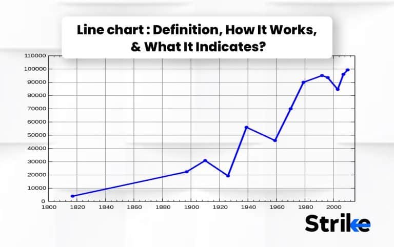
A line chart is a type of data visualization that displays data as a series of points connected by straight lines. A line chart shows trends and patterns over time and represents continuously changing data. It displays data as a series of points connected by straight lines. It is a widespread type of graph that shows information in a series where line segments connect data points.
Line charts are generally used to show information that gets changed frequently over time. It is most commonly used to describe the day-to-day price changes in business stocks. For example, the number of doughnuts sold daily for a year can be represented through a line chart.
The stacked line chart is another type representing more than one data column. It has more than one line, which is stacked upon each other and does not intersect the other lines. It is also used to compare multiple data over the same time interval.
What is Line Chart?
A line chart is the simplest form of graphical representation of data where the points are joined through a line series that can be straight or curved. Line charts originated in the 18th century when scientists and mathematicians used them to represent data. William Playfair used the first line chart in 1786. He used a line chart to show the fluctuation of wheat prices over the past 30 years.
A line chart has two axes, i.e., the horizontal axis or x-axis and the vertical axis or y-axis. The horizontal axis represents the time interval, while the vertical axis represents quantity. The data is plotted through points, then connected through a line to show the changes over time. The curve of the line chart determines the trend of specific data. A line chart can also compare two data groups over the same time interval.

The line chart is used on a daily basis to keep track of changes in stock prices, business sales, etc. There are different uses of line charts in different fields.
How Does Line Chart Work?
A line chart displays data sets as a series of points, where each dot represents a specific value taken at a particular moment. A continuous line that shows the trend or pattern of the data across time is then formed by connecting the dots with straight lines.
The data is plotted on the graph with the XY axis, where the X-axis represents the time interval, the Y-axis represents the quantity, and the points are plotted accordingly. After plotting all the points, they are connected through straight lines.

The line chart displays and compares the changes over time. These charts are highly used to observe the changes in stock price, temperature, population growth, company growth, etc. These charts are a beneficial tool used in different fields and industries to display information in a simpler and graphical form among other chart types.
What does Line Chart indicates?
Line charts indicate a change in data over a specific time, resulting in a trend or pattern formation. It allows us to observe and analyze the changes in a variable over a while. The easiest way to observe the overall change is to look at the graph’s direction.
Line charts are used to show the trading prices of stocks, solve theorems, weather trends, population patterns, growth of a company, etc. Line charts can also be used to compare data for the same time interval. These are also used to predict and forecast changes.
We use line charts in our day-to-day life. It keeps track of changes happening in regular time intervals. It is one of the most straightforward tools which helps compare the changes over time.
What Does Stacked Line Mean on Line Chart?
The stacked lines are the lines that present multiple series of data and are cumulative. These lines are stacked upon each other, so they do not intersect at any point. Stacked lines are represented by different colors.
These are often used to track business sales over different periods. It also allows tracking the total value of the products over a certain period. Stacked lines can sometimes be challenging to plot and read on a line chart with many variables.

What is the Line Chart Trading System?
A line chart trading system is a method traders use where the trading strategies are based on the analysis of the data plotted on line charts.
These traders observe the trend through the charts and then trade based on it. This chart aims to study the past prices and patterns of the market over weeks or months so that traders can predict future trades and plan accordingly. Traders can use this information to make trading decisions once they identify a trend or pattern in the price movements of a financial instrument.
The decisions made for short-term and long-term trades or investments using these systems can be unreliable as the prices can rise and fall anytime, so traders should always be prepared for the consequences.

What are Line Patterns You Need to Know?
Line charts are the most accessible and simplest form of graphical representation of data. It is the most basic type of chart representing day-to-day life information.
The 3 significant types of line charts are as follows:
- Simple Line Chart- The chart plotted with only a single line, i.e., a single data set, is presented through this chart. It is typically used to show trends over time, such as changes in stock prices or sales figures.

- Multiple Line Chart- The chart plotted with more than one line, i.e., various data sets are presented on the same axes. Different lines are shown through different colors, in this type of chart . It compares trends or patterns across multiple data sets, making it a valuable tool for data analysis and visualization.

- Compound Line Chart- The chart is plotted with different data sets divided into subtypes. The chart visualizes the trends between the various data and identifies the patterns.

These are the three different types of line charts. The choice of using a specific type of line chart depends on the data variations or different data sub-types.
What are the Advantages of Line Chart?
Line charts are a popular type of chart used in the graphical representation of data. Here are 5 of the advantages of using line charts:
- Easy to analyze- Line charts are very simple and easy to understand. It allows quick interpretation of trends and patterns in the data, making them an effective tool for presenting the information.
- Highlight comparisons-It makes the comparison of daily trade and sales easy.
- Plot different data sets- multiple lines are also drawn in a line chart, to compare different data sets of the same time interval.
- Useful for forecasting trends- Line charts can help forecast future trends by identifying patterns.
- Show trends over time- Line graphs are handy for displaying trends over time, as they can easily show changes and patterns in the data.
Overall, line charts are a powerful tool for visualizing data, making it easy to understand and interpret trends and patterns over time.
What are the Disadvantages of Line Chart?
Line charts have disadvantages too, even though they are a helpful tool in representing data and are very easy to understand. The four obvious disadvantages are given below.
- Limited data variables- it becomes challenging to plot on the graph, if the data is in decimal or fractional form,
- Limited data type- A wide range of data can be difficult to plot.
- Lacks in accuracy- Line charts can be misleading if the scale on the vertical axis needs to be appropriately labeled or if the data points are not evenly spaced.
- Less detailed information- Line charts only represent the data points connected by the lines, which would not provide detailed information about the data.
These are some of the disadvantages of line charts. Line charts are sometimes not considered to be the most reliable data visualization type, due to these limitations.
How do I read the Stock Market Line Chart?
A line chart shows the market price of a share in the stock market at a specific time interval. The chart’s X-axis represents time, while the Y-axis represents the stock price. The point plotted on the chart shows the stock price at a particular time, and the line represents the stock’s price over a while. The time period can be days, weeks, months, or years.
The overall direction of the graph determines the trend of the stock price during technical analysis. The upward movement of the line graph represents that the prices are rising, and the downward direction represents that the prices are falling. The sideward direction of the line graph represents that the prices are constant.

How to create line charts in an excel spreadsheet?
The steps to create a line chart in an excel spreadsheet is-
- Entering data- Enter the data of different axes in two separate columns.
- Select the data- Select the cell range with data by dragging through the mouse.
- Insert the chart- Click on the “Insert” tab, and in the “charts” section, select “line.”


- Choose the chart type- Select the type of line graph according to your need.

- Customize the chart according to your choice by labeling both axes, giving the title, changing the font size, color or style, etc.

- Save the chart- Once the line chart is created, save it by clicking Ctrl+S or going to the “File” tab and then selecting the “Save As” option.
This method can be used to create a line chart in an excel spreadsheet. One must, however, note that the steps or processes may vary in different versions of excel.
How Much Does Each Lines in Line Chart Worth?
The lines on the line chart represent the changes over time. The graph’s Y-axis represents the numerical variable, and the X-axis represents the data’s category or time interval.
The value of each line is relative to the scale of the Y-axis or the vertical axis. For example, each line point represents a value between 0 and 10 if the Y-axis is scaled from 0 to 10. Each line point represents a value between 0 and 100 if the Y-axis is scaled from 0 to 100.
How is the Accuracy of Line Chart?
The Line chart’s accuracy depends on the data plotted on the graph. We can entirely rely on Line Chart when the data plotted on the graph is accurate. The curated line chart will only be reliable if the data is accurate and plotted correctly.
The accuracy of the data is directly dependent on several factors. 3 of the main factors are-
- Data quality- The graph would be accurate if the data is accurate and consistent.
- Data intervals- Data points plotted at correct intervals can lead to an accurate line graph.
- Interpretation- The accuracy of the line chart is highly dependent on how it is interpreted or used.
The accuracy of a line chart relies on these factors. One should be very careful about these factors so that there is no harm to the accuracy of the line chart.
What is an example of a line chart?
A line chart is a type of data representation in a graphical way. It is the simplest and most accessible form of data visualization technique. Take a look at the image shown below to see an example.

The image shows New York’s temperature over six days, where the X-axis represents the day, and the Y-axis represents the degrees Fahrenheit. The temperature of different days is shown through the line graph. On day 1, the temperature was 43 degrees Fahrenheit; on day 6, the temperature was 67 degrees Fahrenheit. The temperature of different days has been plotted on the chart.
The direction of the line from the temperature of day 1 to day two is in the upward direction, which represents the temperature rise. The direction of the line connecting day two to day 3 is in the downward direction, which means the downfall of temperature. The data plotted on the line graph shows the rise and downfall trend of the temperature.
What is the Best Indicator for Line Chart?
The best indicators for the line chart depend on the purpose of using the chart. 3 of the most commonly used indicators are-
- Trend Line- This line shows the direction of the data through the marked data points.
- Moving average- This line shows the average data value over a specific time period.
- MACD (Moving Average Convergence Divergence)- This shows the change in trends or patterns of the data through two moving averages.
The best indicator for the line chart varies from person to person and the purpose of using the chart.
Why Do Most People Not Use Line for Trading?
People who don’t have specialization in analyzing line charts do not prefer to use a line graph for observing trade patterns. It does not show the opening, closing, or high and low prices of a specific time. It does not support many technical market indicators traders commonly use to analyze, such as moving averages, oscillators, and momentum indicators.
Is a Line chart dependable for Stock Market Technical Analysis?
No, Line charts are not helpful for stock market technical analysts. It needs more detailed information, and the analysts cannot rely on these charts entirely.
Stock market technical analysis involves detailed information about the stock market, and different prices, such as opening, closing, and high or low prices on a daily basis, which a line graph lacks.
Is line chart better than candlestick charts?
No, the line chart is not greater than the candlestick charts. The line chart shows the general information in the simplest way. It is easy to read and understand, even for new analysts. It does not, however, provide detailed information and can sometimes be inaccurate if not plotted or read properly.
The candlestick chart, on the other hand, shows the information in a very detailed format. It offers crucial market information like the opening, closing, high, low, etc. It provides a wide range of technical indicators, making the traders easily identify the trend and plan to trade accordingly.

Is a Line chart excellent for day trading?
No, Line charts are not the most efficient tool for day trading since they don’t provide enough information about the stock price.
Day trading involves trading securities within a single day with the goal of profits. Line charts need more detail for day trading analysis. Traders use charts such as candlesticks or bar charts to get a more accurate picture of market activity.
Do traders use line charts?
Yes, traders use line charts, as it helps them get information about the overall rise or fall in the stock market on a long-term basis. But it is less popular than candlestick charts or bar charts. Line charts are easy to understand, and the information can be displayed in the long and short-term, but it needs more detailed information. It can be used as the starting point of analysis, but it is only moderately reliable.
What is the Difference between Line Chart and Bar Chart?
Line charts and bar charts are two different forms of data visualization. These charts show data in a simpler format but there are many differences between these two. 5 of the major differences between line chart and bar chart are-
| Line Chart | Bar Chart |
| Data is represented through points which are then connected with a line. | Data is represented through rectangular bars for different categories or groups. |
| It represents a numerical data type. | It represents categorical or nominal data type. |
| It allows us to compare data between different categories or groups. | It allows us to compare different data sets over a specific period of time. |
| The X-axis represents the time interval. | The X-axis represents the categories or groups. |
| It does not allow to compare data for different categories and can be difficult to read if there is too much data. | It does not allow large data sets and can be difficult to read when there are too many categories. |

The choice of choosing either of the charts depends on the nature of the data and the purpose of using it. Line chart is ideal to show changes in data over time while bar chart allows to present data of different categories or groups.


 Previous Article


![15 Investing.com Alternatives [Free+Paid] You Should Use in 2026](https://www.strike.money/wp-content/uploads/2026/04/Investing.com-Alternatives.jpg "15 Investing.com Alternatives [Free+Paid] You Should Use in 2026 154")
![15 TradeStation Alternatives [Free+Paid] You Should Use in 2026](https://www.strike.money/wp-content/uploads/2026/04/TradeStation-Alternatives.jpg "15 TradeStation Alternatives [Free+Paid] You Should Use in 2026 155")
![15 Chartink Alternatives [Free+Paid] You Should Use in 2026](https://www.strike.money/wp-content/uploads/2026/04/Chartlink-Alternatives.jpg "15 Chartink Alternatives [Free+Paid] You Should Use in 2026 156")
: Overview, 10 Types of Indicators, Settings for Different Markets 157")


 : Definition, Formula, calculation, Uses, Advantages Vs limitations 160")


No Comments Yet.