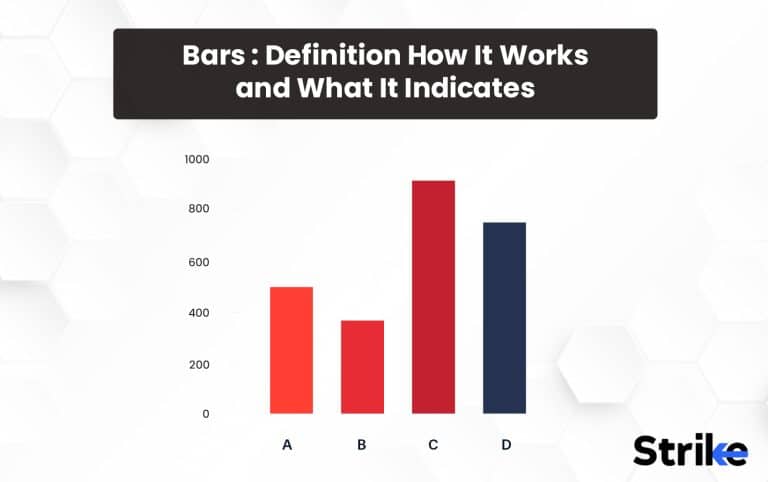
A bar chart is a graphical representation of the price movement of a financial asset over a given period of time. It displays the asset’s opening, closing, and high and low prices, typically for each day in the selected time frame. It represents several values or categories using rectangular bars with varied lengths or heights. The bars, which can be horizontal or vertical, are frequently used to compare values or depict changes over time. Each bar is proportionally longer or taller than the value it stands for, and the bars are often organized from highest to lowest or left to right. Bar charts are frequently used to visualize and present data in business, economics, statistics, and other subjects clearly and straightforwardly.
The bars are usually plotted along the x-axis, with the height or length of each bar proportional to the value it represents. Bar charts are useful for comparing the size or magnitude of different values or categories. They can be used to show trends over time, compare different groups or subgroups, or display the frequency distribution of a variable. Bar charts can be created using software like Microsoft Excel or Google Sheets. They are commonly used in business, finance, education, and other fields to visualize and communicate data.
What is Bar Chart?
A bar chart is a graphical representation of data that uses rectangular bars to compare different categories or groups. The bars are typically plotted vertically or horizontally, and their length represents the value or quantity of the displayed data.
Bar charts are a common way to represent data visually. Its origins can be traced back to the 18th century when Scottish engineer, economist, and inventor William Playfair first introduced the concept of displaying data using graphic representations. Playfair made his first bar chart in 1786, showing imports and exports of goods between England and other countries. His chart uses bars to represent the values of different countries, with the length of the bar proportional to the value it represents. Playfair’s innovation was a significant breakthrough in data visualization, paving the way for using bar charts and other graphical representations of data we see today.

Bar charts commonly display categorical data, such as product survey results or sales figures. Bar charts are also helpful in showing changes in data over time. The bars can be arranged in any order, but they are often sorted in descending or ascending order to make it easier to identify the largest or smallest values.
How does Bar Chart Works?
A bar chart compares data across different categories or time periods. It comprises two axes, one representing the groups or categories being compared, the other representing which represents the groups or categories being compared, and the other representing the numerical values related to those groups or categories. Each bar’s height or length corresponds to the value it stands for.
Before creating the categories or values you want to display in the bar chart, you must first decide. The x-axis, or horizontal axis, is used to depict these categories. Plots of the values or frequencies are made along the vertical axis or y-axis.
The length or height of each bar in the graph, which represents a category or value, reflects the magnitude or frequency of that category or value. The bars are often spaced apart by a tiny gap to make the chart easier to read.
The bars can be colored or shaded to differentiate them from one another and make them more visually appealing. You can also add labels to the bars for additional information or context.
Bar charts display simple data sets or compare data across different categories or values. These are easy to interpret and understand than other chart types. Bar charts can be created using simple tools like Excel or Google Sheets.
What Does Bar Chart Indicate?
A bar represents a category or value in a bar chart, and its length or height corresponds to its magnitude or frequency. The bars are usually arranged along the x-axis, representing the categories or values being compared. The y-axis represents the scale of the values being compared.

The Bar chart provides a variety of information, such as-
- Comparison of values: Bar charts can be used to compare the values of different categories or values. For example, a bar chart could show the sales figures for different products, allowing you to compare their relative performance.
- Frequency of occurrence: Bar charts can also indicate the frequency of occurrence of different categories or values. For example, a bar chart could show the number of people in different age groups.
- Change over time: Bar charts can also be used to show changes in data over time. For example, a bar chart could show a company’s annual revenue over the years.
Overall, bar charts are a powerful tool for visualizing data and indicating trends and patterns. They are widely used in business, science, and research to communicate insights and make informed decisions based on data.
What is the Bar Chart Trading System?
The Bar Chart Trading System is a technical analysis tool used in trading to identify trends, patterns, and trading opportunities in the stock, commodity, or forex markets. It is based on using bar charts to plot price data and other technical indicators, such as moving averages, volume, and momentum.
The system involves analyzing the bar charts to identify patterns and trends in the price data, such as support and resistance levels, trend lines, and chart formations like head and shoulders or double tops. These patterns can then be used to make trading decisions, such as buying or selling at specific price levels. Traders using the Bar Chart Trading System typically use a combination of technical indicators to confirm or refute signals from the price data. For example, they may use moving averages to identify trends or momentum indicators like the relative strength index (RSI) to confirm price movements.
What are Bar Patterns You Need to Know?
Bar patterns are a common technical analysis tool traders use to identify potential trading opportunities in the financial markets. These patterns indicate potential trading opportunities, trend reversals, or other important price movements. Here are four popular bar patterns:
- Inside Bar Pattern: An inside bar pattern is formed when the high and low of a bar are completely within the high and low of the preceding bar. This pattern indicates a period of consolidation or indecision in the market and may signal a potential breakout or reversal.

2. Outside Bar Pattern: An outside bar pattern is formed when a bar’s high and low exceed the preceding bar’s high and low. This pattern indicates a shift in market sentiment and may signal a potential trend reversal.

- Pin Bar Pattern: A pin bar pattern is formed when a bar has a long tail or shadow and a small body. This pattern indicates a rejection of a certain price level and may signal a potential trend reversal.

- Doji Pattern: A doji pattern is formed when a bar’s opening and closing prices are nearly identical, resulting in a very small body. This pattern indicates indecision in the market and may signal a potential trend reversal.

These are some of the popular bar patterns traders use in their trading.
What are the Advantages of a Bar Chart?
A bar chart is a handy tool. Bar charts are one of the most commonly used types of charts for visualizing data. They are simple to create and interpret, and they can be used to represent a wide range of data types. Here are 5 advantages follows:
- Easy to read and understand: Bar charts are easy to read and understand, even for people unfamiliar with data visualization. The bars provide a visual representation of the data that is easy to interpret, and color and labels can help make the chart even more accessible.
- Facilitate comparison: Bar charts make comparing the data in different categories or values easy. By arranging the bars logically, you can quickly see which category or value has the highest or lowest value.
- Show trends and patterns: Bar charts can be used to show trends and patterns in the data over time, making it easy to see how it changes or evolves.
- Provide a clear picture of data distribution: Bar charts can also show data distribution across categories or values. This can be useful in identifying outliers or patterns that take time to be apparent.
- Can accommodate large datasets: Bar charts can accommodate large datasets without becoming cluttered or difficult to read. This makes them a useful tool for presenting complex data clearly and concisely.
Bar charts are a versatile and powerful tool for presenting data in a way that is accessible and easy to understand. They are widely used in business, science, and research to communicate insights and make informed decisions based on data.
What are the Disadvantages of Bar Charts?
A bar chart is a graphical representation that uses rectangular bars of equal width to show data in a visually appealing way. This type of chart is commonly used to compare different categories of data over time or across different groups. Although bar charts are widely used and considered an effective way of presenting data, they also have several disadvantages. Here are 5 disadvantages follows:
- Limited to one or two variables: Bar charts are typically used to represent one or two variables at a time, so they may not be suitable for more complex data sets that involve multiple variables.
- Limited customization: While bar charts are easy to create and interpret, they can be limited in customization. For example, you may not be able to customize the colors or layout of the bars.
- Can be misleading: Bar charts can sometimes be misleading depending on how the data is presented. For example, using a scale that starts at a value other than zero can make differences between bars appear larger or smaller than they are.
- Difficult to compare precise values: Although bar charts make it easy to compare values, it can be difficult to compare precise values because the length or height of the bars is only an approximation.
- Not suitable for continuous data: Bar charts are best suited for data divided into discrete categories or values. Other graphs, such as line charts, are more appropriate for continuous data.
Bar charts are a popular way of presenting data but have several disadvantages. It is important to carefully consider the scale and labels used and the number of categories presented to ensure the information is accurately and effectively presented.
How to Analyze a Bar Chart for Technical Analysis?
Analyzing a bar chart for technical analysis involves these 5 steps:
- Identify the trend: The first step in analyzing a bar chart is to identify the trend. This can be done by looking for patterns of higher highs and higher lows in an uptrend or lower highs and lower lows in a downtrend.
- Look for key support and resistance levels: Once you have identified the trend, you can look for key support and resistance levels that the price may be approaching. These levels are important because they can indicate potential buying or selling opportunities.
- Analyze the volume: Volume can provide important clues about the strength of a trend or a potential reversal. An increase in volume during an uptrend or downtrend can indicate that the trend is strong, while a decrease in volume may indicate that the trend is weakening.
- Look for chart patterns: Bar charts can also identify patterns such as head and shoulders, triangles, and double tops or bottoms. These patterns can provide valuable information about the potential direction of the price.
- Use technical indicators: You can use technical indicators such as moving averages and relative strength index (RSI) to provide additional confirmation of the trend and potential entry or exit points.
Analyzing a bar chart for technical analysis involves identifying the trend, looking for key support and resistance levels, analyzing volume, identifying chart patterns, and using technical indicators. Combining these techniques lets you better understand the market and make more informed trading decisions.
How Much Does Each Bar in Bar Chart Worth?
The value of each bar in a bar chart depends on the scale of the axis being used. For example, the y-axis of a bar chart is labeled with rupee amounts ranging from Rs. 0 to Rs. 100, and then each bar would represent a specific rupee amount within that range.
The height or length of each bar represents the value or frequency of the data being plotted, with the height or length proportional to the value being represented. For example, if the y-axis is labeled in dollars and a bar is twice as high as another bar, it would represent a value twice as large as the value the smaller bar represents.

It’s important to note that the scale of the axis can significantly impact how the data is interpreted. For example, if the scale starts at a value other than zero, the differences between the bars may appear larger or smaller than they are. It’s important to choose an appropriate scale that accurately represents the data being plotted to avoid any misinterpretation.
How is the Accuracy of the Bar Chart?
The accuracy of a bar chart depends on several factors, including the accuracy of the data being plotted, the precision of the measurements used to collect the data, and the appropriateness of the chart type for the data being presented.
Bar charts are generally considered to be an accurate way to present data because they provide a clear and concise visual representation of the data. However, there are some limitations to their accuracy that should be considered. For example, the length or height of each bar in a bar chart only approximates the actual value being represented, making it difficult to compare precise values.
Additionally, if the data being plotted is not accurate or if there are errors in the data, the accuracy of the bar chart can be affected. It’s important to ensure that the data being plotted is accurate and reliable to ensure the accuracy of the resulting chart.
What is an Example of a Bar Chart?
An example of a bar chart could be a graph that shows the sales of different products in a store over a certain period of time. Each bar in the chart would represent the sales of a particular product, with the height of the bar indicating the total sales for that product during the time period being measured.
For example, if the chart showed the sales of mobile phones over the course of years, the height of each bar would represent the total sales for that product during the year. The x-axis of the chart could be labeled with the year, and the y-axis could be labeled with the total sales of the mobile phone.

This bar chart could be used to compare the changes in sales over time and identify trends or patterns that could inform future business decisions.
Why Most People Do Not Used Bar for Trading?
Bar charts are a common and well-liked technical analysis tool, but some traders decide not to use them for various reasons. One explanation might be that some trading methods may work better with other chart styles, such as candlestick charts, which offer more specific information regarding price changes. Bar charts may also be less visually appealing or more challenging to read for some traders than other chart patterns.
Another reason is that many trading platforms offer a variety of chart types and technical analysis tools, which can make it easy for traders to switch between different chart types depending on their needs.
The choice of charting style ultimately depends on personal taste and the trading technique employed. Some traders prefer bar charts, while other chart styles may be more appropriate for a given trader’s needs.
Is Bar dependable for Stock Market Technical Analysis?
Yes, bar charts are a widely used tool in the technical analysis of the stock market. They are often used to identify trends, support and resistance levels, and potential trading opportunities.
Bar charts can provide traders with a visual representation of price movements over time, making it easier to identify trends and patterns. By analyzing the length and direction of individual bars, traders can identify potential changes in price direction and anticipate potential support and resistance levels.
Is Bar greater than Candlestick?
No, the bar is not greater than the candlestick. It is because candlestick charts provide more detailed information about price movements and can be used to identify specific candlestick patterns, providing important trading signals. The candlestick patterns can indicate potential trend reversals, continuation of a trend, or indecision in the market. Additionally, candlestick charts can provide information about market sentiment, as certain candlestick patterns may indicate whether the market is bullish or bearish.
Is Bar excellent for day trading?
Yes, bar charts are excellent for day trading, as they provide a clear and simple representation of price movements over time. By analyzing the length and direction of individual bars, traders can identify potential changes in price direction and anticipate potential support and resistance levels, which can be useful for making trading decisions.
Do Traders Use Bar?
Yes, traders widely use bar charts in various financial markets, including stocks, commodities, and forex. Bar charts provide a simple and clear representation of price movements over time, making identifying trends and potential trading opportunities easier. They are also useful for identifying support and resistance levels and potential price reversals.
What is the Difference between Bar Chart from Renko Chart?
The 5 most prevalent differences between the Bar chart and the Renko chart are as follows-
| BAR CHART | RENKO CHART |
| It has fixed time intervals and shows price movement over time. | It has variables based on price movements. |
| Each bar represents a specified time interval | Each brick represents a price movement |
| It shows high, low, open, and close prices | It shows high and low prices only |
| It can show price movement in any direction | It shows price movement in one direction |
| It can have variable bar sizes depending on the time interval being used. | It has fixed brick sizes that do not change based on time. |


 Previous Article


![15 Investing.com Alternatives [Free+Paid] You Should Use in 2026](https://www.strike.money/wp-content/uploads/2026/04/Investing.com-Alternatives.jpg "15 Investing.com Alternatives [Free+Paid] You Should Use in 2026 88")
![15 TradeStation Alternatives [Free+Paid] You Should Use in 2026](https://www.strike.money/wp-content/uploads/2026/04/TradeStation-Alternatives.jpg "15 TradeStation Alternatives [Free+Paid] You Should Use in 2026 89")
![15 Chartink Alternatives [Free+Paid] You Should Use in 2026](https://www.strike.money/wp-content/uploads/2026/04/Chartlink-Alternatives.jpg "15 Chartink Alternatives [Free+Paid] You Should Use in 2026 90")
: Overview, 10 Types of Indicators, Settings for Different Markets 92")

 : Definition, Formula, calculation, Uses, Advantages Vs limitations 94")


: How We Used This 70/30 Indicator in 6 High Win-rate Strategies 97")


No Comments Yet.