
Ratio Charts
Visualize Stock Relationships & Market Trends
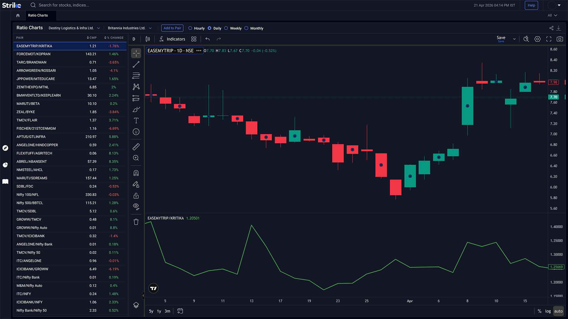
Ratio Charts compare one stock, sector, or index against another using relative price or ratio-based values. It helps you see outperformance or underperformance more clearly than absolute price.


Powerful Ratio Chart Capabilities
Everything you need to understand relative performance across stocks and sectors

Relative Performance View
Compare assets using ratio values to see which one is gaining or losing strength over time.

Sector & Stock Comparison
Analyse how stocks or sectors are performing against each other instead of in isolation.

Trend Tracking
Follow how relative strength builds, fades, or shifts across different timeframes.
Relative Performance Through Ratio Views
Compare performance to identify consistent outperformers
 Pair Comparison
Visual Comparison
Visual Comparison of Stock Ratios lets you plot one stock against another using ratio lines. It helps identify which stock is gaining relative strength and which one is lagging.
-
 Relative price ratio
-
Outperformance trends
-
Pair comparison
 Sector Rotation
Sector Performance Analysis
Sector Performance Analysis compares sector indices against each other using ratio charts. You can see which sectors are gaining relative momentum instead of just moving up or down.
-
Sector rotation
-
Relative strength shifts
-
Index comparison
 Trend History
Historical Ratio Trends
Historical Ratio Trends shows how relative performance has changed over time. It helps in spotting long-term leadership shifts and periods where one stock consistently outperformed another.
-
Long-term ratio trends
-
Performance cycles
-
Trend persistence
 Multi Comparison
Multi-Stock Comparison
Multi-Stock Comparison allows multiple stocks to be plotted on the same ratio framework. It helps in identifying which stock is leading within a group over a given period.
-
Multiple ratio lines
-
Relative ranking
-
Comparative strength
 Live Updates
Real-Time Data Updates
Real-Time Data Updates ensure the ratio values adjust with live price changes. This helps track shifts in relative strength as they develop, not after the move is complete.
-
Live ratio updates
-
Intraday changes
-
Dynamic comparison
 Market Readability
Easy Interpretation
Easy Interpretation focuses on making relative moves readable through simple ratio lines. Instead of tracking multiple charts, you can see divergence or convergence in one place.
-
Clear ratio lines
-
Divergence patterns
-
Quick comparison

How Strike Ratio Charts Work
From price comparison to relative strength in three simple steps
Select Assets
Choose two or more stocks, sectors, or indices you want to compare.
View Ratio Movement
Track how the ratio line moves as prices change, showing which asset is outperforming.
Identify Leadership
Use these shifts to understand which stock or sector is leading and where strength is fading.
Explore All Features
Professional-grade tools built to analyze market movements and trading opportunities in real time

Advanced scanners
Filter stocks using price, volume, technical indicators, and patterns. Returns setups that match defined conditions without manual chart checks.
Explore Advanced scanners →

Futures & Options
Access open interest, volume, and long-short data across indices and stocks. Helps read position buildup and derivative activity.
Explore Futures & Options →

Sentiment Indicators
Analyse market positioning using breadth data, derivatives activity, and momentum signals across stocks and indices.
Explore Sentiment Indicators →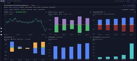

Stocks & Indices
View price trends, financial data, and technical indicators together. Compare performance across timeframes and track index movement.
Explore Stocks & Indices →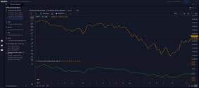

Diffusion Indicators
Measure percentage of stocks aligned with trend or momentum signals. Shows whether market moves have broad participation.
Explore Diffusion Indicators →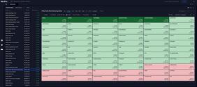

Interactive Heatmaps
Visualise sector and stock movement using percentage change and market cap weight. Highlights where gains or declines are concentrated.
Explore Interactive Heatmaps →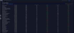

IPO Tracker
Track upcoming and active IPOs with issue dates, price bands, lot sizes, and subscription data across investor categories.
Explore IPO Tracker →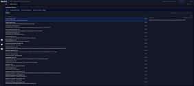

Bulletin Board
View news, announcements, corporate actions, and deal activity together. Helps link market events with price movement.
Explore Bulletin Board →

Market Calendar
Track earnings, IPOs, and economic events by date. Useful for planning trades around scheduled market triggers.
Explore Market Calendar →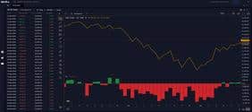

FII DII Data
Track institutional buying and selling across cash and derivatives segments. Shows changes in exposure by FIIs and DIIs.
Explore FII DII Data →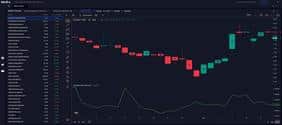

Ratio Charts
Compare stocks or sectors using price ratios. Helps identify relative strength and shifts in outperformance over time.
Explore Ratio Charts →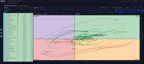

RRG
Plots relative strength and momentum against each other; shows clockwise rotation between leading, weakening, lagging, and improving quadrants.
Explore RRG →Frequently Asked Questions
Ratio Charts plot one asset against another, usually as a price ratio. Instead of looking at price in isolation, you’re checking how one stock is performing relative to another. For example, if a stock is going up but its ratio against a sector index is falling, it means it’s still underperforming that sector.
They help in identifying relative strength. Two stocks can both be rising, but one might be doing better. The ratio line makes that visible. Over time, traders use this to rotate into stronger names rather than just holding what’s going up.
You can, yes. Usually people do this within a sector - banking, IT, things like that. When you plot them together, one or two names tend to stay on top over time. That’s what most people end up focusing on rather than the whole group.
They are, especially for tracking leadership trends. If one stock keeps outperforming others over months or years, it usually shows up clearly on the ratio chart. That’s often where long-term capital tends to stay.
Yes, they move with price changes. So as prices shift during the day, the ratio adjusts as well. This makes it easier to catch changes in relative strength while they’re happening.
You’re mainly tracking relative movement between two assets. If the ratio keeps making higher highs and holding above recent levels, it usually means one stock is consistently outperforming. When it starts breaking prior lows or fails to hold those levels, that leadership often shifts. Sideways phases usually show up when both are moving similarly, so there’s no clear relative edge.
What Our Traders Say

Mr. Ayush
5.0
Working Professional


Vinit Baro
5.0
Working Professional


Nitin Prajapati
5.0
Working Professional


Manish Setia
5.0
Investor
Why Traders Love Our Ratio Charts

Spot Real Leaders
Sometimes everything looks like it’s moving up, but one stock quietly outperforms. The ratio makes that gap obvious instead of relying only on price charts.

Make Better Switches
There are phases where one stock keeps gaining relative strength while another fades. You can actually see that shift and adjust instead of holding both.

One View, Clear Answer
Instead of flipping between multiple charts, you just follow one ratio line. If it’s rising, one’s leading. If not, something’s changing underneath.

Works Across Timeframes
You can use it intraday to catch quick shifts or over weeks to track consistent outperformers. The behaviour holds up across both short and longer periods.
Strike
PROFESSIONAL TRADING PLATFORM
Join thousands of traders worldwide
Get Market Insights Delivered Quickly
Join 100,000+ traders receiving our exclusive newsletter with market analysis, trading strategies, and actionable insights.

Expert insights on market trends and opportunities
Proven techniques from professional traders
Comprehensive beginner to advanced trading guide
Be the first to read our latest articles
"Strike's newsletter completely transformed my trading approach. The insights are invaluable!"
— Amit Sharma, Active Trader50K+
Active Traders
$2.5B+
Trading Volume
150+
Markets Covered
24/7
Support Available