
Heatmaps
Visualize Stock Market Trends Instantly
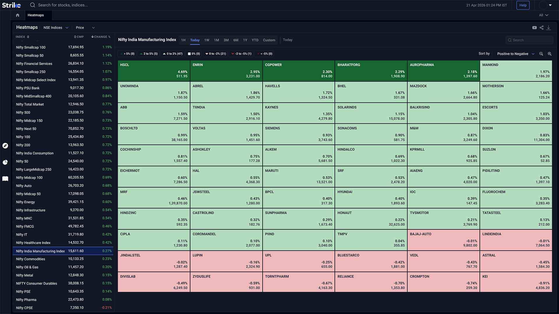
Heatmaps give you a quick visual view of how the market is moving, using simple colors to show what’s gaining, falling, or staying flat.


Powerful Heatmap Capabilities
Everything you need to read market structure without scanning individual charts

Visual Market View
See how stocks and sectors are moving using colors, so you can understand direction without reading numbers.

Quick Pattern Recognition
Spot where strength is building or slowing down across sectors and groups without checking each stock individually.

Simplified Market Read
Get a broad sense of market direction whether things are mostly positive, negative, or mixed within seconds.
Visual Market Views Across Segments
Get a quick sense of strength and weakness across the market
 Index view
NSE Indices
NSE Indices Heatmaps show real-time performance of major Nifty indices and sectors, displayed visually so you can quickly spot sector rotation, relative strength, and index movement.
-
 Sector Visualization
-
Color Coded Returns
-
Time & % Sorting
 Derivatives view
F&O Baskets
F&O Heatmaps give you a visual read of what’s happening in the derivatives space. It helps you notice shifts in activity - sometimes subtle, sometimes not, without going too deep immediately.
-
Open interest trends
-
Price movement
-
Volume activity
 Market Breadth
Advance Decline - Intraday
Advance Decline - Intraday Heatmaps show how many stocks are moving up versus down during the day. It’s a simple way to understand whether the market is broadly positive or not, without overthinking it.
-
Advancing stocks
-
Declining stocks
-
Market breadth
 Full Market View
NSE All Stocks
NSE All Stocks Heatmaps give you a broader look at the market. You can quickly spot which stocks are moving, where the action is, and where things are relatively quiet.
-
Top gainers & losers
-
Live price movement
-
Trend shifts
 Custom View
Watchlist Heatmaps
Watchlist Heatmaps let you track your own set of stocks in a visual way. Instead of checking each one separately, you can just glance at it and get a rough idea of what’s happening.
-
Custom stock list
-
Price changes
-
Volume spikes

How Strike Heatmaps Work
From visual overview to deeper analysis in three simple steps
View Heatmap
See stocks or sectors displayed using color based on price movement for a quick read of what’s gaining or falling.
Scan Movement
Identify clusters across sectors or stocks to spot where strength, weakness, or market participation is building.
Check Details
Open a stock or sector to view charts, price, and volume for deeper analysis.
Explore All Features
Professional-grade tools built to analyze market movements and trading opportunities in real time

Advanced Scanners
Filter stocks using price, volume, technical indicators, and patterns. Returns setups that match defined conditions without manual chart checks.
Explore Advanced scanners →

Futures & Options
Access open interest, volume, and long-short data across indices and stocks. Helps read position buildup and derivative activity.
Explore Futures & Options →

Sentiment Indicators
Analyse market positioning using breadth data, derivatives activity, and momentum signals across stocks and indices.
Explore Sentiment Indicators →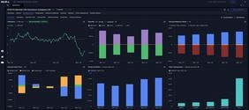

Stocks & Indices
View price trends, financial data, and technical indicators together. Compare performance across timeframes and track index movement.
Explore Stocks & Indices →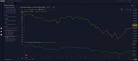

Diffusion Indicators
Measure percentage of stocks aligned with trend or momentum signals. Shows whether market moves have broad participation.
Explore Diffusion Indicators →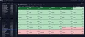

Interactive Heatmaps
Visualise sector and stock movement using percentage change and market cap weight. Highlights where gains or declines are concentrated.
Explore Interactive Heatmaps →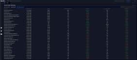

IPO Tracker
Track upcoming and active IPOs with issue dates, price bands, lot sizes, and subscription data across investor categories.
Explore IPO Tracker →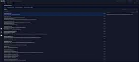

Bulletin Board
View news, announcements, corporate actions, and deal activity together. Helps link market events with price movement.
Explore Bulletin Board →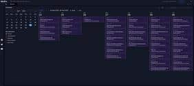

Market Calendar
Track earnings, IPOs, and economic events by date. Useful for planning trades around scheduled market triggers.
Explore Market Calendar →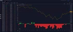

FII DII Data
Track institutional buying and selling across cash and derivatives segments. Shows changes in exposure by FIIs and DIIs.
Explore FII DII Data →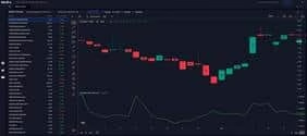

Ratio Charts
Compare stocks or sectors using price ratios. Helps identify relative strength and shifts in outperformance over time.
Explore Ratio Charts →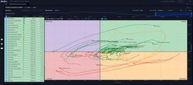

RRG
Plots relative strength and momentum against each other; shows clockwise rotation between leading, weakening, lagging, and improving quadrants.
Explore RRG →Frequently Asked Questions
It’s basically a way to look at the market without getting stuck in numbers. You’ll see blocks in different colors - some green, some red and that alone tells you what’s moving. Not exact details, just enough to get a quick sense.
They don’t really tell you what to do directly. It’s more about getting a feel for the market. You open it, and in a few seconds you can tell if things look strong, weak, or just mixed. From there, you usually dig deeper into specific stocks or sectors.
Mostly price changes, sometimes volume, and in F&O Heatmaps you’ll also see open interest. It’s kept simple on purpose. If something catches your eye, that’s when you go check charts or details separately.
Yeah, you can. With Watchlist Heatmaps, you just add the stocks you care about and keep it to that. Otherwise it can feel a bit too crowded, especially if you’re tracking a lot at once.
Yes, you’ll find Heatmaps for regular NSE stocks, F&O contracts, and indices as well. You don’t have to use all of them though - most people stick to what they usually trade.
It updates in real time, or very close to it. During market hours, if something moves quickly, you’ll see that change almost immediately. You don’t really have to refresh anything.
Anyone who wants a quick overview without getting into too much detail right away. Traders use it more actively during the day, while long-term investors might just check it occasionally to see how things are moving.
What Our Traders Say

Mr. Ayush
5.0
Working Professional

Vinit Baro
5.0
Working Professional

Nitin Prajapati
5.0
Working Professional

Manish Setia
5.0
Investor
Why Traders Love Our Heatmaps

Quick Overview
You open it, and in a few seconds you already know how the market feels. No need to go through charts one by one.

Easy Comparison
Everything sits next to each other, so you can instantly tell which sectors or stocks are doing better and which ones aren’t.

Faster Scanning
Instead of checking 20 - 30 stocks individually, you just scan the screen once and get a rough idea of where the action is.

Useful Starting Point
Most people don’t take decisions from this directly. It’s more like the first step - see what’s moving, then go deeper from there.
Strike
PROFESSIONAL TRADING PLATFORM
Join thousands of traders worldwide
Join 50K+ traders receiving our exclusive newsletter with market analysis, trading strategies, and actionable insights.

Expert insights on market trends and opportunities
Proven techniques from professional traders
Comprehensive beginner to advanced trading guide
Be the first to read our latest articles
"Strike's newsletter completely transformed my trading approach. The insights are invaluable!"
— Amit Sharma, Active Trader50K+
Active Traders
$2.5B+
Trading Volume
150+
Markets Covered
24/7
Support Available