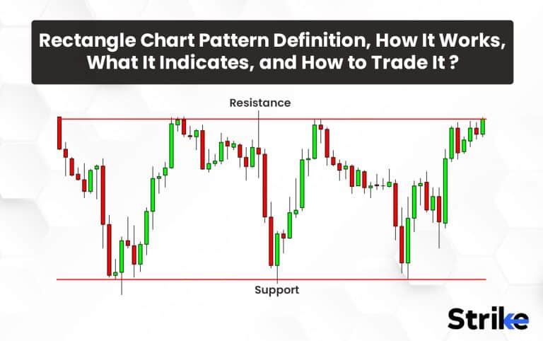
The rectangle chart pattern forms when the price of a security trades between two parallel and horizontal support and resistance levels for an extended period. The rectangular pattern consolidation creates a rectangular shape on the price chart as the price bounces between support and resistance. The rectangle indicates a balance between buyers and sellers agreeing on the asset’s value range for the time being. This pause typically occurs after a prior uptrend or downtrend. Traders watch for an eventual breakout from the rectangle pattern in either direction to signal trades.
A break above resistance indicates the uptrend is resuming and traders may go long. A break below support signals the downtrend is continuing and traders may go short. The rectangle helps identify consolidation and potential breakouts. Determining key support and resistance levels from the pattern allows traders to time entries for when the breakout occurs. Overall, the rectangle provides chart context, helps spot trend pauses and continuations, and highlights pending trading opportunities on the horizon.
What is the Rectangle Chart Pattern?
The rectangle chart pattern is used to identify potential price trends in the market. This pattern is formed when the price of a security moves within a horizontal range for an extended period, creating a rectangle-like shape on a price chart. During this period, the price is neither trending upwards nor downwards but is moving sideways within a particular price range.

The pattern is considered valid when the price breaks out of the rectangle pattern on high volume. A break to the upside suggests bullish sentiment. A break to the downside indicates bearish sentiment. Traders can use the rectangle chart pattern to identify potential buy and sell signals.
A buy signal is generated when the price breaks out of the rectangle pattern to the upside, indicating a potential uptrend. A sell signal is generated when the price breaks out of the rectangle pattern to the downside, indicating a potential downtrend.
How Does Rectangle Chart Pattern Work?
Rectangle chart patterns work by spotting a time of market consolidation where buyers and sellers are in a state of equilibrium. The pattern appears on a price chart resembling a rectangle when a security price moves continuously within a horizontal range. This indicates that the asset’s price fluctuates horizontally within a specific price range rather than trending upwards or downwards.
Two parallel trend lines, with the top line denoting the resistance level and the lower line denoting the support level, combine to form the rectangle pattern. The price point at which strong selling pressure is anticipated to keep prices from rising is known as the resistance level. The price point at which strong purchasing pressure is anticipated to keep prices from falling is known as the support level.
Traders can utilise the rectangle pattern to spot possible buy and sell signals after it has been established. A buy signal is created when the price exits the rectangle pattern to the upside, signalling the possibility of an upswing. A sell signal is created, when the price exits the rectangle pattern to the downward, signalling the possibility of a decline.
What Does the Rectangle Chart Pattern Indicate?
Rectangle chart indicates a significant shift in the market’s sentiment when the price leaves the rectangle pattern on high volume. A breakthrough that is upward shows optimistic emotion, while one that is downward suggests pessimistic feelings. The strength of the trend is also determined by the size of the price move that follows the breakout; greater moves signify stronger trends.
As the price trades sideways between horizontal support and resistance levels, the rectangle signals a balance between supply and demand forces in the market. This tight trading range indicates that buyers and sellers agree on the asset’s fair value for the time being after a prior uptrend or downtrend.
However, this balance is temporary. The rectangle represents a pause or intermission, not a reversal. Traders anticipate an eventual breakout that will drive the price out of this consolidation zone. A break above resistance implies the prior uptrend is resuming with renewed buying momentum.
A break below support suggests the earlier downtrend is continuing fueled by selling pressure. The impending breakout, in either direction, is the key trading opportunity signaled by the rectangle pattern. It confirms the asset’s next likely move after a period of indecision and directionless trading.
What are Potential Benefits of Rectangle Chart Pattern Used as a Trading Decision?
The rectangle chart pattern can offer traders vital information about possible price moves and market moods, making it a powerful technical analysis tool. Five potential benefits of using the rectangle chart pattern are listed below.
Identifying potential price trends. Traders can use the rectangle chart pattern to determine probable entry and exit points for investment. Traders can limit their losses if the price does not move in the anticipated direction following the breakout by placing stop-loss orders below the support level when buying or above the resistance level when selling.
Generating potential buy and sell signals. Traders use the rectangle chart pattern to produce probable buy and sell recommendations. A buy signal is created when the price exits the rectangle pattern to the upside, signalling the possibility of an upswing. A sell signal is generated indicating the probability of a fall when the price leaves the rectangle pattern to the downside.
Limiting risk. The rectangle chart pattern are traded using stop-loss orders to reduce risk. Stop-loss orders are set above the resistance level when selling or below the support level when purchasing. This assists traders in limiting their losses if the price does not move in the predicted direction following the breakout.
Understanding market sentiment. The breakout from the rectangle chart pattern can also indicate a shift in market sentiment. It suggests bullish sentiment if the breakout is to the upside. A breakout to the downside indicates bearish sentiment.
Easy to identify. The rectangle pattern is one of the easiest chart patterns to identify, making it accessible to traders of all skill levels.
The rectangle chart pattern can provide valuable information about potential price trends, market sentiment, and support and resistance levels. Traders can potentially improve their chances of success in the market by using this information in their trading decisions.
What are Risks of Rectangle Chart Pattern Used as a Trading Decision?
The Rectangle chart pattern has its own set of risks and limitations, just like any other trading decision. The following are 5 risks of rectangle chart pattern used as trading decisions.
False breakouts. The breakout from the rectangle chart pattern can sometimes be a false signal. Traders find that the price moves in the opposite direction from the anticipated trend after the breakout, resulting in losses.
Whipsawing. The rectangle chart pattern can also be subject to whipsawing, which occurs when the price moves rapidly in both directions, causing losses for traders who have entered trades based on the pattern.
Limited information. Rectangle chart patterns can reveal important details about possible price movements as well as areas of support and resistance, but they do not give a whole picture of the market. Trading choices should be based on a combination of fundamental analysis, technical analysis, and market sentiment.
Market Volatility. The rectangle chart pattern becomes invalid due to market volatility and unanticipated occurrences that result in major price changes. Unexpected circumstances have an impact on traders’ deals, leading to losses.
Small price moves. The price movement that follows the rectangle pattern splits can occasionally be modest, which limits the potential reward for traders.
Traders should be aware of the limitations of the pattern and use it in combination with other technical analysis tools, as well as fundamental analysis and market sentiment, to make informed trading decisions.
How to Trade Using the Rectangle Chart Pattern?
The support and resistance levels of the rectangle chart pattern must be identified before trading, and trades must be entered and exited based on the breakout of these levels. The following are 5 steps for trading using the rectangle chart pattern are as follows.
Identify the rectangle pattern. The first step is to identify the rectangle pattern on the price chart. Price should move sideways between these levels for a considerable amount of time throughout the pattern.
Identify the support and resistance levels. Traders should determine the pattern’s support and resistance levels once the rectangle pattern has been identified. The rectangular pattern’s top border is the resistance level, while its lower boundary is the support level.
Set your entry and exit points. You must determine your entry point into the trade. For a bullish rectangle, look to enter a long position when the price breaks out convincingly above the established resistance level. For a bearish pattern, enter a short position when the price breaks below support.
Set your stop-loss. Implement a stop-loss order to control trading risk. For long trades, set the stop-loss just below the rectangle’s support. For shorts, set it above resistance. This will limit losses in case the breakout fails.
Monitor the trade. Monitor the trade closely as it plays out. Ensure upside or downside momentum continues as expected. If momentum wanes, consider exiting the position promptly to avoid being stuck in poor trades.
Trading rectangle breakouts requires adherence to entry rules, disciplined risk management, ongoing trade monitoring, and incremental profit-taking. Following these guidelines will lead to more successful outcomes when trading this chart pattern
How Reliable is the Rectangle Chart Pattern for Technical Analysis?
The rectangle chart pattern has proven to be a reliable setup with a high win rate around 85% based on historical data. The predictive power and win rate statistics illustrate why the rectangle is considered one of the more accurate and profitable technical analysis chart patterns to trade.
What are Some Common Mistakes Traders Do when Using the Rectangle Chart Pattern?
Traders make common mistakes when using the Rectangle chart pattern. The following are 5 common mistakes that traders can make when using the rectangle chart pattern for trading.
- Not waiting for the breakout. Entering trades prematurely before the actual breakout occurs. It’s crucial to wait for the price to break support or resistance.
- Acting on false breakouts. Not verifying the validity of breakouts which fail and trap buyers/sellers on the wrong side. Look for increased volume on true breakouts.
- Poor risk management. Neglecting to use proper stop losses below support or above resistance when trading the pattern.
- Insufficient trade planning. Not identifying profit targets, exits, and risk parameters in advance leads to poor trade execution.
- Lack of patience. Feeling forced to take action during the consolidation leads to impulsive trades. Rectangles require patience to wait for the right entry signal.
It’s crucial to keep in mind that the rectangle chart pattern is not the only tool in technical analysis and are used with other technical indicators to help traders make informed trading decisions. Traders should efficiently control risk by placing stop-loss orders and modifying their trades as needed.
How Do You Identify a Bullish Rectangle?
A bullish rectangle pattern forms when the price of an asset consolidates between clearly defined horizontal support and resistance levels. To identify this pattern, you first look for the prior uptrend that precedes the rectangle. See the picture below.

This shows that buyers were in control before the consolidation period. Next, notice the rectangular shape as the price bounces between parallel support and resistance lines for at least twice as long as the previous trend. The longer the consolidation, the more significant the eventual breakout tends to be. A breakout above resistance on heavier volume confirms the bullishness, signaling that buyers have overwhelmed sellers and the uptrend is resuming. The rectangle provides a reliable buy signal for traders to enter long positions in anticipation of continued rising prices now that the consolidation period is ending.
What is a Bearish Rectangle Chart Pattern?
A bearish rectangle chart pattern is a technical analysis pattern that typically indicates the continuation of a prior downtrend. It is a rectangle or box-shaped pattern that forms when the price moves sideways between a support level and a resistance level.

What is the success rate of the bullish rectangle pattern?
The market circumstances, the length of the pattern, and the force of the breakout are variables that affect the bullish rectangle pattern’s success rate. The reliability of the pattern during the breakout tends to be enhanced by a long time of consolidation and a bigger trading volume. The bullish rectangle pattern has a success rate of 85% (according to liberated stock traders), which means that in 85% of instances, a bullish breakout occurs as a result of the pattern.
What is an Example of Rectangle Chart Pattern?
Let’s assume that after many months of uptrend, Company ABC’s stock enters a consolidation phase. Company ABC enters a phase of consolidation during which the price oscillates between two horizontal lines. The top line links the highs, while the lower line connects the lows of the consolidation region. The support level at the bottom and the resistance level at the top results in a rectangle pattern.

The low trading activity during the consolidation phase suggests that market participants are unsure of the stock’s future course. Buyers start gathering shares close to the support level and sellers start booking profits close to the resistance level as the pattern takes shape.
How Does Supply and Demand Work for Rectangle Chart Patterns?
The rectangle chart patterns show a balance between market supply and demand. Buyers and sellers are in balance throughout the consolidation stage, resulting in a horizontal price range. The rectangle pattern’s support and resistance levels signify the price ranges at which buyers and sellers are willing to enter and leave their respective positions.
Demand rises as purchasers are more eager to purchase shares at a discount when the price gets closer to the support level. Supply, in contrast, rises as the price approaches the resistance level because sellers are more prepared to part with their stock for a premium.
How Is Support and Resistance for the Rectangle Chart Pattern?
Support and resistance levels are essential components of the rectangle chart pattern. The support level is the lower horizontal line that connects the price lows during the consolidation phase, while the resistance level is the upper horizontal line that connects the price highs during the same period.

The support level, which serves as the lower border of the Rectangle pattern, denotes a price at which the asset often attracts purchasing interest, preventing further declines. This level is thought of as a price floor when demand for the asset rises, perhaps causing price reversals or bounces.
The top limit of the Rectangle pattern is defined by the resistance level. It denotes a price range where the asset is likely to experience selling pressure, limiting its ability to increase. This level is seen as a price ceiling, at which point supply for the asset increases, potentially leading to price reversals or pullbacks.
What is the Measuring Principle of the Rectangle Chart Pattern?
The measuring principle provides a method for setting price targets after trading the breakout from a rectangle chart pattern. It is based on taking the height of the rectangle formation and projecting it from the breakout point. For example, a bullish rectangle is Rs. 5 tall from support to resistance, mean thet you would measure Rs 5 above the resistance breakout which becomes the minimum target. This assumes the ensuing move will be roughly equal to the preceding consolidation.
The opposite applies for bearish rectangles which measure the pattern height below the support breakout for the downward target. This measuring technique establishes reasonable expectations for the magnitude of the impending trend resumption. Traders use it to set profit objectives and plan exits when trading rectangle breakouts. While not precise, the rectangle’s measuring principle provides an evidence-based estimate for projecting the size of the expected move after consolidation ends.
Is a Rectangle Chart Pattern Bullish?
The rectangle chart pattern itself is neither bullish nor bearish. The direction of the eventual breakout from the rectangle determines whether it is a bullish continuation or bearish reversal pattern.
Do Rectangle Pattern Only Occur when the Price is Moving between Horizontal Support?
No, rectangle patterns can also form between sloping or angled support and resistance levels, as long as they are parallel lines containing the price action. The key is that the pattern demonstrates contained trading within well-defined upper and lower boundaries.
Does the Rectangle Pattern Indicates No Trend?
The rectangle pattern indicates a pause or consolidation within an existing trend. It represents a temporary loss of direction, not the complete absence of a trend. The prior uptrend or downtrend is expected to resume once the price breaks out of the rectangle formation.
Does the Rectangle Chart Pattern Ends when There Is a Breakout?
Yes, the rectangle pattern is considered completed once the price breaks out and closes convincingly above or below the defined horizontal barriers. The breakout signals the end of the consolidation period and continuation of the overall trend. Traders will enter positions in the direction of the breakout, anticipating follow-through from the ending rectangle pattern.
What is the Difference between Rectangle Chart Pattern from Diamond Chart Pattern?
The Rectangle pattern is a horizontal continuation pattern. The Rectangle Pattern occurs when the price of an asset moves within two parallel horizontal lines for a specific period.

The Diamond pattern appears when the price forms a diamond-shaped symmetrical pattern by connecting higher highs with a descending trendline and lower lows with an ascending trendline.
The following are 5 differences between Rectangle Chart Pattern and Diamond Chart Pattern.
| RECTANGLE CHART PATTERN | DIAMOND CHART PATTERN |
| A period of consolidation where the price moves between two horizontal lines. | A period of consolidation where the price forms higher lows and lower highs, creating a diamond shape. |
| Two horizontal lines represent the support and resistance levels. | Four trend lines converge to form the diamond shape. |
| It typically indicates a neutral market where neither buyers or sellers have gained control. | It can indicate both bullish and bearish market conditions, depending on the direction of the breakout. |
| The measuring principle is used to estimate the potential price move after the breakout. | The measuring principle is not as reliable as other chart patterns. |
| It is more common and easier to identify. | It is less common and more difficult to identify. |


 Previous Article


![15 Investing.com Alternatives [Free+Paid] You Should Use in 2026](https://www.strike.money/wp-content/uploads/2026/04/Investing.com-Alternatives.jpg "15 Investing.com Alternatives [Free+Paid] You Should Use in 2026 76")
![15 TradeStation Alternatives [Free+Paid] You Should Use in 2026](https://www.strike.money/wp-content/uploads/2026/04/TradeStation-Alternatives.jpg "15 TradeStation Alternatives [Free+Paid] You Should Use in 2026 77")
![15 Chartink Alternatives [Free+Paid] You Should Use in 2026](https://www.strike.money/wp-content/uploads/2026/04/Chartlink-Alternatives.jpg "15 Chartink Alternatives [Free+Paid] You Should Use in 2026 78")
: Overview, 10 Types of Indicators, Settings for Different Markets 79")


 : Definition, Formula, calculation, Uses, Advantages Vs limitations 82")


No Comments Yet.